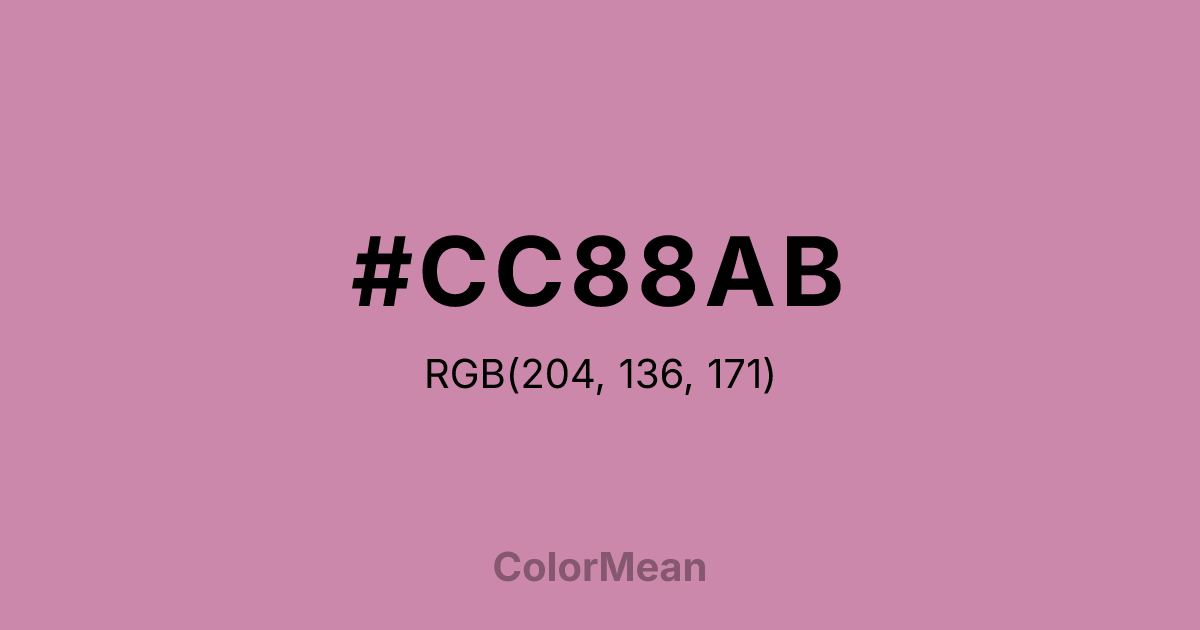
#CC88AB Color Information
#CC88AB RGB value is (204, 136, 171). The hex color red value is 204, green is 136, and blue is 171. Its HSL format shows a hue of 329°, saturation of 40 percent, and lightness of 67 percent. The CMYK process values are 0 percent, 33 percent, 16 percent, 20 percent.
#CC88AB Color Meaning
Color #CC88AB suggests mature warmth, faded digital sentiment, and substantial softness. #CC88AB muted, dusty pink is significantly more grounded, resembling a pink that has been used, weathered, or placed in shadow. Psychologically, color #CC88AB is comforting in a more substantive, less sugary way, promoting feelings of stability, quiet affection, and resilient warmth. #CC88AB feels less like a highlight and more like a foundational, textured element. #CC88AB color provides emotional weight within its family. Culturally, as part of the X11 system, color #CC88AB provides the crucial mid-tone that allows for realistic shading and the modeling of three-dimensional pink objects or effects in digital design. Symbolically, #CC88AB represents the history of interaction, a button that has been pressed many times, or warmth that has depth and memory. Color #CC88AB completes the narrative of a full-color spectrum, proving that even a color like pink can have a serious, grounded, and functional dark side.
Color Conversion
Convert #CC88AB across different color models and formats. These conversions help designers work seamlessly between digital and print media, ensuring this color maintains its intended appearance across RGB screens, CMYK printers, and HSL color manipulations.
RGB Values & CMYK Values
RGB Values
CMYK Values
Color Variations
#CC88AB harmonies come to life through carefully balanced shades, tints, and tones, giving this color depth and flexibility across light and dark variations. Shades add richness, tints bring an airy softness, and tones soften intensity, making it easy to pair in clean, modern palettes.
Color Harmonies
#CC88AB harmonies create beautiful relationships with other colors based on their position on the color wheel. Each harmony type offers unique design possibilities, enabling cohesive and visually appealing color schemes.
Analogous
Colors adjacent on the color wheel (30° apart)
Complementary
Colors opposite on the color wheel (180° apart)
Split Complementary
Three colors using one base hue and the two hues beside its opposite
Triadic
Three colors evenly spaced (120° apart)
Tetradic
Four colors forming a rectangle on the wheel
Square
Four colors evenly spaced (90° apart)
Double Split
Four colors formed from two base hues and the colors next to their opposites
Monochromatic
Variations of a single hue
Contrast Checker
(WCAG 2.1) Test #CC88AB for accessibility compliance against white and black backgrounds. Proper contrast ensures this color remains readable and usable for all audiences, meeting WCAG 2.1 standards for both normal and large text applications.
Sample Text
This is how your text will look with these colors.
Large Text (18pt+)
Normal Text
UI Components
Color Blindness Simulator
See how #CC88AB appears to people with different types of color vision deficiencies. These simulations help create more inclusive designs that consider how this color is perceived across various visual abilities.
Normal Vision
protanopia
Note: These simulations are approximations. Actual color vision deficiency varies by individual.
CSS Examples
Background Color
Text Color
Sample Text
Border Color
Box Shadow
Text Shadow
Sample Text
Gradient
#CC88AB Color FAQs
Frequently asked questions about #CC88AB color meaning, symbolism, and applications. Click on any question to expand detailed answers.
