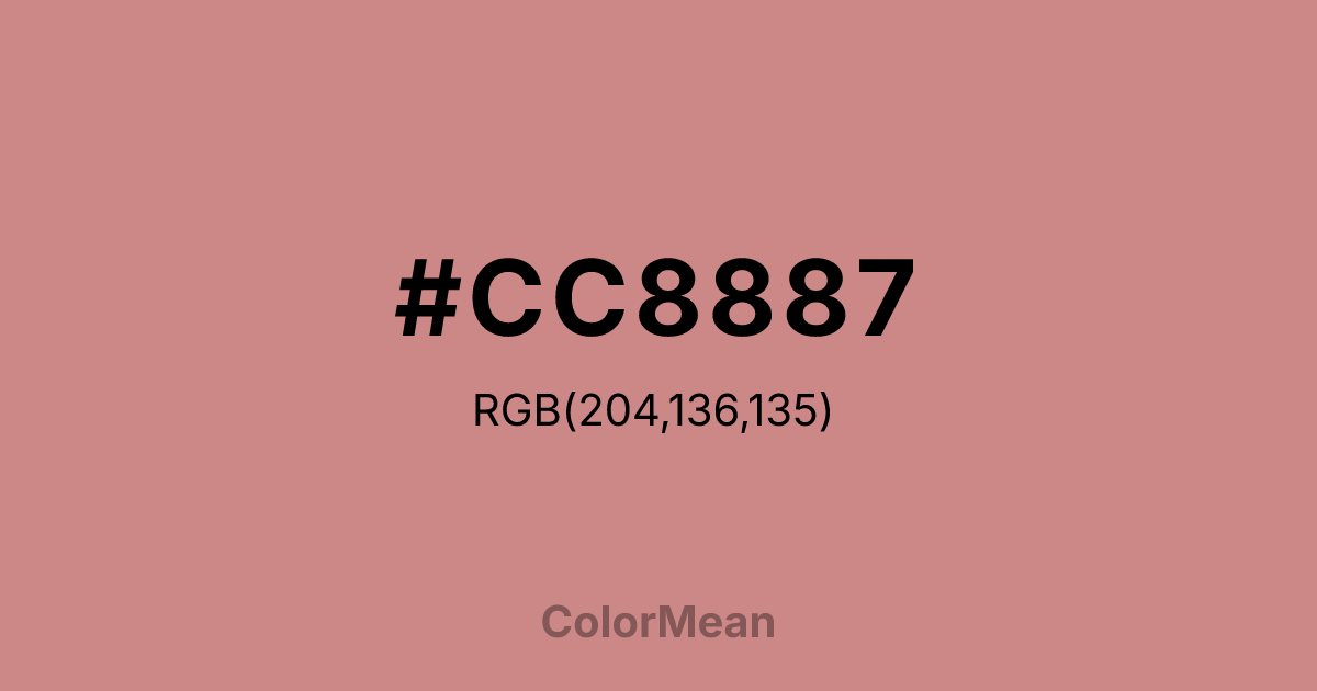
#CC8887 Color Information
#CC8887 RGB value is (204, 136, 135). The hex color red value is 204, green is 136, and blue is 135. Its HSL format shows a hue of 1°, saturation of 40 percent, and lightness of 66 percent. The CMYK process values are 0 percent, 33 percent, 34 percent, 20 percent.
#CC8887 Color Meaning
Color #CC8887 offers urban warmth, resilient softness, and architectural blush. Color #CC8887 is a dusty rose with strong gray undertones—less romantic, more pragmatic. #CC8887 mirrors the terra-cotta facades of Manhattan brownstones and the quiet endurance of city life: worn but dignified, soft but unbreakable. Psychologically, color #CC8887 balances emotional accessibility with urban realism. Unlike bright pinks that feel naive, #CC8887 tone acknowledges complexity while offering comfort. #CC8887’s used in metropolitan healthcare and community spaces to soften institutional rigidity without infantilizing users. #CC8887 says: I see your stress, and I’m still kind. Culturally, color #CC8887 aligns with East Coast design ethos—where warmth is earned, not given freely. #CC8887 appears in boutique hotels, literary journals, and local branding that values history over trend. #CC8887’s the pink of brownstone stoops at dusk, of subway ads that feel human amid chaos. #CC8887 resists both cold minimalism and decorative excess. Symbolically, color #CC8887 represents compassionate realism. #CC8887’s not optimism—#CC8887’s stubborn hope. In editorial or civic design, #CC8887 conveys empathy grounded in experience. #CC8887’s the color of a neighbor who checks in, not a slogan on a poster. Authentic, weathered, and quietly persistent.
Color Conversion
Convert #CC8887 across different color models and formats. These conversions help designers work seamlessly between digital and print media, ensuring this color maintains its intended appearance across RGB screens, CMYK printers, and HSL color manipulations.
RGB Values & CMYK Values
RGB Values
CMYK Values
Color Variations
#CC8887 harmonies come to life through carefully balanced shades, tints, and tones, giving this color depth and flexibility across light and dark variations. Shades add richness, tints bring an airy softness, and tones soften intensity, making it easy to pair in clean, modern palettes.
Color Harmonies
#CC8887 harmonies create beautiful relationships with other colors based on their position on the color wheel. Each harmony type offers unique design possibilities, enabling cohesive and visually appealing color schemes.
Analogous
Colors adjacent on the color wheel (30° apart)
Complementary
Colors opposite on the color wheel (180° apart)
Split Complementary
Three colors using one base hue and the two hues beside its opposite
Triadic
Three colors evenly spaced (120° apart)
Tetradic
Four colors forming a rectangle on the wheel
Square
Four colors evenly spaced (90° apart)
Double Split
Four colors formed from two base hues and the colors next to their opposites
Monochromatic
Variations of a single hue
Contrast Checker
(WCAG 2.1) Test #CC8887 for accessibility compliance against white and black backgrounds. Proper contrast ensures this color remains readable and usable for all audiences, meeting WCAG 2.1 standards for both normal and large text applications.
Sample Text
This is how your text will look with these colors.
Large Text (18pt+)
Normal Text
UI Components
Color Blindness Simulator
See how #CC8887 appears to people with different types of color vision deficiencies. These simulations help create more inclusive designs that consider how this color is perceived across various visual abilities.
Normal Vision
protanopia
Note: These simulations are approximations. Actual color vision deficiency varies by individual.
CSS Examples
Background Color
Text Color
Sample Text
Border Color
Box Shadow
Text Shadow
Sample Text
Gradient
#CC8887 Color FAQs
Frequently asked questions about #CC8887 color meaning, symbolism, and applications. Click on any question to expand detailed answers.
