#C4AE9B Color Information
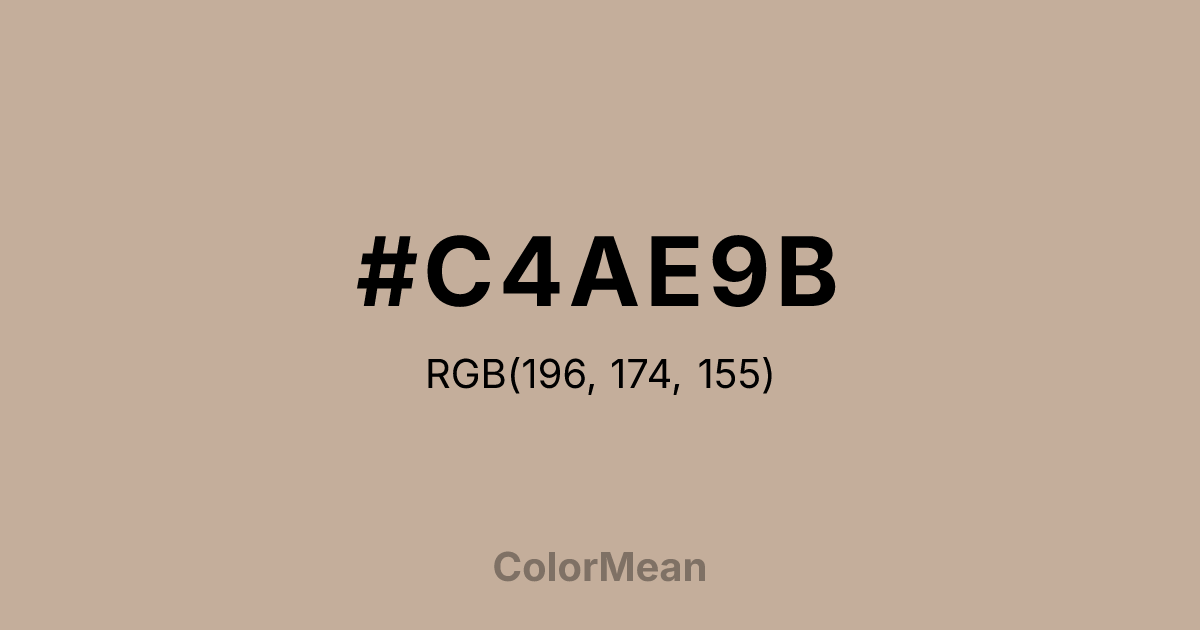
#C4AE9B RGB value is (196, 174, 155). The hex color red value is 196, green is 174, and blue is 155. Its HSL format shows a hue of 28°, saturation of 26 percent, and lightness of 69 percent. The CMYK process values are 0 percent, 11 percent, 21 percent, 23 percent.
#C4AE9B Color Meaning
Color #C4AE9B projects understated practicality, adaptive neutrality, and weathered composure. Originating from Urdu for “dust” or “soil,” #C4AE9B warm, desaturated tan (RGB 195, 176, 145) emerged in 19th-century British military uniforms to blend with arid landscapes. Khaki (#C4AE9B) avoids the sterility of grays and the warmth of beiges, occupying a middle ground that feels both utilitarian and subtly human. Its low chroma reduces visual competition, allowing other elements to lead—making #C4AE9B a backbone color in editorial layouts, corporate wear, and minimalist interiors. Historically, Khaki (#C4AE9B) symbolized colonial control but later evolved into a civilian emblem of modesty and functionality—think safari jackets, field notebooks, and artisanal paper. In urban contexts, #C4AE9B now reads as “quiet luxury,” favored by brands rejecting overt branding in favor of tactile authenticity. Psychologically, #C4AE9B tone supports sustained focus: unlike bright colors that spike attention, Khaki (#C4AE9B) maintains baseline alertness without strain, ideal for workwear or reading environments. From a symbolic perspective, Khaki (#C4AE9B) embodies preparedness without aggression. #C4AE9B is the color of someone who packs extra layers, checks the map twice, and listens more than they speak. In design systems, #C4AE9B functions as a bridge between warm and cool palettes—grounding electric accents or softening pastels. Spiritually, #C4AE9B reflects the virtue of unassuming readiness: not waiting for storms to pass, but learning to move steadily through them.
Color Conversion
Convert #C4AE9B across different color models and formats. These conversions help designers work seamlessly between digital and print media, ensuring this color maintains its intended appearance across RGB screens, CMYK printers, and HSL color manipulations.
RGB Values & CMYK Values
RGB Values
CMYK Values
Color Variations
#C4AE9B harmonies come to life through carefully balanced shades, tints, and tones, giving this color depth and flexibility across light and dark variations. Shades add richness, tints bring an airy softness, and tones soften intensity, making it easy to pair in clean, modern palettes.
Color Harmonies
#C4AE9B harmonies create beautiful relationships with other colors based on their position on the color wheel. Each harmony type offers unique design possibilities, enabling cohesive and visually appealing color schemes.
Analogous
Colors adjacent on the color wheel (30° apart)
Complementary
Colors opposite on the color wheel (180° apart)
Split Complementary
Three colors using one base hue and the two hues beside its opposite
Triadic
Three colors evenly spaced (120° apart)
Tetradic
Four colors forming a rectangle on the wheel
Square
Four colors evenly spaced (90° apart)
Double Split
Four colors formed from two base hues and the colors next to their opposites
Monochromatic
Variations of a single hue
Contrast Checker
(WCAG 2.1) Test #C4AE9B for accessibility compliance against white and black backgrounds. Proper contrast ensures this color remains readable and usable for all audiences, meeting WCAG 2.1 standards for both normal and large text applications.
Sample Text
This is how your text will look with these colors.
Large Text (18pt+)
Normal Text
UI Components
Color Blindness Simulator
See how #C4AE9B appears to people with different types of color vision deficiencies. These simulations help create more inclusive designs that consider how this color is perceived across various visual abilities.
Normal Vision
protanopia
Note: These simulations are approximations. Actual color vision deficiency varies by individual.
CSS Examples
Background Color
Text Color
Sample Text
Border Color
Box Shadow
Text Shadow
Sample Text
Gradient
#C4AE9B Color FAQs
Frequently asked questions about #C4AE9B color meaning, symbolism, and applications. Click on any question to expand detailed answers.
