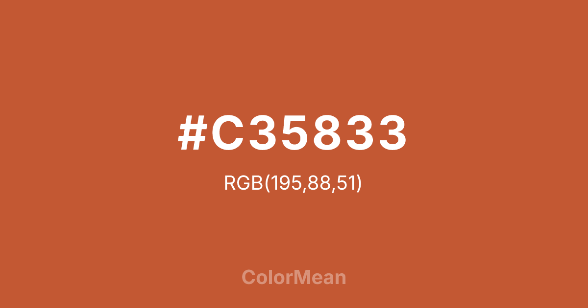
#C35833 Color Information
#C35833 RGB value is (195, 88, 51). The hex color red value is 195, green is 88, and blue is 51. Its HSL format shows a hue of 15°, saturation of 59 percent, and lightness of 48 percent. The CMYK process values are 0 percent, 55 percent, 74 percent, 24 percent.
#C35833 Color Meaning
Color #C35833 conveys vibrant earthiness, energetic warmth, and approachable intensity. #C35833 rich, reddish-orange evokes terracotta, autumn persimmons, and fired clay, suggesting a vitality that is organic, handmade, and warmly inviting. Psychologically, color #C35833 is stimulating and confidence-building, promoting sociability, creative energy, and a sense of hearty, robust well-being. #C35833 combines the excitement of orange with a grounding, earthy red undertone, making #C35833 feel both energetic and trustworthy. #C35833 color is friendly yet substantial. Symbolically, color #C35833 represents the fire of creativity rooted in the earth, passion made practical, and communal warmth. #C35833 is the color of the artisan's kiln or a shared harvest feast. Culturally, #C35833 appears in folk art, Southwestern design, and branding for artisanal food or craft products, signaling authenticity, handcrafted quality, and spirited tradition. Color #C35833 embodies a warmth that is not merely decorative but functional and nourishing.
Color Conversion
Convert #C35833 across different color models and formats. These conversions help designers work seamlessly between digital and print media, ensuring this color maintains its intended appearance across RGB screens, CMYK printers, and HSL color manipulations.
RGB Values & CMYK Values
RGB Values
CMYK Values
Color Variations
#C35833 harmonies come to life through carefully balanced shades, tints, and tones, giving this color depth and flexibility across light and dark variations. Shades add richness, tints bring an airy softness, and tones soften intensity, making it easy to pair in clean, modern palettes.
Color Harmonies
#C35833 harmonies create beautiful relationships with other colors based on their position on the color wheel. Each harmony type offers unique design possibilities, enabling cohesive and visually appealing color schemes.
Analogous
Colors adjacent on the color wheel (30° apart)
Complementary
Colors opposite on the color wheel (180° apart)
Split Complementary
Three colors using one base hue and the two hues beside its opposite
Triadic
Three colors evenly spaced (120° apart)
Tetradic
Four colors forming a rectangle on the wheel
Square
Four colors evenly spaced (90° apart)
Double Split
Four colors formed from two base hues and the colors next to their opposites
Monochromatic
Variations of a single hue
Contrast Checker
(WCAG 2.1) Test #C35833 for accessibility compliance against white and black backgrounds. Proper contrast ensures this color remains readable and usable for all audiences, meeting WCAG 2.1 standards for both normal and large text applications.
Sample Text
This is how your text will look with these colors.
Large Text (18pt+)
Normal Text
UI Components
Color Blindness Simulator
See how #C35833 appears to people with different types of color vision deficiencies. These simulations help create more inclusive designs that consider how this color is perceived across various visual abilities.
Normal Vision
protanopia
Note: These simulations are approximations. Actual color vision deficiency varies by individual.
CSS Examples
Background Color
Text Color
Sample Text
Border Color
Box Shadow
Text Shadow
Sample Text
Gradient
#C35833 Color FAQs
Frequently asked questions about #C35833 color meaning, symbolism, and applications. Click on any question to expand detailed answers.

