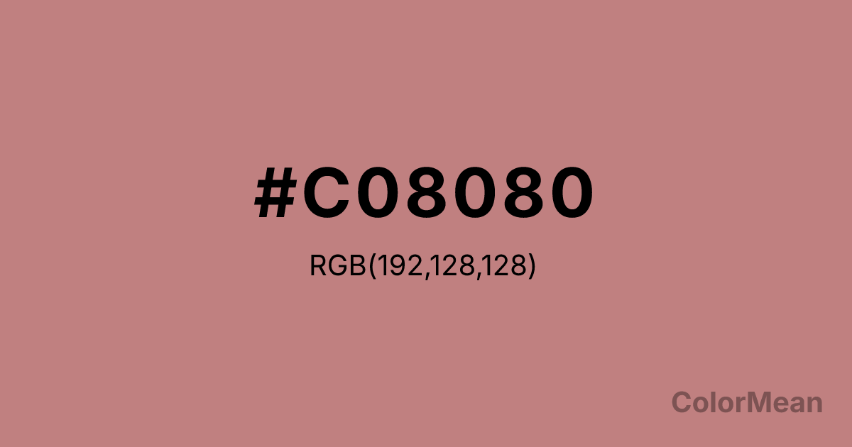
#C08080 Color Information
#C08080 RGB value is (192, 128, 128). The hex color red value is 192, green is 128, and blue is 128. Its HSL format shows a hue of 0°, saturation of 34 percent, and lightness of 63 percent. The CMYK process values are 0 percent, 33 percent, 33 percent, 25 percent.
#C08080 Color Meaning
Color #C08080 softens passion into memory. #C08080 dusty pink-brown strips romance of its gloss, leaving warmth tempered by time. Color #C08080 evokes faded love letters, well-worn quilts, and gentle remembrance—ideal for heritage storytelling, senior wellness, and inclusive femininity. Perceptual studies show that desaturated reds like color #C08080 activate emotional recall without triggering urgency—making them effective in memorial design and therapeutic contexts. Its gray undertone adds neutrality, allowing #C08080 to cross gender and age boundaries more easily than bright pinks. Historically used in Victorian interiors and early 20th-century photography, color #C08080 bridges nostalgia and modernity. Today, #C08080 appears in editorial layouts and ceramic glazes where subtlety signals sophistication. #C08080 never shouts; #C08080 resonates—like a voice remembered, not recorded.
Color Conversion
Convert #C08080 across different color models and formats. These conversions help designers work seamlessly between digital and print media, ensuring this color maintains its intended appearance across RGB screens, CMYK printers, and HSL color manipulations.
RGB Values & CMYK Values
RGB Values
CMYK Values
Color Variations
#C08080 harmonies come to life through carefully balanced shades, tints, and tones, giving this color depth and flexibility across light and dark variations. Shades add richness, tints bring an airy softness, and tones soften intensity, making it easy to pair in clean, modern palettes.
Color Harmonies
#C08080 harmonies create beautiful relationships with other colors based on their position on the color wheel. Each harmony type offers unique design possibilities, enabling cohesive and visually appealing color schemes.
Analogous
Colors adjacent on the color wheel (30° apart)
Complementary
Colors opposite on the color wheel (180° apart)
Split Complementary
Three colors using one base hue and the two hues beside its opposite
Triadic
Three colors evenly spaced (120° apart)
Tetradic
Four colors forming a rectangle on the wheel
Square
Four colors evenly spaced (90° apart)
Double Split
Four colors formed from two base hues and the colors next to their opposites
Monochromatic
Variations of a single hue
Contrast Checker
(WCAG 2.1) Test #C08080 for accessibility compliance against white and black backgrounds. Proper contrast ensures this color remains readable and usable for all audiences, meeting WCAG 2.1 standards for both normal and large text applications.
Sample Text
This is how your text will look with these colors.
Large Text (18pt+)
Normal Text
UI Components
Color Blindness Simulator
See how #C08080 appears to people with different types of color vision deficiencies. These simulations help create more inclusive designs that consider how this color is perceived across various visual abilities.
Normal Vision
protanopia
Note: These simulations are approximations. Actual color vision deficiency varies by individual.
CSS Examples
Background Color
Text Color
Sample Text
Border Color
Box Shadow
Text Shadow
Sample Text
Gradient
#C08080 Color FAQs
Frequently asked questions about #C08080 color meaning, symbolism, and applications. Click on any question to expand detailed answers.
