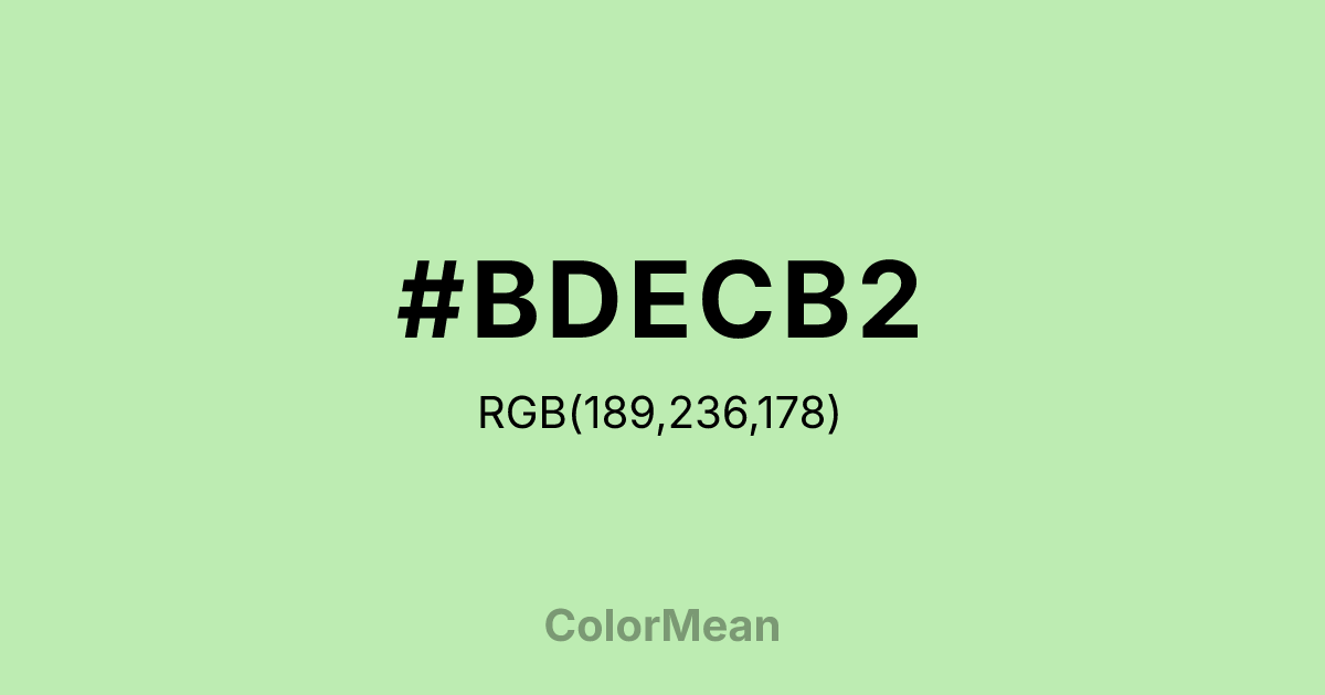
#BDECB2 Color Information
#BDECB2 RGB value is (189, 236, 178). The hex color red value is 189, green is 236, and blue is 178. Its HSL format shows a hue of 109°, saturation of 60 percent, and lightness of 81 percent. The CMYK process values are 20 percent, 0 percent, 25 percent, 7 percent.
#BDECB2 Color Meaning
Color #BDECB2 denotes nurtured growth, gentle success, and eco-friendly assurance. #BDECB2 soft, yellowish-green is reminiscent of healthy new leaves, succulent plants, and organic cotton, suggesting vitality that is cultivated, safe, and sustainable. Psychologically, color #BDECB2 is reassuring and restorative, promoting feelings of well-being, harmony, and gentle progress. #BDECB2 signifies "healthy" and "natural" in a calm, trustworthy manner, often used to signal ethical choices, wellness, and balanced living. #BDECB2 color feels both fresh and reliable. Culturally, color #BDECB2 is dominant in the wellness industry, eco-product packaging, and modern healthcare design, symbolizing clean living, mindful consumption, and holistic health. Symbolically, #BDECB2 represents growth that is cared for, nature as a managed sanctuary, and success that is measured in balance and sustainability. Spiritually, color #BDECB2 aligns with the heart chakra's connection to nurturing and growth, encouraging a compassionate stewardship of both self and environment.
Color Conversion
Convert #BDECB2 across different color models and formats. These conversions help designers work seamlessly between digital and print media, ensuring this color maintains its intended appearance across RGB screens, CMYK printers, and HSL color manipulations.
RGB Values & CMYK Values
RGB Values
CMYK Values
Color Variations
#BDECB2 harmonies come to life through carefully balanced shades, tints, and tones, giving this color depth and flexibility across light and dark variations. Shades add richness, tints bring an airy softness, and tones soften intensity, making it easy to pair in clean, modern palettes.
Color Harmonies
#BDECB2 harmonies create beautiful relationships with other colors based on their position on the color wheel. Each harmony type offers unique design possibilities, enabling cohesive and visually appealing color schemes.
Analogous
Colors adjacent on the color wheel (30° apart)
Complementary
Colors opposite on the color wheel (180° apart)
Split Complementary
Three colors using one base hue and the two hues beside its opposite
Triadic
Three colors evenly spaced (120° apart)
Tetradic
Four colors forming a rectangle on the wheel
Square
Four colors evenly spaced (90° apart)
Double Split
Four colors formed from two base hues and the colors next to their opposites
Monochromatic
Variations of a single hue
Contrast Checker
(WCAG 2.1) Test #BDECB2 for accessibility compliance against white and black backgrounds. Proper contrast ensures this color remains readable and usable for all audiences, meeting WCAG 2.1 standards for both normal and large text applications.
Sample Text
This is how your text will look with these colors.
Large Text (18pt+)
Normal Text
UI Components
Color Blindness Simulator
See how #BDECB2 appears to people with different types of color vision deficiencies. These simulations help create more inclusive designs that consider how this color is perceived across various visual abilities.
Normal Vision
protanopia
Note: These simulations are approximations. Actual color vision deficiency varies by individual.
CSS Examples
Background Color
Text Color
Sample Text
Border Color
Box Shadow
Text Shadow
Sample Text
Gradient
#BDECB2 Color FAQs
Frequently asked questions about #BDECB2 color meaning, symbolism, and applications. Click on any question to expand detailed answers.

