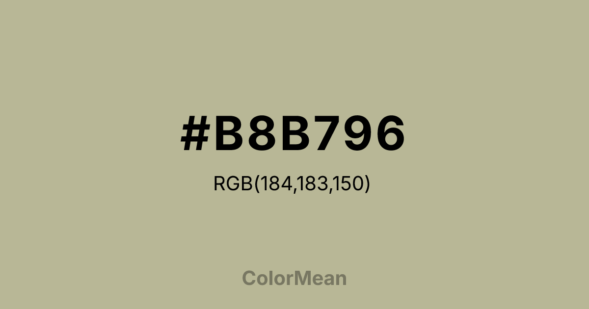
#B8B796 Color Information
#B8B796 RGB value is (184, 183, 150). The hex color red value is 184, green is 183, and blue is 150. Its HSL format shows a hue of 58°, saturation of 19 percent, and lightness of 65 percent. The CMYK process values are 0 percent, 1 percent, 18 percent, 28 percent.
#B8B796 Color Meaning
Color #B8B796 signifies organic neutrality, textured calm, and coastal stillness. #B8B796 warm, greenish-grey resembles sun-bleached stones, driftwood, and dried sage, suggesting elements smoothed and harmonized by natural forces. Psychologically, color #B8B796 is deeply calming and centering, promoting feelings of balance, natural order, and resilient tranquility. #B8B796 provides a neutral backdrop that feels alive with subtle texture and organic warmth, reducing visual noise while maintaining a connection to the natural world. #B8B796 color is a restful, grounded neutral. Symbolically, color #B8B796 represents the wisdom of erosion, harmony achieved through time, and the beauty of the blended and worn. #B8B796 is the color of a landscape in repose. Culturally, #B8B796 is a staple in coastal, rustic, and minimalist design where a sense of serene, textural authenticity is desired. Color #B8B796 embodies an aesthetic of peaceful accumulation and natural selection, offering a visual tone that feels both curated and effortlessly evolved.
Color Conversion
Convert #B8B796 across different color models and formats. These conversions help designers work seamlessly between digital and print media, ensuring this color maintains its intended appearance across RGB screens, CMYK printers, and HSL color manipulations.
RGB Values & CMYK Values
RGB Values
CMYK Values
Color Variations
#B8B796 harmonies come to life through carefully balanced shades, tints, and tones, giving this color depth and flexibility across light and dark variations. Shades add richness, tints bring an airy softness, and tones soften intensity, making it easy to pair in clean, modern palettes.
Color Harmonies
#B8B796 harmonies create beautiful relationships with other colors based on their position on the color wheel. Each harmony type offers unique design possibilities, enabling cohesive and visually appealing color schemes.
Analogous
Colors adjacent on the color wheel (30° apart)
Complementary
Colors opposite on the color wheel (180° apart)
Split Complementary
Three colors using one base hue and the two hues beside its opposite
Triadic
Three colors evenly spaced (120° apart)
Tetradic
Four colors forming a rectangle on the wheel
Square
Four colors evenly spaced (90° apart)
Double Split
Four colors formed from two base hues and the colors next to their opposites
Monochromatic
Variations of a single hue
Contrast Checker
(WCAG 2.1) Test #B8B796 for accessibility compliance against white and black backgrounds. Proper contrast ensures this color remains readable and usable for all audiences, meeting WCAG 2.1 standards for both normal and large text applications.
Sample Text
This is how your text will look with these colors.
Large Text (18pt+)
Normal Text
UI Components
Color Blindness Simulator
See how #B8B796 appears to people with different types of color vision deficiencies. These simulations help create more inclusive designs that consider how this color is perceived across various visual abilities.
Normal Vision
protanopia
Note: These simulations are approximations. Actual color vision deficiency varies by individual.
CSS Examples
Background Color
Text Color
Sample Text
Border Color
Box Shadow
Text Shadow
Sample Text
Gradient
#B8B796 Color FAQs
Frequently asked questions about #B8B796 color meaning, symbolism, and applications. Click on any question to expand detailed answers.
