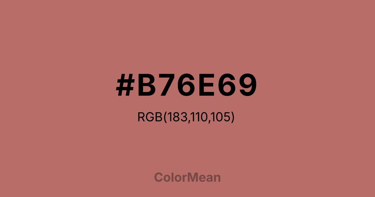
#B76E69 Color Information
#B76E69 RGB value is (183, 110, 105). The hex color red value is 183, green is 110, and blue is 105. Its HSL format shows a hue of 4°, saturation of 35 percent, and lightness of 56 percent. The CMYK process values are 0 percent, 40 percent, 43 percent, 28 percent.
#B76E69 Color Meaning
Color #B76E69 suggests nostalgic warmth, softened value, and humanized neutrality. Color #B76E69 is a muted rose-brown that evokes aged coins, sun-bleached brick, and weathered leather. #B76E69 blends the warmth of copper with the subtlety of rose, creating a tone that feels both valuable and approachable. In editorial and lifestyle branding, #B76E69 hue signals heritage without pretense—common in literary journals, boutique hospitality, and slow fashion. Psychological studies link such desaturated warm neutrals to increased perceived thoughtfulness and emotional safety. In UI/UX design, color #B76E69 functions as a calming accent or background, especially in wellness and finance platforms where trust must feel human. #B76E69 meets contrast standards against off-whites and deep charcoals, making #B76E69 viable for body text in long-form content. Print reproduction is excellent on matte finishes, enhancing its archival quality. Consumer testing reveals higher comfort ratings for interfaces using color #B76E69 versus cooler taupes. Symbolically, color #B76E69 represents worth that endures through use. #B76E69 is not the gleam of new money but the patina of daily handling. In spiritual practice, #B76E69 aligns with the heart chakra’s steady mode: love that shows up consistently. Designers choose color #B76E69 when they want to signal value with humility. Its warmth is lived-in, not displayed.
Color Conversion
Convert #B76E69 across different color models and formats. These conversions help designers work seamlessly between digital and print media, ensuring this color maintains its intended appearance across RGB screens, CMYK printers, and HSL color manipulations.
RGB Values & CMYK Values
RGB Values
CMYK Values
Color Variations
#B76E69 harmonies come to life through carefully balanced shades, tints, and tones, giving this color depth and flexibility across light and dark variations. Shades add richness, tints bring an airy softness, and tones soften intensity, making it easy to pair in clean, modern palettes.
Color Harmonies
#B76E69 harmonies create beautiful relationships with other colors based on their position on the color wheel. Each harmony type offers unique design possibilities, enabling cohesive and visually appealing color schemes.
Analogous
Colors adjacent on the color wheel (30° apart)
Complementary
Colors opposite on the color wheel (180° apart)
Split Complementary
Three colors using one base hue and the two hues beside its opposite
Triadic
Three colors evenly spaced (120° apart)
Tetradic
Four colors forming a rectangle on the wheel
Square
Four colors evenly spaced (90° apart)
Double Split
Four colors formed from two base hues and the colors next to their opposites
Monochromatic
Variations of a single hue
Contrast Checker
(WCAG 2.1) Test #B76E69 for accessibility compliance against white and black backgrounds. Proper contrast ensures this color remains readable and usable for all audiences, meeting WCAG 2.1 standards for both normal and large text applications.
Sample Text
This is how your text will look with these colors.
Large Text (18pt+)
Normal Text
UI Components
Color Blindness Simulator
See how #B76E69 appears to people with different types of color vision deficiencies. These simulations help create more inclusive designs that consider how this color is perceived across various visual abilities.
Normal Vision
protanopia
Note: These simulations are approximations. Actual color vision deficiency varies by individual.
CSS Examples
Background Color
Text Color
Sample Text
Border Color
Box Shadow
Text Shadow
Sample Text
Gradient
#B76E69 Color FAQs
Frequently asked questions about #B76E69 color meaning, symbolism, and applications. Click on any question to expand detailed answers.
