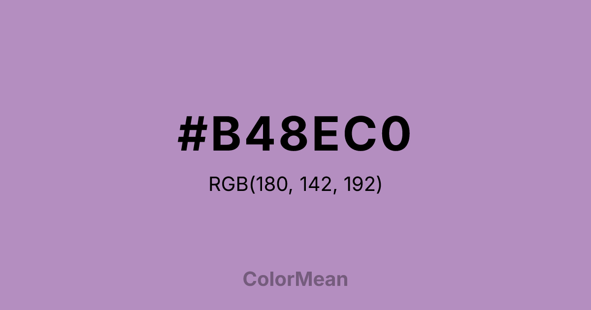
#B48EC0 Color Information
#B48EC0 RGB value is (180, 142, 192). The hex color red value is 180, green is 142, and blue is 192. Its HSL format shows a hue of 286°, saturation of 28 percent, and lightness of 65 percent. The CMYK process values are 6 percent, 26 percent, 0 percent, 25 percent.
#B48EC0 Color Meaning
Color #B48EC0 expresses quiet dignity, introspective warmth, and understated creativity. Unlike bold purples that command attention, #B48EC0 muted reddish-purple draws viewers inward. Psychologically, color #B48EC0 balances the spiritual depth of violet with the grounded tenderness of rose, fostering contemplation without isolation. #B48EC0 works well in spaces meant for reflection—such as reading nooks, therapy rooms, or journaling apps—because #B48EC0 feels personal but not overwhelming. Historically, the #B48EC0 plant symbolizes faithfulness and modesty, and the color inherits those traits. In branding, color #B48EC0 appeals to niche markets: artisanal goods, indie literature, or wellness brands that prioritize authenticity over spectacle. Spiritually, #B48EC0 represents inner listening and compassionate boundaries. Unlike royal purples tied to power, #B48EC0 suggests wisdom earned through patience. Use color #B48EC0 when you want emotional resonance without drama or dominance.
Color Conversion
Convert #B48EC0 across different color models and formats. These conversions help designers work seamlessly between digital and print media, ensuring this color maintains its intended appearance across RGB screens, CMYK printers, and HSL color manipulations.
RGB Values & CMYK Values
RGB Values
CMYK Values
Color Variations
#B48EC0 harmonies come to life through carefully balanced shades, tints, and tones, giving this color depth and flexibility across light and dark variations. Shades add richness, tints bring an airy softness, and tones soften intensity, making it easy to pair in clean, modern palettes.
Color Harmonies
#B48EC0 harmonies create beautiful relationships with other colors based on their position on the color wheel. Each harmony type offers unique design possibilities, enabling cohesive and visually appealing color schemes.
Analogous
Colors adjacent on the color wheel (30° apart)
Complementary
Colors opposite on the color wheel (180° apart)
Split Complementary
Three colors using one base hue and the two hues beside its opposite
Triadic
Three colors evenly spaced (120° apart)
Tetradic
Four colors forming a rectangle on the wheel
Square
Four colors evenly spaced (90° apart)
Double Split
Four colors formed from two base hues and the colors next to their opposites
Monochromatic
Variations of a single hue
Contrast Checker
(WCAG 2.1) Test #B48EC0 for accessibility compliance against white and black backgrounds. Proper contrast ensures this color remains readable and usable for all audiences, meeting WCAG 2.1 standards for both normal and large text applications.
Sample Text
This is how your text will look with these colors.
Large Text (18pt+)
Normal Text
UI Components
Color Blindness Simulator
See how #B48EC0 appears to people with different types of color vision deficiencies. These simulations help create more inclusive designs that consider how this color is perceived across various visual abilities.
Normal Vision
protanopia
Note: These simulations are approximations. Actual color vision deficiency varies by individual.
CSS Examples
Background Color
Text Color
Sample Text
Border Color
Box Shadow
Text Shadow
Sample Text
Gradient
#B48EC0 Color FAQs
Frequently asked questions about #B48EC0 color meaning, symbolism, and applications. Click on any question to expand detailed answers.
