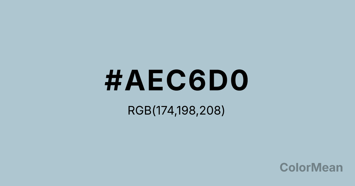
#AEC6D0 Color Information
#AEC6D0 RGB value is (174, 198, 208). The hex color red value is 174, green is 198, and blue is 208. Its HSL format shows a hue of 198°, saturation of 27 percent, and lightness of 75 percent. The CMYK process values are 16 percent, 5 percent, 0 percent, 18 percent.
#AEC6D0 Color Meaning
Color #AEC6D0 projects serene detachment, soft professionalism, and collective calm. #AEC6D0 light, grayish blue resembles weathered denim or dove feathers, suggesting a dependable, unassuming tranquility. Psychologically, color #AEC6D0 is calming and focusing, reducing mental noise and promoting a sense of orderly, cooperative composure. #AEC6D0 is a color of quiet intelligence and gentle authority, often used in environments that require collaborative thought and stress-free interaction. #AEC6D0 shade feels both cool and subtly friendly. Culturally, color #AEC6D0 is common in corporate interiors, healthcare waiting areas, and academic settings where a universally soothing, non-distracting atmosphere is desired. Symbolically, #AEC6D0 represents harmonious groups, clear communication without aggression, and ideas that are calmly shared. Color #AEC6D0 embodies the visual concept of a "level playing field," providing a neutral-yet-engaging backdrop that facilitates shared focus and mutual understanding without emotional intensity.
Color Conversion
Convert #AEC6D0 across different color models and formats. These conversions help designers work seamlessly between digital and print media, ensuring this color maintains its intended appearance across RGB screens, CMYK printers, and HSL color manipulations.
RGB Values & CMYK Values
RGB Values
CMYK Values
Color Variations
#AEC6D0 harmonies come to life through carefully balanced shades, tints, and tones, giving this color depth and flexibility across light and dark variations. Shades add richness, tints bring an airy softness, and tones soften intensity, making it easy to pair in clean, modern palettes.
Color Harmonies
#AEC6D0 harmonies create beautiful relationships with other colors based on their position on the color wheel. Each harmony type offers unique design possibilities, enabling cohesive and visually appealing color schemes.
Analogous
Colors adjacent on the color wheel (30° apart)
Complementary
Colors opposite on the color wheel (180° apart)
Split Complementary
Three colors using one base hue and the two hues beside its opposite
Triadic
Three colors evenly spaced (120° apart)
Tetradic
Four colors forming a rectangle on the wheel
Square
Four colors evenly spaced (90° apart)
Double Split
Four colors formed from two base hues and the colors next to their opposites
Monochromatic
Variations of a single hue
Contrast Checker
(WCAG 2.1) Test #AEC6D0 for accessibility compliance against white and black backgrounds. Proper contrast ensures this color remains readable and usable for all audiences, meeting WCAG 2.1 standards for both normal and large text applications.
Sample Text
This is how your text will look with these colors.
Large Text (18pt+)
Normal Text
UI Components
Color Blindness Simulator
See how #AEC6D0 appears to people with different types of color vision deficiencies. These simulations help create more inclusive designs that consider how this color is perceived across various visual abilities.
Normal Vision
protanopia
Note: These simulations are approximations. Actual color vision deficiency varies by individual.
CSS Examples
Background Color
Text Color
Sample Text
Border Color
Box Shadow
Text Shadow
Sample Text
Gradient
#AEC6D0 Color FAQs
Frequently asked questions about #AEC6D0 color meaning, symbolism, and applications. Click on any question to expand detailed answers.
