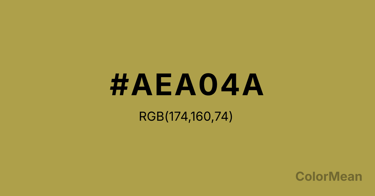
#AEA04A Color Information
#AEA04A RGB value is (174, 160, 74). The hex color red value is 174, green is 160, and blue is 74. Its HSL format shows a hue of 52°, saturation of 40 percent, and lightness of 49 percent. The CMYK process values are 0 percent, 8 percent, 57 percent, 32 percent.
#AEA04A Color Meaning
Color #AEA04A softens the sun. #AEA04A dusty golden-yellow bridges ochre and mustard, carrying just enough saturation to feel luminous without glare. Color #AEA04A evokes sun-bleached stone, dried grasses, and aged parchment—light that has been filtered through time. Color #AEA04A radiates warmth without heat. In interior design, color #AEA04A enhances spatial perception in small rooms by reflecting warm light without overwhelming surfaces. Unlike bright yellows that can induce agitation, color #AEA04A promotes calm alertness—ideal for reading nooks or creative studios. Color #AEA04A feels inviting because #AEA04A’s already weathered. Culturally, #AEA04A ties to Mediterranean villages, monastic libraries, and natural dye traditions. In digital branding, color #AEA04A signals heritage innovation—think slow tech or regenerative agriculture. Paired with deep navy or charcoal, color #AEA04A creates contrast that feels historical, not harsh. Color #AEA04A is the color of knowledge preserved, not broadcast.
Color Conversion
Convert #AEA04A across different color models and formats. These conversions help designers work seamlessly between digital and print media, ensuring this color maintains its intended appearance across RGB screens, CMYK printers, and HSL color manipulations.
RGB Values & CMYK Values
RGB Values
CMYK Values
Color Variations
#AEA04A harmonies come to life through carefully balanced shades, tints, and tones, giving this color depth and flexibility across light and dark variations. Shades add richness, tints bring an airy softness, and tones soften intensity, making it easy to pair in clean, modern palettes.
Color Harmonies
#AEA04A harmonies create beautiful relationships with other colors based on their position on the color wheel. Each harmony type offers unique design possibilities, enabling cohesive and visually appealing color schemes.
Analogous
Colors adjacent on the color wheel (30° apart)
Complementary
Colors opposite on the color wheel (180° apart)
Split Complementary
Three colors using one base hue and the two hues beside its opposite
Triadic
Three colors evenly spaced (120° apart)
Tetradic
Four colors forming a rectangle on the wheel
Square
Four colors evenly spaced (90° apart)
Double Split
Four colors formed from two base hues and the colors next to their opposites
Monochromatic
Variations of a single hue
Contrast Checker
(WCAG 2.1) Test #AEA04A for accessibility compliance against white and black backgrounds. Proper contrast ensures this color remains readable and usable for all audiences, meeting WCAG 2.1 standards for both normal and large text applications.
Sample Text
This is how your text will look with these colors.
Large Text (18pt+)
Normal Text
UI Components
Color Blindness Simulator
See how #AEA04A appears to people with different types of color vision deficiencies. These simulations help create more inclusive designs that consider how this color is perceived across various visual abilities.
Normal Vision
protanopia
Note: These simulations are approximations. Actual color vision deficiency varies by individual.
CSS Examples
Background Color
Text Color
Sample Text
Border Color
Box Shadow
Text Shadow
Sample Text
Gradient
#AEA04A Color FAQs
Frequently asked questions about #AEA04A color meaning, symbolism, and applications. Click on any question to expand detailed answers.
