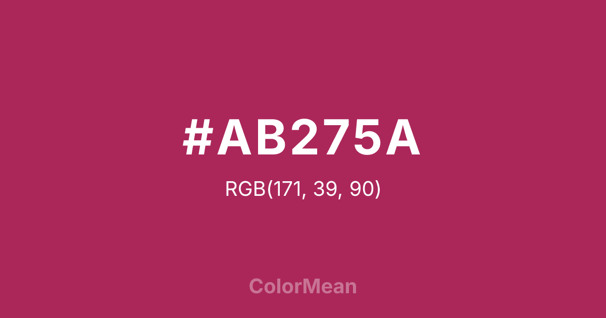
#AB275A Color Information
#AB275A RGB value is (171, 39, 90). The hex color red value is 171, green is 39, and blue is 90. Its HSL format shows a hue of 337°, saturation of 63 percent, and lightness of 41 percent. The CMYK process values are 0 percent, 77 percent, 47 percent, 33 percent.
#AB275A Color Meaning
Color #AB275A embodies solemn passion, artistic depth, and quiet rebellion. #AB275A near-burgundy shade straddles red and purple, merging the urgency of activism with the introspection of spirituality. Psychologically, color #AB275A evokes emotional complexity—#AB275A feels intimate but not fragile, intense but not volatile. Designers use #AB275A in literary journals, avant-garde fashion, and social justice movements that reject superficiality. Culturally, the amaranth plant symbolizes immortality across civilizations, and #AB275A hue channels that endurance through shadow rather than brightness. #AB275A lacks royal pretense; instead, #AB275A suggests wisdom forged in struggle. Spiritually, #AB275A reflects inner fire that refuses to be extinguished—ideal for memorials, poetry, or brands centered on legacy. Use color #AB275A when your audience values substance over spectacle and emotion over explanation.
Color Conversion
Convert #AB275A across different color models and formats. These conversions help designers work seamlessly between digital and print media, ensuring this color maintains its intended appearance across RGB screens, CMYK printers, and HSL color manipulations.
RGB Values & CMYK Values
RGB Values
CMYK Values
Color Variations
#AB275A harmonies come to life through carefully balanced shades, tints, and tones, giving this color depth and flexibility across light and dark variations. Shades add richness, tints bring an airy softness, and tones soften intensity, making it easy to pair in clean, modern palettes.
Color Harmonies
#AB275A harmonies create beautiful relationships with other colors based on their position on the color wheel. Each harmony type offers unique design possibilities, enabling cohesive and visually appealing color schemes.
Analogous
Colors adjacent on the color wheel (30° apart)
Complementary
Colors opposite on the color wheel (180° apart)
Split Complementary
Three colors using one base hue and the two hues beside its opposite
Triadic
Three colors evenly spaced (120° apart)
Tetradic
Four colors forming a rectangle on the wheel
Square
Four colors evenly spaced (90° apart)
Double Split
Four colors formed from two base hues and the colors next to their opposites
Monochromatic
Variations of a single hue
Contrast Checker
(WCAG 2.1) Test #AB275A for accessibility compliance against white and black backgrounds. Proper contrast ensures this color remains readable and usable for all audiences, meeting WCAG 2.1 standards for both normal and large text applications.
Sample Text
This is how your text will look with these colors.
Large Text (18pt+)
Normal Text
UI Components
Color Blindness Simulator
See how #AB275A appears to people with different types of color vision deficiencies. These simulations help create more inclusive designs that consider how this color is perceived across various visual abilities.
Normal Vision
protanopia
Note: These simulations are approximations. Actual color vision deficiency varies by individual.
CSS Examples
Background Color
Text Color
Sample Text
Border Color
Box Shadow
Text Shadow
Sample Text
Gradient
#AB275A Color FAQs
Frequently asked questions about #AB275A color meaning, symbolism, and applications. Click on any question to expand detailed answers.

