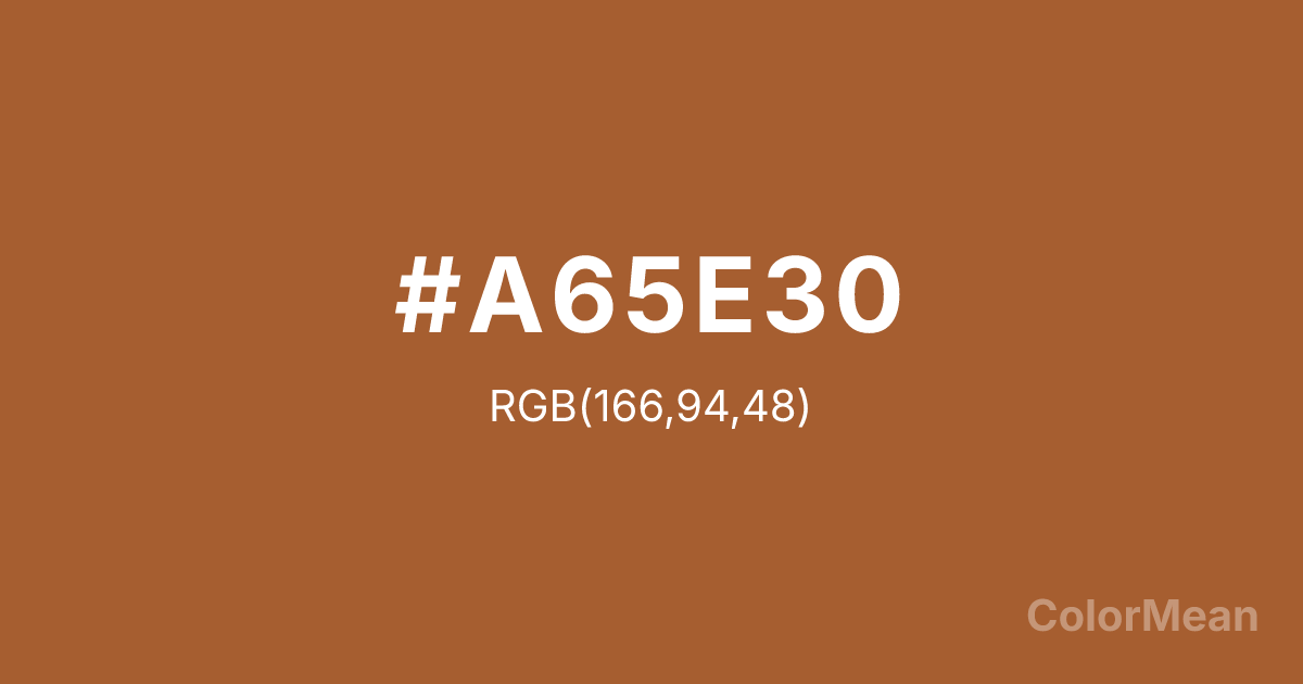
#A65E30 Color Information
#A65E30 RGB value is (166, 94, 48). The hex color red value is 166, green is 94, and blue is 48. Its HSL format shows a hue of 23°, saturation of 55 percent, and lightness of 42 percent. The CMYK process values are 0 percent, 43 percent, 71 percent, 35 percent.
#A65E30 Color Meaning
Color #A65E30 fuses fire with earth. #A65E30 rich, red-#A65E30 evokes roasted coffee, cinnamon bark, and desert canyons at dawn—warmth that has been tempered by exposure. Color #A65E30 suggests transformation through heat, not just color. Color #A65E30 feels alive because #A65E30’s been changed. Sensory marketing studies show that warm browns like color #A65E30 enhance flavor perception in food branding by 15–20% compared to neutral tones, as the brain links the hue to caramelization and roasting. Color #A65E30 works powerfully in coffee, spice, and craft beer labels where authenticity matters more than brightness. Culturally, #A65E30 bridges Middle Eastern spice markets, Southwestern architecture, and artisan baking. In digital design, color #A65E30 adds warmth to e-commerce product cards without visual fatigue. Paired with cream or deep teal, color #A65E30 creates palettes that feel both grounded and aromatic—like a kitchen that’s been used, not staged.
Color Conversion
Convert #A65E30 across different color models and formats. These conversions help designers work seamlessly between digital and print media, ensuring this color maintains its intended appearance across RGB screens, CMYK printers, and HSL color manipulations.
RGB Values & CMYK Values
RGB Values
CMYK Values
Color Variations
#A65E30 harmonies come to life through carefully balanced shades, tints, and tones, giving this color depth and flexibility across light and dark variations. Shades add richness, tints bring an airy softness, and tones soften intensity, making it easy to pair in clean, modern palettes.
Color Harmonies
#A65E30 harmonies create beautiful relationships with other colors based on their position on the color wheel. Each harmony type offers unique design possibilities, enabling cohesive and visually appealing color schemes.
Analogous
Colors adjacent on the color wheel (30° apart)
Complementary
Colors opposite on the color wheel (180° apart)
Split Complementary
Three colors using one base hue and the two hues beside its opposite
Triadic
Three colors evenly spaced (120° apart)
Tetradic
Four colors forming a rectangle on the wheel
Square
Four colors evenly spaced (90° apart)
Double Split
Four colors formed from two base hues and the colors next to their opposites
Monochromatic
Variations of a single hue
Contrast Checker
(WCAG 2.1) Test #A65E30 for accessibility compliance against white and black backgrounds. Proper contrast ensures this color remains readable and usable for all audiences, meeting WCAG 2.1 standards for both normal and large text applications.
Sample Text
This is how your text will look with these colors.
Large Text (18pt+)
Normal Text
UI Components
Color Blindness Simulator
See how #A65E30 appears to people with different types of color vision deficiencies. These simulations help create more inclusive designs that consider how this color is perceived across various visual abilities.
Normal Vision
protanopia
Note: These simulations are approximations. Actual color vision deficiency varies by individual.
CSS Examples
Background Color
Text Color
Sample Text
Border Color
Box Shadow
Text Shadow
Sample Text
Gradient
#A65E30 Color FAQs
Frequently asked questions about #A65E30 color meaning, symbolism, and applications. Click on any question to expand detailed answers.
