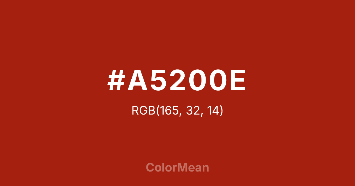
#A5200E Color Information
#A5200E RGB value is (165, 32, 14). The hex color red value is 165, green is 32, and blue is 14. Its HSL format shows a hue of 7°, saturation of 84 percent, and lightness of 35 percent. The CMYK process values are 0 percent, 81 percent, 92 percent, 35 percent.
#A5200E Color Meaning
Color #A5200E embodies bold vitality, passionate intensity, and grounded assertiveness. #A5200E deep red shade encourages decisiveness, strength, and focused energy. Color #A5200E psychologically supports courage, motivation, and emotional resilience. In Western culture, color #A5200E signifies power, love, and attention, often used in design and fashion to convey authority and warmth. Eastern traditions associate #A5200E with life-force energy, protection, and auspiciousness. Fengshui considers #A5200E energizing, suitable for focal points, entrances, or spaces that benefit from stimulating action. Spiritually, color #A5200E aligns with the Root and Sacral Chakras, promoting grounding, personal power, and passionate energy. Designers and artists use #A5200E deep tone for accents, luxury materials, and natural-themed compositions, balancing intensity with sophistication. Its dark, saturated red conveys both warmth and authority.
Color Conversion
Convert #A5200E across different color models and formats. These conversions help designers work seamlessly between digital and print media, ensuring this color maintains its intended appearance across RGB screens, CMYK printers, and HSL color manipulations.
RGB Values & CMYK Values
RGB Values
CMYK Values
Color Variations
#A5200E harmonies come to life through carefully balanced shades, tints, and tones, giving this color depth and flexibility across light and dark variations. Shades add richness, tints bring an airy softness, and tones soften intensity, making it easy to pair in clean, modern palettes.
Color Harmonies
#A5200E harmonies create beautiful relationships with other colors based on their position on the color wheel. Each harmony type offers unique design possibilities, enabling cohesive and visually appealing color schemes.
Analogous
Colors adjacent on the color wheel (30° apart)
Complementary
Colors opposite on the color wheel (180° apart)
Split Complementary
Three colors using one base hue and the two hues beside its opposite
Triadic
Three colors evenly spaced (120° apart)
Tetradic
Four colors forming a rectangle on the wheel
Square
Four colors evenly spaced (90° apart)
Double Split
Four colors formed from two base hues and the colors next to their opposites
Monochromatic
Variations of a single hue
Contrast Checker
(WCAG 2.1) Test #A5200E for accessibility compliance against white and black backgrounds. Proper contrast ensures this color remains readable and usable for all audiences, meeting WCAG 2.1 standards for both normal and large text applications.
Sample Text
This is how your text will look with these colors.
Large Text (18pt+)
Normal Text
UI Components
Color Blindness Simulator
See how #A5200E appears to people with different types of color vision deficiencies. These simulations help create more inclusive designs that consider how this color is perceived across various visual abilities.
Normal Vision
protanopia
Note: These simulations are approximations. Actual color vision deficiency varies by individual.
CSS Examples
Background Color
Text Color
Sample Text
Border Color
Box Shadow
Text Shadow
Sample Text
Gradient
#A5200E Color FAQs
Frequently asked questions about #A5200E color meaning, symbolism, and applications. Click on any question to expand detailed answers.

