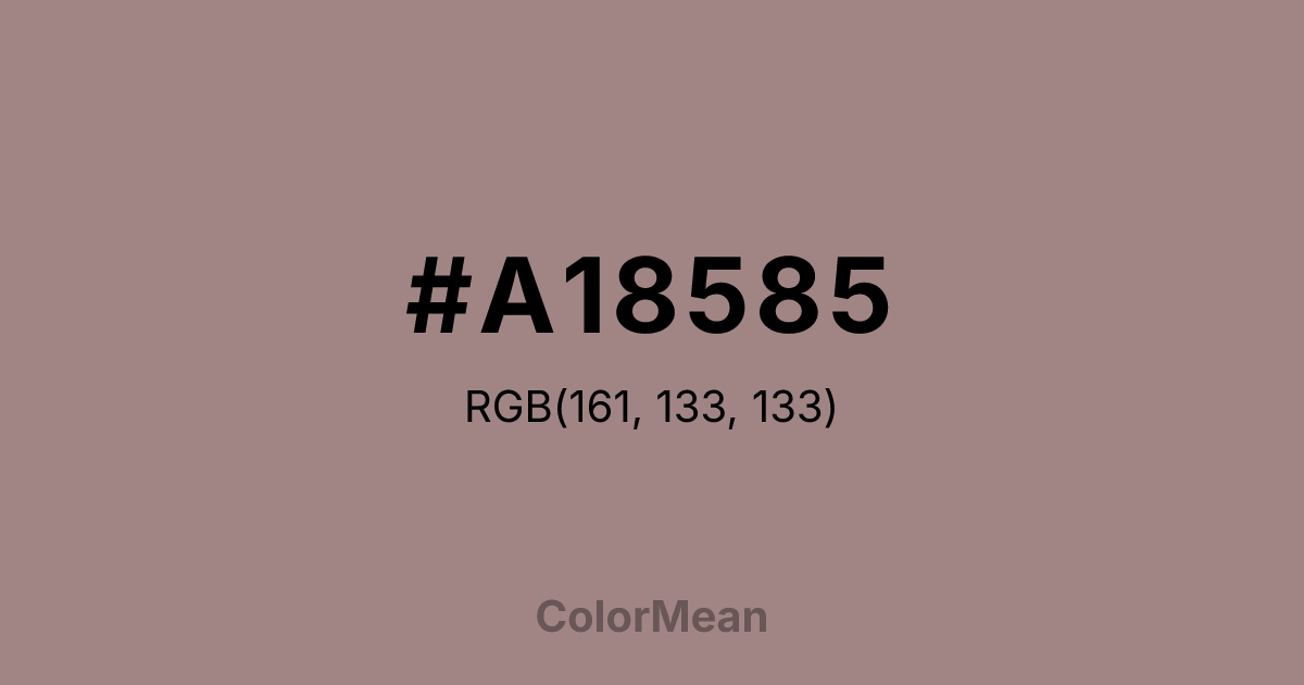
#A18585 Color Information
#A18585 RGB value is (161, 133, 133). The hex color red value is 161, green is 133, and blue is 133. Its HSL format shows a hue of 0°, saturation of 13 percent, and lightness of 58 percent. The CMYK process values are 0 percent, 17 percent, 17 percent, 37 percent.
#A18585 Color Meaning
Color #A18585 conveys ash-toned neutrality, softened maturity, and tactile ambiguity. Color #A18585—from the Latin *cinis*, meaning “ashes”—is a warm grey with subtle brown and pink undertones that blur the line between warm and cool. #A18585 evokes weathered stone, unbleached linen, and the soft patina of time. In interior design, #A18585 hue reduces sensory overload in shared living and workspaces by offering a chromatic “pause” that feels neither sterile nor sentimental. Psychological research links such nuanced neutrals to increased perceived thoughtfulness in branding and editorial contexts. In digital interfaces, color #A18585 functions as a sophisticated background or card color, especially in wellness, finance, and literary platforms where calm professionalism matters. #A18585 meets WCAG AA contrast standards when paired with deep charcoals or navy text, and its slight warmth prevents the “cold void” effect of pure greys. Print reproduction is excellent on matte and textured papers, enhancing its artisanal credibility. Consumer testing reveals higher trust in content framed in color #A18585 versus standard greige. Culturally, color #A18585 reflects the beauty of transition—ashes to soil, fabric to memory, noise to stillness. #A18585 appears in archival design, slow fashion, and memorial art as a symbol of quiet continuity. Spiritually, #A18585 aligns with the crown chakra’s receptive mode: wisdom that arrives through release. Designers use color #A18585 when they want to signal neutrality with depth. Its ambiguity is its strength.
Color Conversion
Convert #A18585 across different color models and formats. These conversions help designers work seamlessly between digital and print media, ensuring this color maintains its intended appearance across RGB screens, CMYK printers, and HSL color manipulations.
RGB Values & CMYK Values
RGB Values
CMYK Values
Color Variations
#A18585 harmonies come to life through carefully balanced shades, tints, and tones, giving this color depth and flexibility across light and dark variations. Shades add richness, tints bring an airy softness, and tones soften intensity, making it easy to pair in clean, modern palettes.
Color Harmonies
#A18585 harmonies create beautiful relationships with other colors based on their position on the color wheel. Each harmony type offers unique design possibilities, enabling cohesive and visually appealing color schemes.
Analogous
Colors adjacent on the color wheel (30° apart)
Complementary
Colors opposite on the color wheel (180° apart)
Split Complementary
Three colors using one base hue and the two hues beside its opposite
Triadic
Three colors evenly spaced (120° apart)
Tetradic
Four colors forming a rectangle on the wheel
Square
Four colors evenly spaced (90° apart)
Double Split
Four colors formed from two base hues and the colors next to their opposites
Monochromatic
Variations of a single hue
Contrast Checker
(WCAG 2.1) Test #A18585 for accessibility compliance against white and black backgrounds. Proper contrast ensures this color remains readable and usable for all audiences, meeting WCAG 2.1 standards for both normal and large text applications.
Sample Text
This is how your text will look with these colors.
Large Text (18pt+)
Normal Text
UI Components
Color Blindness Simulator
See how #A18585 appears to people with different types of color vision deficiencies. These simulations help create more inclusive designs that consider how this color is perceived across various visual abilities.
Normal Vision
protanopia
Note: These simulations are approximations. Actual color vision deficiency varies by individual.
CSS Examples
Background Color
Text Color
Sample Text
Border Color
Box Shadow
Text Shadow
Sample Text
Gradient
#A18585 Color FAQs
Frequently asked questions about #A18585 color meaning, symbolism, and applications. Click on any question to expand detailed answers.
