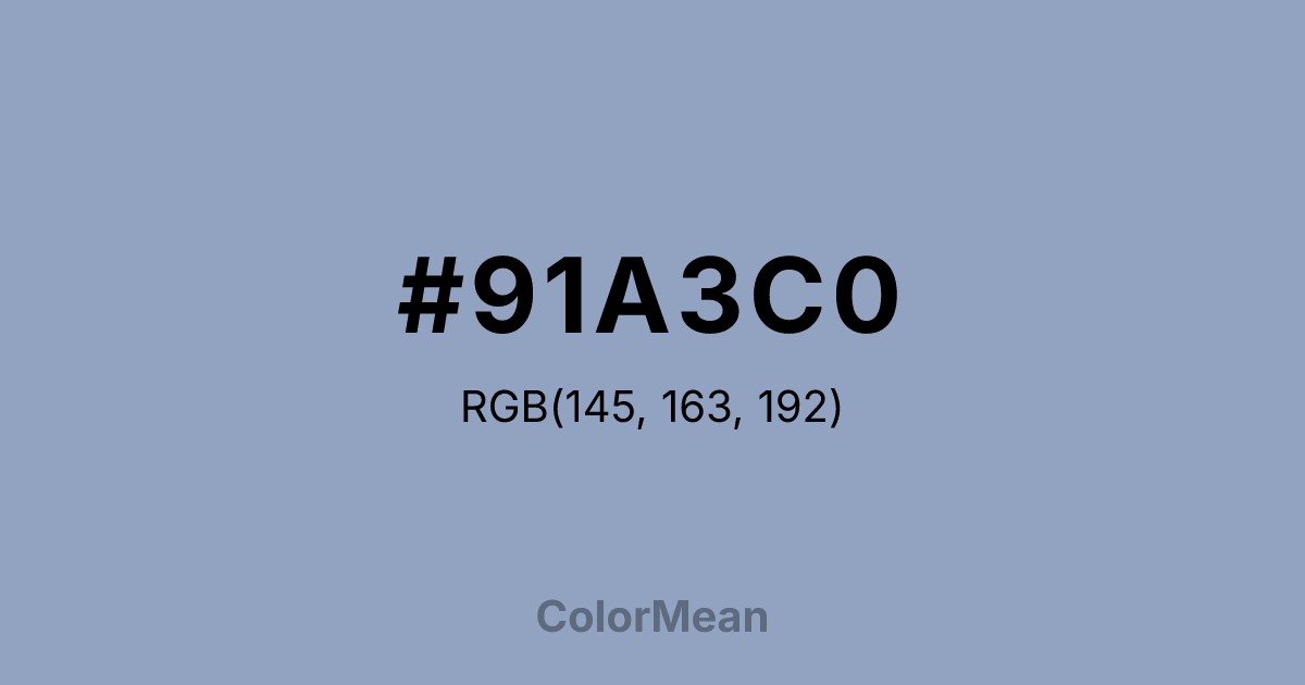
#91A3C0 Color Information
#91A3C0 RGB value is (145, 163, 192). The hex color red value is 145, green is 163, and blue is 192. Its HSL format shows a hue of 217°, saturation of 27 percent, and lightness of 66 percent. The CMYK process values are 24 percent, 15 percent, 0 percent, 25 percent.
#91A3C0 Color Meaning
Color #91A3C0 suggests dreamlike detachment, soft intellect, and gentle possibility. Color #91A3C0 is a muted periwinkle—greyed lavender-blue that hovers between thought and feeling. Named possibly from “ceiling” (as in sky-touching height), #91A3C0 evokes dawn light through high windows or the inside of a seashell. In therapeutic design, color #91A3C0 reduces cognitive overload by offering a chromatic “pause”—cool enough to calm, warm enough to connect. Unlike stark blues, #91A3C0 avoids clinical distance; unlike purples, #91A3C0 resists mysticism. In digital interfaces, color #91A3C0 functions as a calming background for creative or reflective apps—journaling, meditation, or ideation tools. #91A3C0 provides sufficient contrast against dark greys for readability while maintaining serenity. Print use is effective in editorial design, especially for lifestyle or literary publications seeking a contemplative tone. Consumer testing shows higher engagement with content framed in color #91A3C0 versus standard greys, likely due to its subtle emotional resonance. Culturally, color #91A3C0 reflects the space between decision and dream—potential not yet formed. #91A3C0 appears in mindfulness branding and educational platforms for neurodiverse learners as a symbol of open-ended thinking. Spiritually, #91A3C0 aligns with the crown chakra’s receptive mode: wisdom that arrives softly. Designers use color #91A3C0 when they want to invite without directing. Its strength is its gentleness—a color that holds space, not answers.
Color Conversion
Convert #91A3C0 across different color models and formats. These conversions help designers work seamlessly between digital and print media, ensuring this color maintains its intended appearance across RGB screens, CMYK printers, and HSL color manipulations.
RGB Values & CMYK Values
RGB Values
CMYK Values
Color Variations
#91A3C0 harmonies come to life through carefully balanced shades, tints, and tones, giving this color depth and flexibility across light and dark variations. Shades add richness, tints bring an airy softness, and tones soften intensity, making it easy to pair in clean, modern palettes.
Color Harmonies
#91A3C0 harmonies create beautiful relationships with other colors based on their position on the color wheel. Each harmony type offers unique design possibilities, enabling cohesive and visually appealing color schemes.
Analogous
Colors adjacent on the color wheel (30° apart)
Complementary
Colors opposite on the color wheel (180° apart)
Split Complementary
Three colors using one base hue and the two hues beside its opposite
Triadic
Three colors evenly spaced (120° apart)
Tetradic
Four colors forming a rectangle on the wheel
Square
Four colors evenly spaced (90° apart)
Double Split
Four colors formed from two base hues and the colors next to their opposites
Monochromatic
Variations of a single hue
Contrast Checker
(WCAG 2.1) Test #91A3C0 for accessibility compliance against white and black backgrounds. Proper contrast ensures this color remains readable and usable for all audiences, meeting WCAG 2.1 standards for both normal and large text applications.
Sample Text
This is how your text will look with these colors.
Large Text (18pt+)
Normal Text
UI Components
Color Blindness Simulator
See how #91A3C0 appears to people with different types of color vision deficiencies. These simulations help create more inclusive designs that consider how this color is perceived across various visual abilities.
Normal Vision
protanopia
Note: These simulations are approximations. Actual color vision deficiency varies by individual.
CSS Examples
Background Color
Text Color
Sample Text
Border Color
Box Shadow
Text Shadow
Sample Text
Gradient
#91A3C0 Color FAQs
Frequently asked questions about #91A3C0 color meaning, symbolism, and applications. Click on any question to expand detailed answers.
