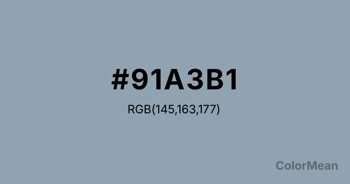
#91A3B1 Color Information
#91A3B1 RGB value is (145, 163, 177). The hex color red value is 145, green is 163, and blue is 177. Its HSL format shows a hue of 206°, saturation of 17 percent, and lightness of 63 percent. The CMYK process values are 18 percent, 8 percent, 0 percent, 31 percent.
#91A3B1 Color Meaning
Color #91A3B1 suggests pragmatic calm, atmospheric neutrality, and soft structuralism. Color #91A3B1 occupies the middle ground between cool blue and warm grey, resulting in a tone that feels both modern and timeless. Often used in urban infrastructure and minimalist interiors, color #91A3B1 supports functionality without emotional imposition. Environmental psychologists note that such mid-tone greys with blue undertones reduce perceived crowding in dense spaces—a key reason for its use in transit hubs and shared workspaces. From a branding perspective, color #91A3B1 communicates approachable professionalism. #91A3B1 lacks the coldness of charcoal and the sterility of silver, offering instead a humanized neutrality. Tech companies favor color #91A3B1 for dashboards and data visualization because #91A3B1 recedes visually, allowing data to take center stage. Unlike pure greys, its subtle blue bias activates mild alertness—ideal for interfaces requiring sustained focus without fatigue. Studies on screen readability confirm that backgrounds in #91A3B1 range improve long-duration task performance. Culturally, color #91A3B1 echoes overcast coastal skies and weathered concrete—materials shaped by time, not force. #91A3B1 symbolizes adaptive resilience: the ability to remain useful amid change. In spiritual design, color #91A3B1 represents the quiet mind, untroubled by extremes. #91A3B1 is not the color of revelation but of steady presence. Designers use color #91A3B1 when the goal is endurance, not excitement—making #91A3B1 a cornerstone of sustainable, user-centered color systems.
Color Conversion
Convert #91A3B1 across different color models and formats. These conversions help designers work seamlessly between digital and print media, ensuring this color maintains its intended appearance across RGB screens, CMYK printers, and HSL color manipulations.
RGB Values & CMYK Values
RGB Values
CMYK Values
Color Variations
#91A3B1 harmonies come to life through carefully balanced shades, tints, and tones, giving this color depth and flexibility across light and dark variations. Shades add richness, tints bring an airy softness, and tones soften intensity, making it easy to pair in clean, modern palettes.
Color Harmonies
#91A3B1 harmonies create beautiful relationships with other colors based on their position on the color wheel. Each harmony type offers unique design possibilities, enabling cohesive and visually appealing color schemes.
Analogous
Colors adjacent on the color wheel (30° apart)
Complementary
Colors opposite on the color wheel (180° apart)
Split Complementary
Three colors using one base hue and the two hues beside its opposite
Triadic
Three colors evenly spaced (120° apart)
Tetradic
Four colors forming a rectangle on the wheel
Square
Four colors evenly spaced (90° apart)
Double Split
Four colors formed from two base hues and the colors next to their opposites
Monochromatic
Variations of a single hue
Contrast Checker
(WCAG 2.1) Test #91A3B1 for accessibility compliance against white and black backgrounds. Proper contrast ensures this color remains readable and usable for all audiences, meeting WCAG 2.1 standards for both normal and large text applications.
Sample Text
This is how your text will look with these colors.
Large Text (18pt+)
Normal Text
UI Components
Color Blindness Simulator
See how #91A3B1 appears to people with different types of color vision deficiencies. These simulations help create more inclusive designs that consider how this color is perceived across various visual abilities.
Normal Vision
protanopia
Note: These simulations are approximations. Actual color vision deficiency varies by individual.
CSS Examples
Background Color
Text Color
Sample Text
Border Color
Box Shadow
Text Shadow
Sample Text
Gradient
#91A3B1 Color FAQs
Frequently asked questions about #91A3B1 color meaning, symbolism, and applications. Click on any question to expand detailed answers.
