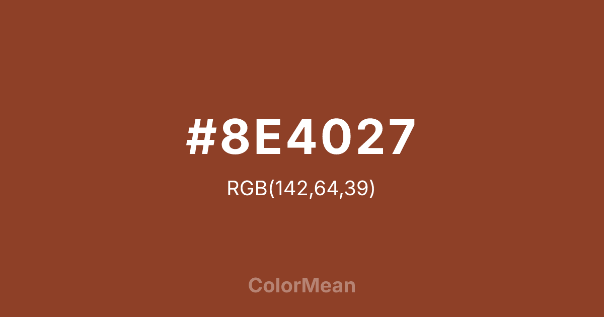
#8E4027 Color Information
#8E4027 RGB value is (142, 64, 39). The hex color red value is 142, green is 64, and blue is 39. Its HSL format shows a hue of 15°, saturation of 57 percent, and lightness of 35 percent. The CMYK process values are 0 percent, 55 percent, 73 percent, 44 percent.
#8E4027 Color Meaning
Color #8E4027 conveys earthy intensity, mineral depth, and grounded warmth. Color #8E4027 is a deep, reddish brown that mirrors oxidized copper ore or roasted clay—dense, warm, and slightly granular. Unlike chocolate, #8E4027 carries metallic memory; unlike rust, #8E4027 feels more refined. In architectural and product design, #8E4027 hue signals durability with heritage, common in terracotta tiles, leather goods, and artisan tools. Environmental psychology links such tones to increased feelings of stability and authenticity in retail and hospitality. Functionally, color #8E4027 serves as a stable anchor in warm palettes. #8E4027 pairs beautifully with olive, cream, and slate, creating compositions that feel rooted yet modern. Digital use is strong in dark-mode interfaces, where #8E4027 reduces glare while maintaining warmth. Print reproduction is superb on textured papers, enhancing its tactile appeal. Consumer studies show products in color #8E4027 are perceived as more hand-finished and durable than those in standard browns. Culturally, color #8E4027 reflects labor that transforms—mining, molding, firing. #8E4027 appears in craft cooperatives, heritage restoration, and slow design as a symbol of process over product. Spiritually, #8E4027 connects to the root chakra’s foundational mode: being as making. Designers choose color #8E4027 when they want to signal depth with warmth. Its richness is earned through fire.
Color Conversion
Convert #8E4027 across different color models and formats. These conversions help designers work seamlessly between digital and print media, ensuring this color maintains its intended appearance across RGB screens, CMYK printers, and HSL color manipulations.
RGB Values & CMYK Values
RGB Values
CMYK Values
Color Variations
#8E4027 harmonies come to life through carefully balanced shades, tints, and tones, giving this color depth and flexibility across light and dark variations. Shades add richness, tints bring an airy softness, and tones soften intensity, making it easy to pair in clean, modern palettes.
Color Harmonies
#8E4027 harmonies create beautiful relationships with other colors based on their position on the color wheel. Each harmony type offers unique design possibilities, enabling cohesive and visually appealing color schemes.
Analogous
Colors adjacent on the color wheel (30° apart)
Complementary
Colors opposite on the color wheel (180° apart)
Split Complementary
Three colors using one base hue and the two hues beside its opposite
Triadic
Three colors evenly spaced (120° apart)
Tetradic
Four colors forming a rectangle on the wheel
Square
Four colors evenly spaced (90° apart)
Double Split
Four colors formed from two base hues and the colors next to their opposites
Monochromatic
Variations of a single hue
Contrast Checker
(WCAG 2.1) Test #8E4027 for accessibility compliance against white and black backgrounds. Proper contrast ensures this color remains readable and usable for all audiences, meeting WCAG 2.1 standards for both normal and large text applications.
Sample Text
This is how your text will look with these colors.
Large Text (18pt+)
Normal Text
UI Components
Color Blindness Simulator
See how #8E4027 appears to people with different types of color vision deficiencies. These simulations help create more inclusive designs that consider how this color is perceived across various visual abilities.
Normal Vision
protanopia
Note: These simulations are approximations. Actual color vision deficiency varies by individual.
CSS Examples
Background Color
Text Color
Sample Text
Border Color
Box Shadow
Text Shadow
Sample Text
Gradient
#8E4027 Color FAQs
Frequently asked questions about #8E4027 color meaning, symbolism, and applications. Click on any question to expand detailed answers.
