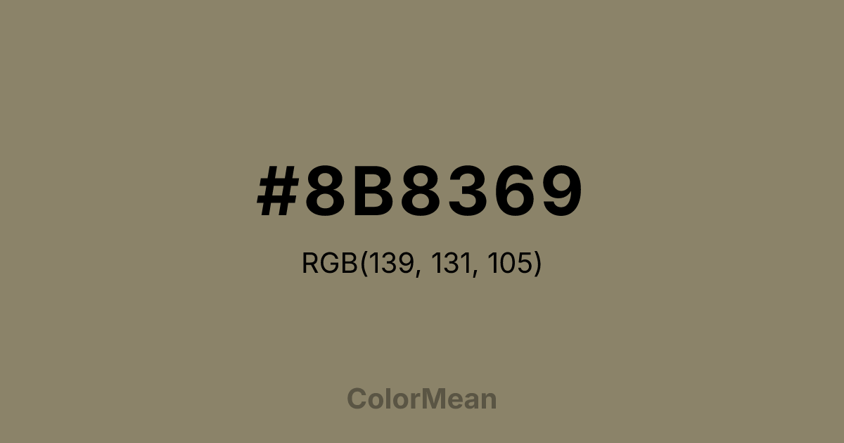
#8B8369 Color Information
#8B8369 RGB value is (139, 131, 105). The hex color red value is 139, green is 131, and blue is 105. Its HSL format shows a hue of 46°, saturation of 14 percent, and lightness of 48 percent. The CMYK process values are 0 percent, 6 percent, 24 percent, 45 percent.
#8B8369 Color Meaning
Color #8B8369 reflects deep earthy stability, endurance, and grounded warmth. #8B8369 darker beige-brown shade conveys reliability, resilience, and natural calm. Psychologically, color #8B8369 promotes emotional security, thoughtful reflection, and steadiness, anchoring environments or compositions with subtle authority. Culturally, color #8B8369 symbolizes harvest, rootedness, and maturity in Western traditions. Eastern symbolism links #8B8369 to grounding earth energy and protective qualities. Fengshui suggests #8B8369 hue for balancing energy in rooms, stabilizing high-traffic areas, or creating comforting corners. Spiritually, #8B8369 resonates with the root chakra, fostering security, endurance, and physical grounding. In design and arts, color #8B8369 works well as a foundational or accent color. Its medium-dark, natural tone pairs with lighter neutrals, muted greens, or deeper browns, perfect for rustic design, furniture finishes, and natural-themed artwork.
Color Conversion
Convert #8B8369 across different color models and formats. These conversions help designers work seamlessly between digital and print media, ensuring this color maintains its intended appearance across RGB screens, CMYK printers, and HSL color manipulations.
RGB Values & CMYK Values
RGB Values
CMYK Values
Color Variations
#8B8369 harmonies come to life through carefully balanced shades, tints, and tones, giving this color depth and flexibility across light and dark variations. Shades add richness, tints bring an airy softness, and tones soften intensity, making it easy to pair in clean, modern palettes.
Color Harmonies
#8B8369 harmonies create beautiful relationships with other colors based on their position on the color wheel. Each harmony type offers unique design possibilities, enabling cohesive and visually appealing color schemes.
Analogous
Colors adjacent on the color wheel (30° apart)
Complementary
Colors opposite on the color wheel (180° apart)
Split Complementary
Three colors using one base hue and the two hues beside its opposite
Triadic
Three colors evenly spaced (120° apart)
Tetradic
Four colors forming a rectangle on the wheel
Square
Four colors evenly spaced (90° apart)
Double Split
Four colors formed from two base hues and the colors next to their opposites
Monochromatic
Variations of a single hue
Contrast Checker
(WCAG 2.1) Test #8B8369 for accessibility compliance against white and black backgrounds. Proper contrast ensures this color remains readable and usable for all audiences, meeting WCAG 2.1 standards for both normal and large text applications.
Sample Text
This is how your text will look with these colors.
Large Text (18pt+)
Normal Text
UI Components
Color Blindness Simulator
See how #8B8369 appears to people with different types of color vision deficiencies. These simulations help create more inclusive designs that consider how this color is perceived across various visual abilities.
Normal Vision
protanopia
Note: These simulations are approximations. Actual color vision deficiency varies by individual.
CSS Examples
Background Color
Text Color
Sample Text
Border Color
Box Shadow
Text Shadow
Sample Text
Gradient
#8B8369 Color FAQs
Frequently asked questions about #8B8369 color meaning, symbolism, and applications. Click on any question to expand detailed answers.
