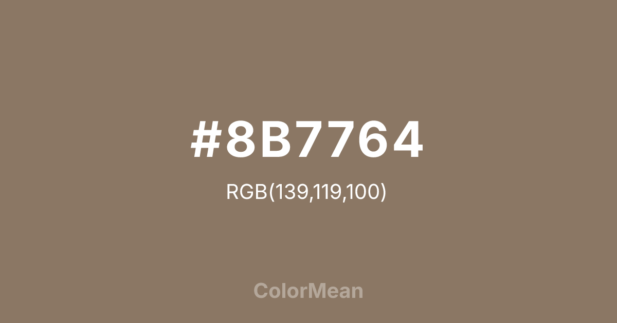
#8B7764 Color Information
#8B7764 RGB value is (139, 119, 100). The hex color red value is 139, green is 119, and blue is 100. Its HSL format shows a hue of 29°, saturation of 16 percent, and lightness of 47 percent. The CMYK process values are 0 percent, 14 percent, 28 percent, 45 percent.
#8B7764 Color Meaning
Color #8B7764 denotes somber earthiness, the foundational shadow of comfort, and solemn warmth. #8B7764 dark, greyish-brown is the deepest anchor in the PeachPuff series, resembling wet sand, dark walnut, or coffee grounds. Psychologically, PeachPuff4 (#8B7764) is stabilizing and serious, conveying the weight and foundation upon which lighter comforts rest. #8B7764 adds gravity and definition, preventing the palette from feeling frivolous or insubstantial. #8B7764 color is the quiet, solemn truth at the root of coziness. Symbolically, PeachPuff4 (#8B7764) represents the raw materials of comfort—the earth, the wood, the bean. #8B7764 is the color of the hearth's stone, not its flame. In the systematic logic of web color gradients, PeachPuff4 (#8B7764) is the final, necessary stop, providing the extreme contrast needed for legibility and dramatic shading. #8B7764 completes the narrative, showing that even the softest, sweetest comfort is ultimately grounded in something solid, dark, and elemental.
Color Conversion
Convert #8B7764 across different color models and formats. These conversions help designers work seamlessly between digital and print media, ensuring this color maintains its intended appearance across RGB screens, CMYK printers, and HSL color manipulations.
RGB Values & CMYK Values
RGB Values
CMYK Values
Color Variations
#8B7764 harmonies come to life through carefully balanced shades, tints, and tones, giving this color depth and flexibility across light and dark variations. Shades add richness, tints bring an airy softness, and tones soften intensity, making it easy to pair in clean, modern palettes.
Color Harmonies
#8B7764 harmonies create beautiful relationships with other colors based on their position on the color wheel. Each harmony type offers unique design possibilities, enabling cohesive and visually appealing color schemes.
Analogous
Colors adjacent on the color wheel (30° apart)
Complementary
Colors opposite on the color wheel (180° apart)
Split Complementary
Three colors using one base hue and the two hues beside its opposite
Triadic
Three colors evenly spaced (120° apart)
Tetradic
Four colors forming a rectangle on the wheel
Square
Four colors evenly spaced (90° apart)
Double Split
Four colors formed from two base hues and the colors next to their opposites
Monochromatic
Variations of a single hue
Contrast Checker
(WCAG 2.1) Test #8B7764 for accessibility compliance against white and black backgrounds. Proper contrast ensures this color remains readable and usable for all audiences, meeting WCAG 2.1 standards for both normal and large text applications.
Sample Text
This is how your text will look with these colors.
Large Text (18pt+)
Normal Text
UI Components
Color Blindness Simulator
See how #8B7764 appears to people with different types of color vision deficiencies. These simulations help create more inclusive designs that consider how this color is perceived across various visual abilities.
Normal Vision
protanopia
Note: These simulations are approximations. Actual color vision deficiency varies by individual.
CSS Examples
Background Color
Text Color
Sample Text
Border Color
Box Shadow
Text Shadow
Sample Text
Gradient
#8B7764 Color FAQs
Frequently asked questions about #8B7764 color meaning, symbolism, and applications. Click on any question to expand detailed answers.
