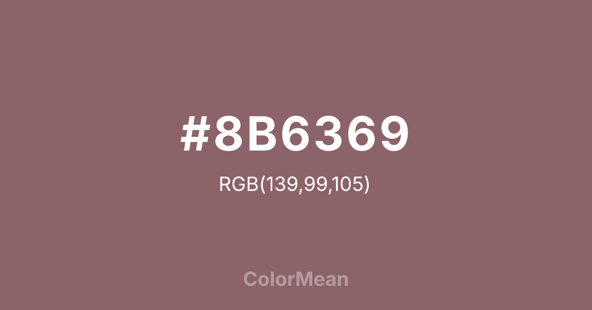
#8B6369 Color Information
#8B6369 RGB value is (139, 99, 105). The hex color red value is 139, green is 99, and blue is 105. Its HSL format shows a hue of 351°, saturation of 17 percent, and lightness of 47 percent. The CMYK process values are 0 percent, 29 percent, 24 percent, 45 percent.
#8B6369 Color Meaning
Color #8B6369 denotes solemn rosiness, the shadow of sentiment, and dignified restraint. #8B6369 dark, greyish pink-brown is the deepest and most serious in the series, evoking dried roses, old brick, and twilight on a blush-colored wall. Psychologically, color #8B6369 is weighty and introspective, conveying deep, reserved emotion, tradition, and the solemn foundation upon which lighter pinks are built. #8B6369 adds gravity and definition, preventing the pink palette from feeling frivolous or insubstantial. #8B6369 color is the architectural shadow of affection. Symbolically, color #8B6369 represents the root of compassion, love that has known solemnity, and sentiment that has been integrated into a lasting structure. #8B6369 is the color of a romantic tragedy or a vow kept in silence. Within the technical gradient, color #8B6369 is the final, necessary anchor, providing maximum contrast and enabling clear legibility for text or critical details, thus ensuring the entire pink system can function with professional versatility.
Color Conversion
Convert #8B6369 across different color models and formats. These conversions help designers work seamlessly between digital and print media, ensuring this color maintains its intended appearance across RGB screens, CMYK printers, and HSL color manipulations.
RGB Values & CMYK Values
RGB Values
CMYK Values
Color Variations
#8B6369 harmonies come to life through carefully balanced shades, tints, and tones, giving this color depth and flexibility across light and dark variations. Shades add richness, tints bring an airy softness, and tones soften intensity, making it easy to pair in clean, modern palettes.
Color Harmonies
#8B6369 harmonies create beautiful relationships with other colors based on their position on the color wheel. Each harmony type offers unique design possibilities, enabling cohesive and visually appealing color schemes.
Analogous
Colors adjacent on the color wheel (30° apart)
Complementary
Colors opposite on the color wheel (180° apart)
Split Complementary
Three colors using one base hue and the two hues beside its opposite
Triadic
Three colors evenly spaced (120° apart)
Tetradic
Four colors forming a rectangle on the wheel
Square
Four colors evenly spaced (90° apart)
Double Split
Four colors formed from two base hues and the colors next to their opposites
Monochromatic
Variations of a single hue
Contrast Checker
(WCAG 2.1) Test #8B6369 for accessibility compliance against white and black backgrounds. Proper contrast ensures this color remains readable and usable for all audiences, meeting WCAG 2.1 standards for both normal and large text applications.
Sample Text
This is how your text will look with these colors.
Large Text (18pt+)
Normal Text
UI Components
Color Blindness Simulator
See how #8B6369 appears to people with different types of color vision deficiencies. These simulations help create more inclusive designs that consider how this color is perceived across various visual abilities.
Normal Vision
protanopia
Note: These simulations are approximations. Actual color vision deficiency varies by individual.
CSS Examples
Background Color
Text Color
Sample Text
Border Color
Box Shadow
Text Shadow
Sample Text
Gradient
#8B6369 Color FAQs
Frequently asked questions about #8B6369 color meaning, symbolism, and applications. Click on any question to expand detailed answers.

