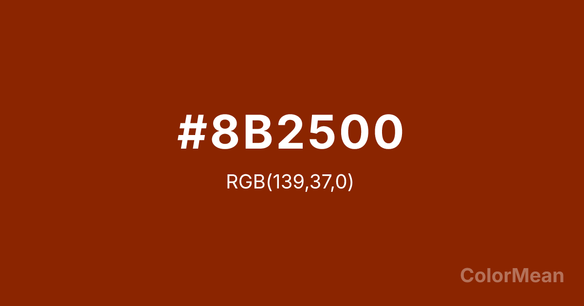
OrangeRed4 (#8B2500) Color Information
OrangeRed4 (#8B2500) RGB value is (139, 37, 0). The hex color red value is 139, green is 37, and blue is 0. Its HSL format shows a hue of 16°, saturation of 100 percent, and lightness of 27 percent. The CMYK process values are 0 percent, 73 percent, 100 percent, 45 percent.
OrangeRed4 (#8B2500) Color Meaning
OrangeRed4 (#8B2500) absorbs energy into shadow. The darkest in the OrangeRed sequence, this near-brown red functions more like a warm black than a true accent. OrangeRed4 (#8B2500) was designed for legibility in monochrome systems where color distinction mattered less than tonal hierarchy. OrangeRed4 (#8B2500) whispers intensity. In archival printing, OrangeRed4 (#8B2500) mimics iron-gall ink and early lithographic reds—tones that age gracefully without fading to pink. OrangeRed4 (#8B2500) feels historical because it references real materials, not screen approximations. Designers use OrangeRed4 (#8B2500) when they need warmth in darkness—think book spines, embossed logos, or luxury packaging. Today, it appears in minimalist fragrance, leather goods, and editorial design where subtlety signals refinement. Paired with cream or slate, OrangeRed4 (#8B2500) creates contrast that feels tactile, not visual. OrangeRed4 (#8B2500) doesn’t glow—it lingers.
Color Conversion
Convert OrangeRed4 (#8B2500) across different color models and formats. These conversions help designers work seamlessly between digital and print media, ensuring this color maintains its intended appearance across RGB screens, CMYK printers, and HSL color manipulations.
RGB Values & CMYK Values
RGB Values
CMYK Values
Color Variations
OrangeRed4 (#8B2500) harmonies come to life through carefully balanced shades, tints, and tones, giving this color depth and flexibility across light and dark variations. Shades add richness, tints bring an airy softness, and tones soften intensity, making it easy to pair in clean, modern palettes.
Color Harmonies
OrangeRed4 (#8B2500) harmonies create beautiful relationships with other colors based on their position on the color wheel. Each harmony type offers unique design possibilities, enabling cohesive and visually appealing color schemes.
Analogous
Colors adjacent on the color wheel (30° apart)
Complementary
Colors opposite on the color wheel (180° apart)
Split Complementary
Three colors using one base hue and the two hues beside its opposite
Triadic
Three colors evenly spaced (120° apart)
Tetradic
Four colors forming a rectangle on the wheel
Square
Four colors evenly spaced (90° apart)
Double Split
Four colors formed from two base hues and the colors next to their opposites
Monochromatic
Variations of a single hue
Contrast Checker
(WCAG 2.1) Test OrangeRed4 (#8B2500) for accessibility compliance against white and black backgrounds. Proper contrast ensures this color remains readable and usable for all audiences, meeting WCAG 2.1 standards for both normal and large text applications.
Sample Text
This is how your text will look with these colors.
Large Text (18pt+)
Normal Text
UI Components
Color Blindness Simulator
See how #8B2500 appears to people with different types of color vision deficiencies. These simulations help create more inclusive designs that consider how this color is perceived across various visual abilities.
Normal Vision
protanopia
Note: These simulations are approximations. Actual color vision deficiency varies by individual.
CSS Examples
Background Color
Text Color
Sample Text
Border Color
Box Shadow
Text Shadow
Sample Text
Gradient
OrangeRed4 (#8B2500) Color FAQs
Frequently asked questions about OrangeRed4 (#8B2500) color meaning, symbolism, and applications. Click on any question to expand detailed answers.

