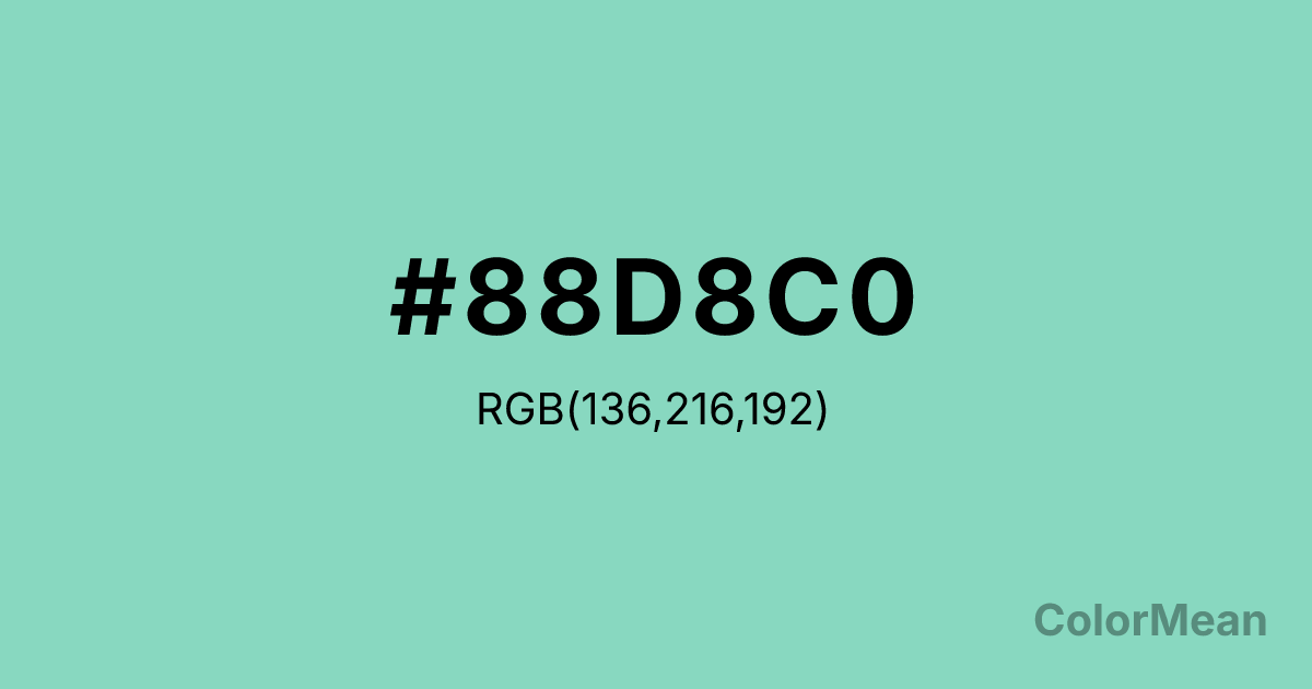
Pearl Aqua (#88D8C0) Color Information
Pearl Aqua (#88D8C0) RGB value is (136, 216, 192). The hex color red value is 136, green is 216, and blue is 192. Its HSL format shows a hue of 162°, saturation of 51 percent, and lightness of 69 percent. The CMYK process values are 37 percent, 0 percent, 11 percent, 15 percent.
Pearl Aqua (#88D8C0) Color Meaning
Pearl Aqua (#88D8C0) projects tropical serenity, liquid clarity, and polished tranquility. This bright, greenish-cyan is reminiscent of shallow Caribbean waters, polished aquamarine, and swimming pools, suggesting a clean, refreshing, and accessible form of escape. Psychologically, Pearl Aqua (#88D8C0) is cooling and mentally refreshing, reducing stress with its association to vacation, clear water, and carefree leisure. It promotes feelings of physical well-being, playful relaxation, and optimistic openness. This color is inherently rejuvenating and friendly. Culturally, Pearl Aqua (#88D8C0) is iconic in retro 1950s design, resort wear, and anything with a vintage tropical or "tiki" aesthetic. Symbolically, it represents manufactured paradise, the commodification of relaxation, and joy that is bright, clean, and easily accessed. Therefore, Pearl Aqua (#88D8C0) acts as a direct visual link to mid-century optimism and the promise of leisure, offering a cheerful, stylized version of natural aquatic beauty.
Color Conversion
Convert Pearl Aqua (#88D8C0) across different color models and formats. These conversions help designers work seamlessly between digital and print media, ensuring this color maintains its intended appearance across RGB screens, CMYK printers, and HSL color manipulations.
RGB Values & CMYK Values
RGB Values
CMYK Values
Color Variations
Pearl Aqua (#88D8C0) harmonies come to life through carefully balanced shades, tints, and tones, giving this color depth and flexibility across light and dark variations. Shades add richness, tints bring an airy softness, and tones soften intensity, making it easy to pair in clean, modern palettes.
Color Harmonies
Pearl Aqua (#88D8C0) harmonies create beautiful relationships with other colors based on their position on the color wheel. Each harmony type offers unique design possibilities, enabling cohesive and visually appealing color schemes.
Analogous
Colors adjacent on the color wheel (30° apart)
Complementary
Colors opposite on the color wheel (180° apart)
Split Complementary
Three colors using one base hue and the two hues beside its opposite
Triadic
Three colors evenly spaced (120° apart)
Tetradic
Four colors forming a rectangle on the wheel
Square
Four colors evenly spaced (90° apart)
Double Split
Four colors formed from two base hues and the colors next to their opposites
Monochromatic
Variations of a single hue
Contrast Checker
(WCAG 2.1) Test Pearl Aqua (#88D8C0) for accessibility compliance against white and black backgrounds. Proper contrast ensures this color remains readable and usable for all audiences, meeting WCAG 2.1 standards for both normal and large text applications.
Sample Text
This is how your text will look with these colors.
Large Text (18pt+)
Normal Text
UI Components
Color Blindness Simulator
See how #88D8C0 appears to people with different types of color vision deficiencies. These simulations help create more inclusive designs that consider how this color is perceived across various visual abilities.
Normal Vision
protanopia
Note: These simulations are approximations. Actual color vision deficiency varies by individual.
CSS Examples
Background Color
Text Color
Sample Text
Border Color
Box Shadow
Text Shadow
Sample Text
Gradient
Pearl Aqua (#88D8C0) Color FAQs
Frequently asked questions about Pearl Aqua (#88D8C0) color meaning, symbolism, and applications. Click on any question to expand detailed answers.
