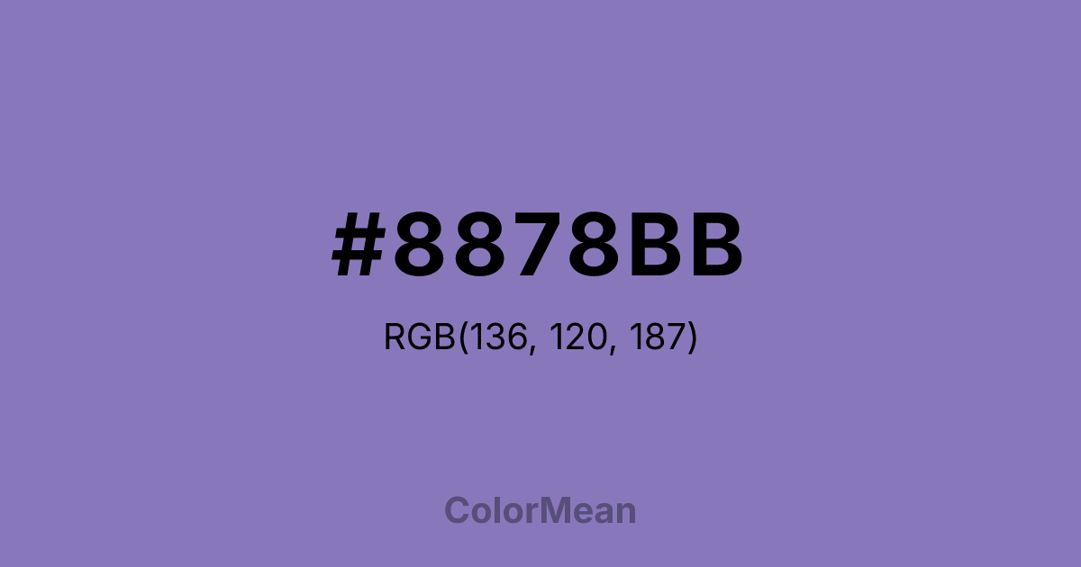
#8878BB Color Information
#8878BB RGB value is (136, 120, 187). The hex color red value is 136, green is 120, and blue is 187. Its HSL format shows a hue of 254°, saturation of 33 percent, and lightness of 60 percent. The CMYK process values are 27 percent, 36 percent, 0 percent, 27 percent.
#8878BB Color Meaning
Color #8878BB conveys creativity, imagination, and subtle elegance. #8878BB medium, slightly muted shade of purple blends calmness with inspiration, offering balance between reflection and innovation. Psychologically, color #8878BB promotes introspection, originality, and artistic thinking, making #8878BB suitable for creative workspaces. Culturally, color #8878BB is linked with luxury, refinement, and spiritual insight in Western traditions, while in Eastern practices, #8878BB relates to meditation, mindfulness, and connection to higher consciousness. Feng Shui favors #8878BB for areas dedicated to knowledge, contemplation, or spiritual growth. Spiritually, #8878BB resonates with the crown chakra, stimulating awareness, intuition, and inner wisdom. In design, color #8878BB complements pastels, soft greys, or metallic tones for elegant interiors, product packaging, and digital interfaces. Artists use #8878BB to evoke mystery, sophistication, and gentle creativity without overwhelming the viewer. Its balanced, vivid quality bridges calmness with inspiration.
Color Conversion
Convert #8878BB across different color models and formats. These conversions help designers work seamlessly between digital and print media, ensuring this color maintains its intended appearance across RGB screens, CMYK printers, and HSL color manipulations.
RGB Values & CMYK Values
RGB Values
CMYK Values
Color Variations
#8878BB harmonies come to life through carefully balanced shades, tints, and tones, giving this color depth and flexibility across light and dark variations. Shades add richness, tints bring an airy softness, and tones soften intensity, making it easy to pair in clean, modern palettes.
Color Harmonies
#8878BB harmonies create beautiful relationships with other colors based on their position on the color wheel. Each harmony type offers unique design possibilities, enabling cohesive and visually appealing color schemes.
Analogous
Colors adjacent on the color wheel (30° apart)
Complementary
Colors opposite on the color wheel (180° apart)
Split Complementary
Three colors using one base hue and the two hues beside its opposite
Triadic
Three colors evenly spaced (120° apart)
Tetradic
Four colors forming a rectangle on the wheel
Square
Four colors evenly spaced (90° apart)
Double Split
Four colors formed from two base hues and the colors next to their opposites
Monochromatic
Variations of a single hue
Contrast Checker
(WCAG 2.1) Test #8878BB for accessibility compliance against white and black backgrounds. Proper contrast ensures this color remains readable and usable for all audiences, meeting WCAG 2.1 standards for both normal and large text applications.
Sample Text
This is how your text will look with these colors.
Large Text (18pt+)
Normal Text
UI Components
Color Blindness Simulator
See how #8878BB appears to people with different types of color vision deficiencies. These simulations help create more inclusive designs that consider how this color is perceived across various visual abilities.
Normal Vision
protanopia
Note: These simulations are approximations. Actual color vision deficiency varies by individual.
CSS Examples
Background Color
Text Color
Sample Text
Border Color
Box Shadow
Text Shadow
Sample Text
Gradient
#8878BB Color FAQs
Frequently asked questions about #8878BB color meaning, symbolism, and applications. Click on any question to expand detailed answers.

