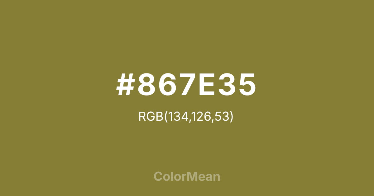
#867E35 Color Information
#867E35 RGB value is (134, 126, 53). The hex color red value is 134, green is 126, and blue is 53. Its HSL format shows a hue of 54°, saturation of 43 percent, and lightness of 37 percent. The CMYK process values are 0 percent, 6 percent, 60 percent, 47 percent.
#867E35 Color Meaning
Color #867E35 whispers of damp stone and slow growth. #867E35 olive-yellow green avoids vibrancy, favoring the muted palette of lichen-covered surfaces. Color #867E35 suggests patience, ecological integration, and time-tested resilience—ideal for heritage agriculture, natural dyes, and archival restoration. Environmental psychologists classify such tones as “non-threatening naturals”—colors that promote restoration without demanding attention. Color #867E35 works especially well in print and packaging where tactile authenticity matters more than screen pop. Its yellow undertone adds warmth without cheer. Culturally, #867E35 references monastic gardens, Japanese wabi-sabi, and European folklore—spaces where decay and life coexist. In modern design, #867E35 grounds digital experiences in organic rhythm. Paired with unbleached paper tones or rust, color #867E35 creates narratives of quiet continuity.
Color Conversion
Convert #867E35 across different color models and formats. These conversions help designers work seamlessly between digital and print media, ensuring this color maintains its intended appearance across RGB screens, CMYK printers, and HSL color manipulations.
RGB Values & CMYK Values
RGB Values
CMYK Values
Color Variations
#867E35 harmonies come to life through carefully balanced shades, tints, and tones, giving this color depth and flexibility across light and dark variations. Shades add richness, tints bring an airy softness, and tones soften intensity, making it easy to pair in clean, modern palettes.
Color Harmonies
#867E35 harmonies create beautiful relationships with other colors based on their position on the color wheel. Each harmony type offers unique design possibilities, enabling cohesive and visually appealing color schemes.
Analogous
Colors adjacent on the color wheel (30° apart)
Complementary
Colors opposite on the color wheel (180° apart)
Split Complementary
Three colors using one base hue and the two hues beside its opposite
Triadic
Three colors evenly spaced (120° apart)
Tetradic
Four colors forming a rectangle on the wheel
Square
Four colors evenly spaced (90° apart)
Double Split
Four colors formed from two base hues and the colors next to their opposites
Monochromatic
Variations of a single hue
Contrast Checker
(WCAG 2.1) Test #867E35 for accessibility compliance against white and black backgrounds. Proper contrast ensures this color remains readable and usable for all audiences, meeting WCAG 2.1 standards for both normal and large text applications.
Sample Text
This is how your text will look with these colors.
Large Text (18pt+)
Normal Text
UI Components
Color Blindness Simulator
See how #867E35 appears to people with different types of color vision deficiencies. These simulations help create more inclusive designs that consider how this color is perceived across various visual abilities.
Normal Vision
protanopia
Note: These simulations are approximations. Actual color vision deficiency varies by individual.
CSS Examples
Background Color
Text Color
Sample Text
Border Color
Box Shadow
Text Shadow
Sample Text
Gradient
#867E35 Color FAQs
Frequently asked questions about #867E35 color meaning, symbolism, and applications. Click on any question to expand detailed answers.
