#86739E Color Information
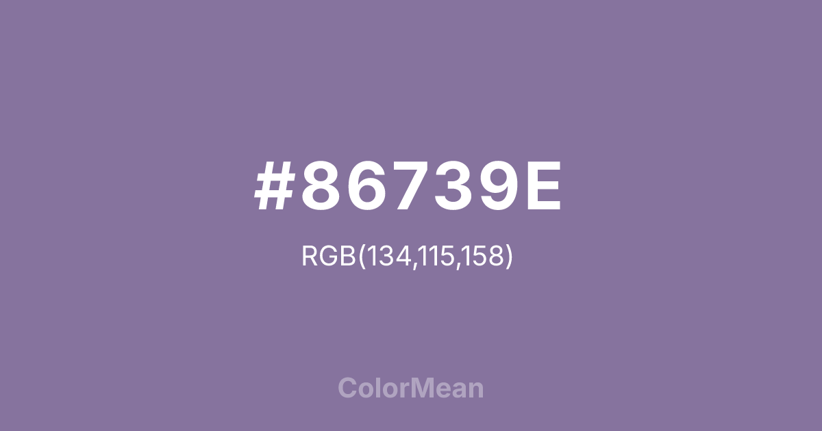
#86739E RGB value is (134, 115, 158). The hex color red value is 134, green is 115, and blue is 158. Its HSL format shows a hue of 267°, saturation of 18 percent, and lightness of 54 percent. The CMYK process values are 15 percent, 27 percent, 0 percent, 38 percent.
#86739E Color Meaning
Color #86739E denotes softened royalty, nostalgic fantasy, and accessible mystique. #86739E medium, greyish purple is dusty and romantic, evoking faded velvet, heather fields at dusk, and vintage perfume bottles. Psychologically, color #86739E encourages creative imagination and sentimental reflection, blending the introspection of purple with a gentle, approachable wistfulness. #86739E feels less authoritative and more personal than pure purple, suggesting individuality, gentle nonconformity, and dreamy sensitivity. #86739E color is mystical made friendly. Culturally, color #86739E appears in bohemian fashion, historical romance genres, and branding for creative or spiritual services with a soft, inclusive appeal. Symbolically, #86739E represents personalized magic, intuition worn lightly, and spirituality blended with earthly sentiment. Color #86739E democratizes the mystery of violet, offering a hue that speaks of inner life, creative spirit, and a gentle connection to the subtle realms without dogma or grandeur.
Color Conversion
Convert #86739E across different color models and formats. These conversions help designers work seamlessly between digital and print media, ensuring this color maintains its intended appearance across RGB screens, CMYK printers, and HSL color manipulations.
RGB Values & CMYK Values
RGB Values
CMYK Values
Color Variations
#86739E harmonies come to life through carefully balanced shades, tints, and tones, giving this color depth and flexibility across light and dark variations. Shades add richness, tints bring an airy softness, and tones soften intensity, making it easy to pair in clean, modern palettes.
Color Harmonies
#86739E harmonies create beautiful relationships with other colors based on their position on the color wheel. Each harmony type offers unique design possibilities, enabling cohesive and visually appealing color schemes.
Analogous
Colors adjacent on the color wheel (30° apart)
Complementary
Colors opposite on the color wheel (180° apart)
Split Complementary
Three colors using one base hue and the two hues beside its opposite
Triadic
Three colors evenly spaced (120° apart)
Tetradic
Four colors forming a rectangle on the wheel
Square
Four colors evenly spaced (90° apart)
Double Split
Four colors formed from two base hues and the colors next to their opposites
Monochromatic
Variations of a single hue
Contrast Checker
(WCAG 2.1) Test #86739E for accessibility compliance against white and black backgrounds. Proper contrast ensures this color remains readable and usable for all audiences, meeting WCAG 2.1 standards for both normal and large text applications.
Sample Text
This is how your text will look with these colors.
Large Text (18pt+)
Normal Text
UI Components
Color Blindness Simulator
See how #86739E appears to people with different types of color vision deficiencies. These simulations help create more inclusive designs that consider how this color is perceived across various visual abilities.
Normal Vision
protanopia
Note: These simulations are approximations. Actual color vision deficiency varies by individual.
CSS Examples
Background Color
Text Color
Sample Text
Border Color
Box Shadow
Text Shadow
Sample Text
Gradient
#86739E Color FAQs
Frequently asked questions about #86739E color meaning, symbolism, and applications. Click on any question to expand detailed answers.
