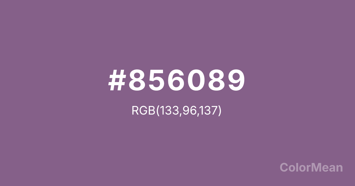
#856089 Color Information
#856089 RGB value is (133, 96, 137). The hex color red value is 133, green is 96, and blue is 137. Its HSL format shows a hue of 294°, saturation of 18 percent, and lightness of 46 percent. The CMYK process values are 3 percent, 30 percent, 0 percent, 46 percent.
#856089 Color Meaning
Color #856089 suggests contemplative depth, cultural nuance, and quiet distinction. Color #856089 is a greyed purple with subtle red undertones—evoking ink-wash landscapes, aged silk, and twilight mist over mountains. Unlike royal purple, #856089 avoids opulence; unlike lavender, #856089 carries weight. In East Asian aesthetics, #856089 tone reflects scholarly restraint and poetic subtlety. Contemporary design adopts #856089 for platforms emphasizing mindfulness, heritage preservation, and cross-cultural dialogue, where silence speaks louder than saturation. Functionally, color #856089 serves as a sophisticated neutral in editorial and digital interfaces. #856089 pairs beautifully with warm greys, olive, and parchment, creating palettes that feel meditative but not monastic. Digital accessibility tests confirm #856089 meets contrast standards against off-whites for body text, especially in long-form reading environments. Print consistency is high on matte finishes, enhancing its archival appeal. Consumer research shows higher trust in content framed in color #856089 versus brighter purples. Symbolically, color #856089 represents wisdom that listens. #856089 is not the violet of mysticism but of measured insight. In spiritual practice, #856089 aligns with the third eye’s receptive mode: clarity through stillness. Designers choose color #856089 when they want to signal depth without drama. Its distinction is earned through restraint.
Convert #856089 across different color models and formats. These conversions help designers work seamlessly between digital and print media, ensuring this color maintains its intended appearance across RGB screens, CMYK printers, and HSL color manipulations.
RGB Values
CMYK Values
#856089 harmonies come to life through carefully balanced shades, tints, and tones, giving this color depth and flexibility across light and dark variations. Shades add richness, tints bring an airy softness, and tones soften intensity, making it easy to pair in clean, modern palettes.
#856089 harmonies create beautiful relationships with other colors based on their position on the color wheel. Each harmony type offers unique design possibilities, enabling cohesive and visually appealing color schemes.
Analogous
Colors adjacent on the color wheel (30° apart)
Complementary
Colors opposite on the color wheel (180° apart)
Split Complementary
Three colors using one base hue and the two hues beside its opposite
Triadic
Three colors evenly spaced (120° apart)
Tetradic
Four colors forming a rectangle on the wheel
Square
Four colors evenly spaced (90° apart)
Double Split
Four colors formed from two base hues and the colors next to their opposites
Monochromatic
Variations of a single hue
(WCAG 2.1) Test #856089 for accessibility compliance against white and black backgrounds. Proper contrast ensures this color remains readable and usable for all audiences, meeting WCAG 2.1 standards for both normal and large text applications.
Sample Text
This is how your text will look with these colors.
Large Text (18pt+)
Normal Text
UI Components
See how #856089 appears to people with different types of color vision deficiencies. These simulations help create more inclusive designs that consider how this color is perceived across various visual abilities.
Normal Vision
protanopia
Note: These simulations are approximations. Actual color vision deficiency varies by individual.
Background Color
Text Color
Sample Text
Border Color
Box Shadow
Text Shadow
Sample Text
Gradient
#856089 Color FAQs
Frequently asked questions about #856089 color meaning, symbolism, and applications. Click on any question to expand detailed answers.
