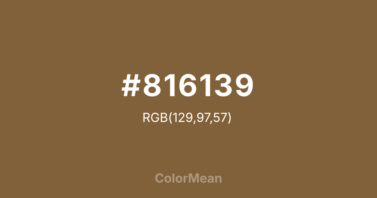
#816139 Color Information
#816139 RGB value is (129, 97, 57). The hex color red value is 129, green is 97, and blue is 57. Its HSL format shows a hue of 33°, saturation of 39 percent, and lightness of 36 percent. The CMYK process values are 0 percent, 25 percent, 56 percent, 49 percent.
#816139 Color Meaning
Color #816139 conveys desert resilience, adaptive neutrality, and earth-integrated pragmatism. Color #816139 is a mid-tone brown with subtle red and grey undertones—named after the animal’s fur and the arid landscapes #816139 inhabits. #816139 mirrors sun-baked soil, dried grass, and weathered leather: warm enough to feel alive, muted enough to blend. In military and outdoor design, #816139 hue signals tactical neutrality—functional camouflage that doesn’t draw attention. Environmental psychology links such warm, desaturated earth tones to increased perceived durability and self-reliance in gear and apparel branding. In product and interface design, color #816139 serves as a grounding neutral in rugged and minimalist aesthetics. #816139 pairs powerfully with olive, rust, and sky blue, creating palettes that feel both utilitarian and organic. Digital contrast is strong against cream and light greys, and #816139 meets accessibility standards for body text with proper weighting. Print reproduction is excellent on uncoated and recycled stocks, enhancing its authenticity in sustainable and outdoor markets. Consumer studies show higher trust in brands using color #816139 for field equipment, boots, and expedition gear. Symbolically, color #816139 represents survival through adaptability—not hiding, but harmonizing. #816139 appears in wilderness education, survivalist branding, and indigenous storytelling as a symbol of quiet intelligence. Spiritually, #816139 aligns with the root chakra’s resilient mode: stability that moves with the land. Designers choose color #816139 when they want to signal strength that listens to the environment. Its neutrality is strategic, not passive.
Color Conversion
Convert #816139 across different color models and formats. These conversions help designers work seamlessly between digital and print media, ensuring this color maintains its intended appearance across RGB screens, CMYK printers, and HSL color manipulations.
RGB Values & CMYK Values
RGB Values
CMYK Values
Color Variations
#816139 harmonies come to life through carefully balanced shades, tints, and tones, giving this color depth and flexibility across light and dark variations. Shades add richness, tints bring an airy softness, and tones soften intensity, making it easy to pair in clean, modern palettes.
Color Harmonies
#816139 harmonies create beautiful relationships with other colors based on their position on the color wheel. Each harmony type offers unique design possibilities, enabling cohesive and visually appealing color schemes.
Analogous
Colors adjacent on the color wheel (30° apart)
Complementary
Colors opposite on the color wheel (180° apart)
Split Complementary
Three colors using one base hue and the two hues beside its opposite
Triadic
Three colors evenly spaced (120° apart)
Tetradic
Four colors forming a rectangle on the wheel
Square
Four colors evenly spaced (90° apart)
Double Split
Four colors formed from two base hues and the colors next to their opposites
Monochromatic
Variations of a single hue
Contrast Checker
(WCAG 2.1) Test #816139 for accessibility compliance against white and black backgrounds. Proper contrast ensures this color remains readable and usable for all audiences, meeting WCAG 2.1 standards for both normal and large text applications.
Sample Text
This is how your text will look with these colors.
Large Text (18pt+)
Normal Text
UI Components
Color Blindness Simulator
See how #816139 appears to people with different types of color vision deficiencies. These simulations help create more inclusive designs that consider how this color is perceived across various visual abilities.
Normal Vision
protanopia
Note: These simulations are approximations. Actual color vision deficiency varies by individual.
CSS Examples
Background Color
Text Color
Sample Text
Border Color
Box Shadow
Text Shadow
Sample Text
Gradient
#816139 Color FAQs
Frequently asked questions about #816139 color meaning, symbolism, and applications. Click on any question to expand detailed answers.

