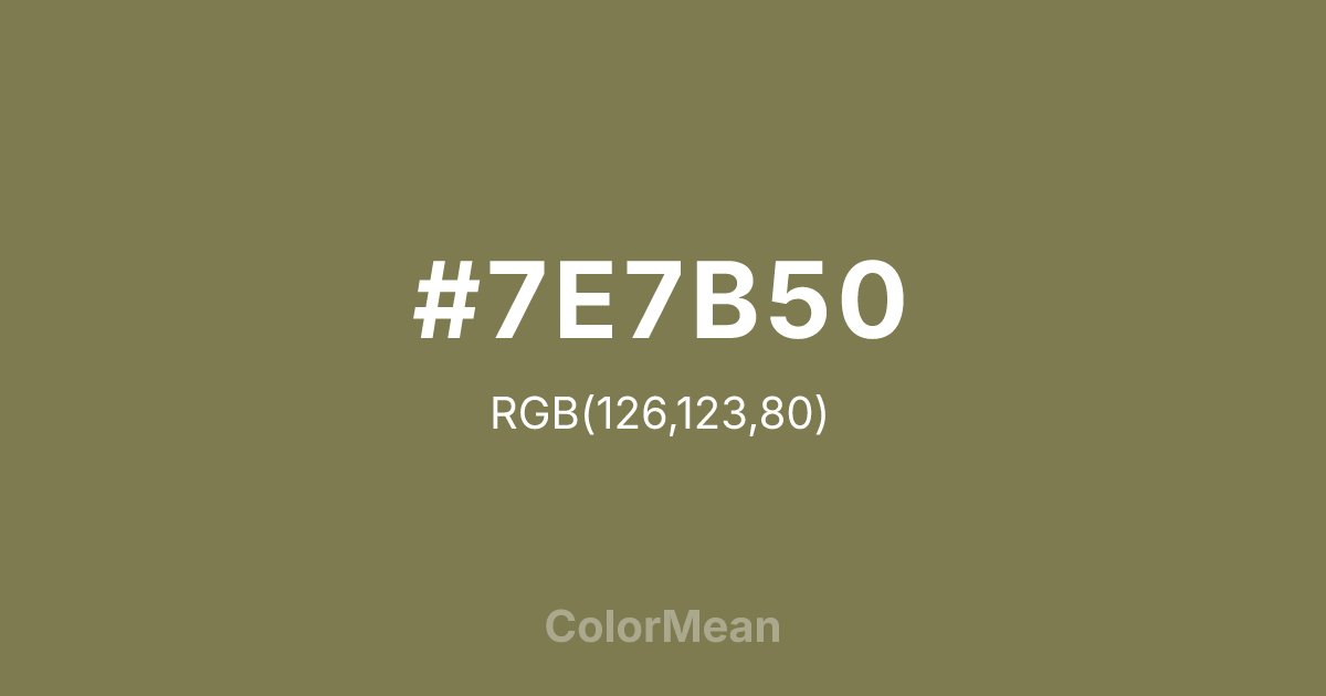
#7E7B50 Color Information
#7E7B50 RGB value is (126, 123, 80). The hex color red value is 126, green is 123, and blue is 80. Its HSL format shows a hue of 56°, saturation of 22 percent, and lightness of 40 percent. The CMYK process values are 0 percent, 2 percent, 37 percent, 51 percent.
#7E7B50 Color Meaning
Color #7E7B50 merges the neutrality of stone with the quiet life of lichen. #7E7B50 balanced green-gray avoids emotional extremes, offering a grounded middle ground between cool detachment and warm familiarity. Color #7E7B50 functions as a sophisticated neutral in editorial design, architectural finishes, and minimalist fashion. Color #7E7B50 says little but implies much through subtle texture. In visual ergonomics, color #7E7B50 reduces screen fatigue better than pure gray because its green undertone engages the eye’s natural resting focus. Unlike sterile greys that feel digital, color #7E7B50 carries organic memory—like weathered slate or untreated linen. Designers choose color #7E7B50 when they need neutrality with warmth. Historically absent from flashy palettes, color #7E7B50 now thrives in biophilic interiors and quiet luxury branding. #7E7B50 pairs powerfully with deep teals or terracotta to create depth without contrast overload. Color #7E7B50 doesn’t command space—#7E7B50 inhabits #7E7B50 with quiet confidence.
Color Conversion
Convert #7E7B50 across different color models and formats. These conversions help designers work seamlessly between digital and print media, ensuring this color maintains its intended appearance across RGB screens, CMYK printers, and HSL color manipulations.
RGB Values & CMYK Values
RGB Values
CMYK Values
Color Variations
#7E7B50 harmonies come to life through carefully balanced shades, tints, and tones, giving this color depth and flexibility across light and dark variations. Shades add richness, tints bring an airy softness, and tones soften intensity, making it easy to pair in clean, modern palettes.
Color Harmonies
#7E7B50 harmonies create beautiful relationships with other colors based on their position on the color wheel. Each harmony type offers unique design possibilities, enabling cohesive and visually appealing color schemes.
Analogous
Colors adjacent on the color wheel (30° apart)
Complementary
Colors opposite on the color wheel (180° apart)
Split Complementary
Three colors using one base hue and the two hues beside its opposite
Triadic
Three colors evenly spaced (120° apart)
Tetradic
Four colors forming a rectangle on the wheel
Square
Four colors evenly spaced (90° apart)
Double Split
Four colors formed from two base hues and the colors next to their opposites
Monochromatic
Variations of a single hue
Contrast Checker
(WCAG 2.1) Test #7E7B50 for accessibility compliance against white and black backgrounds. Proper contrast ensures this color remains readable and usable for all audiences, meeting WCAG 2.1 standards for both normal and large text applications.
Sample Text
This is how your text will look with these colors.
Large Text (18pt+)
Normal Text
UI Components
Color Blindness Simulator
See how #7E7B50 appears to people with different types of color vision deficiencies. These simulations help create more inclusive designs that consider how this color is perceived across various visual abilities.
Normal Vision
protanopia
Note: These simulations are approximations. Actual color vision deficiency varies by individual.
CSS Examples
Background Color
Text Color
Sample Text
Border Color
Box Shadow
Text Shadow
Sample Text
Gradient
#7E7B50 Color FAQs
Frequently asked questions about #7E7B50 color meaning, symbolism, and applications. Click on any question to expand detailed answers.

