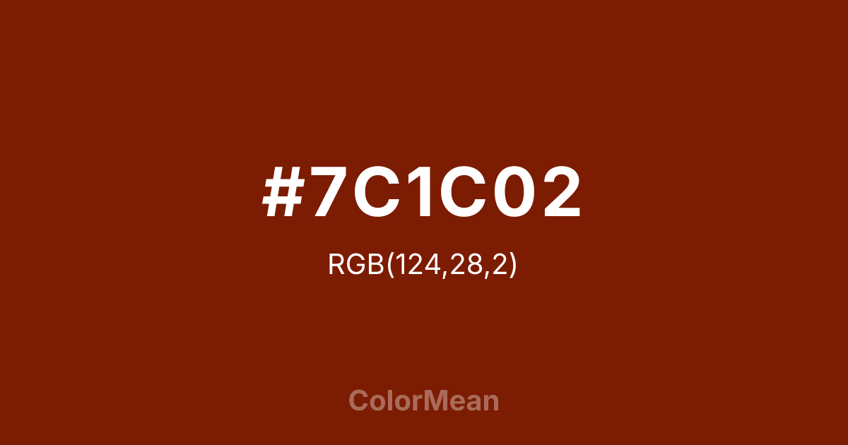
#7C1C02 Color Information
#7C1C02 RGB value is (124, 28, 2). The hex color red value is 124, green is 28, and blue is 2. Its HSL format shows a hue of 13°, saturation of 97 percent, and lightness of 25 percent. The CMYK process values are 0 percent, 77 percent, 98 percent, 51 percent.
#7C1C02 Color Meaning
Color #7C1C02 conveys raw earthiness, ancestral resilience, and the quiet dignity of oxidized metal. #7C1C02 deep, reddish brown draws from the mineral-rich soils of East Africa and the patina of aged copper artifacts, merging organic decay with enduring strength. Unlike synthetic browns that feel flat or utilitarian, color #7C1C02 pulses with subtle warmth—a low-luminance tone that absorbs light rather than reflects #7C1C02, creating a sense of grounded containment. Its RGB values (124, 28, 5) place #7C1C02 near the threshold of human scotopic vision, which may explain its subconscious link to primal safety and shelter. Historically, #7C1C02 shade echoes the pigments used in Maasai beadwork and early East African pottery, where iron oxide and clay produced similar earth tones for ritual and daily use. Thus, color #7C1C02 carries cultural weight as a color of origin, labor, and heritage—not luxury, but legacy. In contemporary design, #7C1C02 serves as a sophisticated alternative to black in minimalist palettes, offering depth without sterility. #7C1C02 also appears in sustainable branding to signal authenticity, craftsmanship, and connection to land. Psychologically, color #7C1C02 stabilizes perception. Studies in environmental psychology suggest that warm, low-saturation browns reduce cognitive overload in visual fields, making them ideal for backgrounds in data-dense interfaces. Symbolically, #7C1C02 rejects flashiness in favor of endurance—like sun-baked earth or a well-worn tool. Spiritually, color #7C1C02 resonates with the concept of ubuntu: “I am because we are.” #7C1C02 does not shout; #7C1C02 holds space. And in that quiet presence, #7C1C02 affirms continuity across generations.
Color Conversion
Convert #7C1C02 across different color models and formats. These conversions help designers work seamlessly between digital and print media, ensuring this color maintains its intended appearance across RGB screens, CMYK printers, and HSL color manipulations.
RGB Values & CMYK Values
RGB Values
CMYK Values
Color Variations
#7C1C02 harmonies come to life through carefully balanced shades, tints, and tones, giving this color depth and flexibility across light and dark variations. Shades add richness, tints bring an airy softness, and tones soften intensity, making it easy to pair in clean, modern palettes.
Color Harmonies
#7C1C02 harmonies create beautiful relationships with other colors based on their position on the color wheel. Each harmony type offers unique design possibilities, enabling cohesive and visually appealing color schemes.
Analogous
Colors adjacent on the color wheel (30° apart)
Complementary
Colors opposite on the color wheel (180° apart)
Split Complementary
Three colors using one base hue and the two hues beside its opposite
Triadic
Three colors evenly spaced (120° apart)
Tetradic
Four colors forming a rectangle on the wheel
Square
Four colors evenly spaced (90° apart)
Double Split
Four colors formed from two base hues and the colors next to their opposites
Monochromatic
Variations of a single hue
Contrast Checker
(WCAG 2.1) Test #7C1C02 for accessibility compliance against white and black backgrounds. Proper contrast ensures this color remains readable and usable for all audiences, meeting WCAG 2.1 standards for both normal and large text applications.
Sample Text
This is how your text will look with these colors.
Large Text (18pt+)
Normal Text
UI Components
Color Blindness Simulator
See how #7C1C02 appears to people with different types of color vision deficiencies. These simulations help create more inclusive designs that consider how this color is perceived across various visual abilities.
Normal Vision
protanopia
Note: These simulations are approximations. Actual color vision deficiency varies by individual.
CSS Examples
Background Color
Text Color
Sample Text
Border Color
Box Shadow
Text Shadow
Sample Text
Gradient
#7C1C02 Color FAQs
Frequently asked questions about #7C1C02 color meaning, symbolism, and applications. Click on any question to expand detailed answers.

