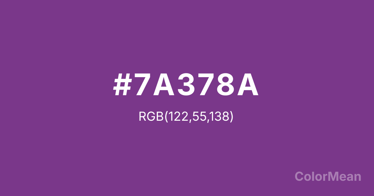
#7A378A Color Information
#7A378A RGB value is (122, 55, 138). The hex color red value is 122, green is 55, and blue is 138. Its HSL format shows a hue of 288°, saturation of 43 percent, and lightness of 38 percent. The CMYK process values are 12 percent, 60 percent, 0 percent, 46 percent.
#7A378A Color Meaning
Color #7A378A represents introspection, depth, and quiet authority. #7A378A dark purple (#7A378A) carries mystery and restraint, often linked to wisdom and internal strength. Psychologically, color #7A378A encourages inward reflection and emotional discipline. #7A378A supports deep thinking and privacy. Culturally, #7A378A appears in ceremonial design, scholarly contexts, and heritage visuals. Spiritually, #7A378A symbolizes inner knowledge, self trust, and controlled spiritual power.
Color Conversion
Convert #7A378A across different color models and formats. These conversions help designers work seamlessly between digital and print media, ensuring this color maintains its intended appearance across RGB screens, CMYK printers, and HSL color manipulations.
RGB Values & CMYK Values
RGB Values
CMYK Values
Color Variations
#7A378A harmonies come to life through carefully balanced shades, tints, and tones, giving this color depth and flexibility across light and dark variations. Shades add richness, tints bring an airy softness, and tones soften intensity, making it easy to pair in clean, modern palettes.
Color Harmonies
#7A378A harmonies create beautiful relationships with other colors based on their position on the color wheel. Each harmony type offers unique design possibilities, enabling cohesive and visually appealing color schemes.
Analogous
Colors adjacent on the color wheel (30° apart)
Complementary
Colors opposite on the color wheel (180° apart)
Split Complementary
Three colors using one base hue and the two hues beside its opposite
Triadic
Three colors evenly spaced (120° apart)
Tetradic
Four colors forming a rectangle on the wheel
Square
Four colors evenly spaced (90° apart)
Double Split
Four colors formed from two base hues and the colors next to their opposites
Monochromatic
Variations of a single hue
Contrast Checker
(WCAG 2.1) Test #7A378A for accessibility compliance against white and black backgrounds. Proper contrast ensures this color remains readable and usable for all audiences, meeting WCAG 2.1 standards for both normal and large text applications.
Sample Text
This is how your text will look with these colors.
Large Text (18pt+)
Normal Text
UI Components
Color Blindness Simulator
See how #7A378A appears to people with different types of color vision deficiencies. These simulations help create more inclusive designs that consider how this color is perceived across various visual abilities.
Normal Vision
protanopia
Note: These simulations are approximations. Actual color vision deficiency varies by individual.
CSS Examples
Background Color
Text Color
Sample Text
Border Color
Box Shadow
Text Shadow
Sample Text
Gradient
#7A378A Color FAQs
Frequently asked questions about #7A378A color meaning, symbolism, and applications. Click on any question to expand detailed answers.
