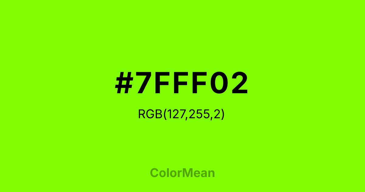
#7FFF02 Color Information
#7FFF02 RGB value is (127, 255, 2). The hex color red value is 127, green is 255, and blue is 2. Its HSL format shows a hue of 90°, saturation of 100 percent, and lightness of 50 percent. The CMYK process values are 50 percent, 0 percent, 99 percent, 0 percent.
#7FFF02 Color Meaning
Color #7FFF02(web) (#7FFF02) emits electrified optimism, digital-native vitality, and unmediated freshness. Chartreuse (web) (#7FFF02) is a pure spectral yellow-green defined by early web standards—vibrant, unblended, and optimized for CRT screens. Unlike earthy greens, #7FFF02 carries no organic restraint; unlike neon, #7FFF02 retains chromatic purity. In human vision studies, #7FFF02 specific wavelength (around 565nm) triggers the fastest neural response, making #7FFF02 ideal for critical alerts, interactive highlights, and real-time indicators. Chartreuse (web) (#7FFF02) doesn’t blend—#7FFF02 broadcasts. Functionally, Chartreuse (web) (#7FFF02) excels in digital contexts requiring split-second recognition. #7FFF02’s used in gaming interfaces, live data dashboards, and emergency notifications where delay is not an option. However, accessibility protocols demand caution: #7FFF02 fails contrast standards on white and requires shape or motion reinforcement for colorblind users. Print reproduction is challenging—CMYK dulls its voltage—so #7FFF02’s best reserved for screen-first applications. When calibrated correctly, Chartreuse (web) (#7FFF02) cuts through visual noise like few other hues. Culturally, Chartreuse (web) (#7FFF02) symbolizes the energy of the new—first leaves, startup logos, digital dawn. #7FFF02 appears in tech launches, youth activism, and renewable energy branding as a sign of systems rebooting. Spiritually, #7FFF02 aligns with the solar plexus chakra’s activated mode: confidence that acts now. Designers use Chartreuse (web) (#7FFF02) when they want to signal innovation without apology. Its power lies in its immediacy—a color that lives in the present tense.
Color Conversion
Convert #7FFF02 across different color models and formats. These conversions help designers work seamlessly between digital and print media, ensuring this color maintains its intended appearance across RGB screens, CMYK printers, and HSL color manipulations.
RGB Values & CMYK Values
RGB Values
CMYK Values
Color Variations
#7FFF02 harmonies come to life through carefully balanced shades, tints, and tones, giving this color depth and flexibility across light and dark variations. Shades add richness, tints bring an airy softness, and tones soften intensity, making it easy to pair in clean, modern palettes.
Color Harmonies
#7FFF02 harmonies create beautiful relationships with other colors based on their position on the color wheel. Each harmony type offers unique design possibilities, enabling cohesive and visually appealing color schemes.
Analogous
Colors adjacent on the color wheel (30° apart)
Complementary
Colors opposite on the color wheel (180° apart)
Split Complementary
Three colors using one base hue and the two hues beside its opposite
Triadic
Three colors evenly spaced (120° apart)
Tetradic
Four colors forming a rectangle on the wheel
Square
Four colors evenly spaced (90° apart)
Double Split
Four colors formed from two base hues and the colors next to their opposites
Monochromatic
Variations of a single hue
Contrast Checker
(WCAG 2.1) Test #7FFF02 for accessibility compliance against white and black backgrounds. Proper contrast ensures this color remains readable and usable for all audiences, meeting WCAG 2.1 standards for both normal and large text applications.
Sample Text
This is how your text will look with these colors.
Large Text (18pt+)
Normal Text
UI Components
Color Blindness Simulator
See how #7FFF02 appears to people with different types of color vision deficiencies. These simulations help create more inclusive designs that consider how this color is perceived across various visual abilities.
Normal Vision
protanopia
Note: These simulations are approximations. Actual color vision deficiency varies by individual.
CSS Examples
Background Color
Text Color
Sample Text
Border Color
Box Shadow
Text Shadow
Sample Text
Gradient
#7FFF02 Color FAQs
Frequently asked questions about #7FFF02 color meaning, symbolism, and applications. Click on any question to expand detailed answers.
