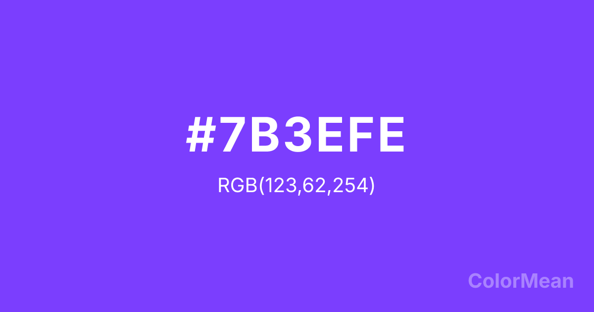
#7B3EFE Color Information
#7B3EFE RGB value is (123, 62, 254). The hex color red value is 123, green is 62, and blue is 254. Its HSL format shows a hue of 259°, saturation of 99 percent, and lightness of 62 percent. The CMYK process values are 52 percent, 76 percent, 0 percent, 0 percent.
#7B3EFE Color Meaning
Color #7B3EFE conveys the standard, referential tone of systematic digital purple, a calibrated balance of vibrancy and depth. #7B3EFE strong violet is the central definition of "purple" in its X11 series, used for primary interactive elements and consistent branding within a digital environment. Psychologically, color #7B3EFE provides reliable stimulation of creativity and individuality, fostering an atmosphere of consistent, approachable mystique and modern flair. #7B3EFE is the workhorse hue for creating a cohesive, creatively charged digital space. #7B3EFE color is confident weirdness made systematic. Symbolically, color #7B3EFE stands for the normalized extraordinary, the reliable application of creative signal. In the architecture of web colors, #7B3EFE is the baseline anchor, ensuring that the core "purple" experience is stable, reproducible, and recognizably vibrant across countless applications, from music software to gaming platforms.
Color Conversion
Convert #7B3EFE across different color models and formats. These conversions help designers work seamlessly between digital and print media, ensuring this color maintains its intended appearance across RGB screens, CMYK printers, and HSL color manipulations.
RGB Values & CMYK Values
RGB Values
CMYK Values
Color Variations
#7B3EFE harmonies come to life through carefully balanced shades, tints, and tones, giving this color depth and flexibility across light and dark variations. Shades add richness, tints bring an airy softness, and tones soften intensity, making it easy to pair in clean, modern palettes.
Color Harmonies
#7B3EFE harmonies create beautiful relationships with other colors based on their position on the color wheel. Each harmony type offers unique design possibilities, enabling cohesive and visually appealing color schemes.
Analogous
Colors adjacent on the color wheel (30° apart)
Complementary
Colors opposite on the color wheel (180° apart)
Split Complementary
Three colors using one base hue and the two hues beside its opposite
Triadic
Three colors evenly spaced (120° apart)
Tetradic
Four colors forming a rectangle on the wheel
Square
Four colors evenly spaced (90° apart)
Double Split
Four colors formed from two base hues and the colors next to their opposites
Monochromatic
Variations of a single hue
Contrast Checker
(WCAG 2.1) Test #7B3EFE for accessibility compliance against white and black backgrounds. Proper contrast ensures this color remains readable and usable for all audiences, meeting WCAG 2.1 standards for both normal and large text applications.
Sample Text
This is how your text will look with these colors.
Large Text (18pt+)
Normal Text
UI Components
Color Blindness Simulator
See how #7B3EFE appears to people with different types of color vision deficiencies. These simulations help create more inclusive designs that consider how this color is perceived across various visual abilities.
Normal Vision
protanopia
Note: These simulations are approximations. Actual color vision deficiency varies by individual.
CSS Examples
Background Color
Text Color
Sample Text
Border Color
Box Shadow
Text Shadow
Sample Text
Gradient
#7B3EFE Color FAQs
Frequently asked questions about #7B3EFE color meaning, symbolism, and applications. Click on any question to expand detailed answers.
