#778BAD Color Information
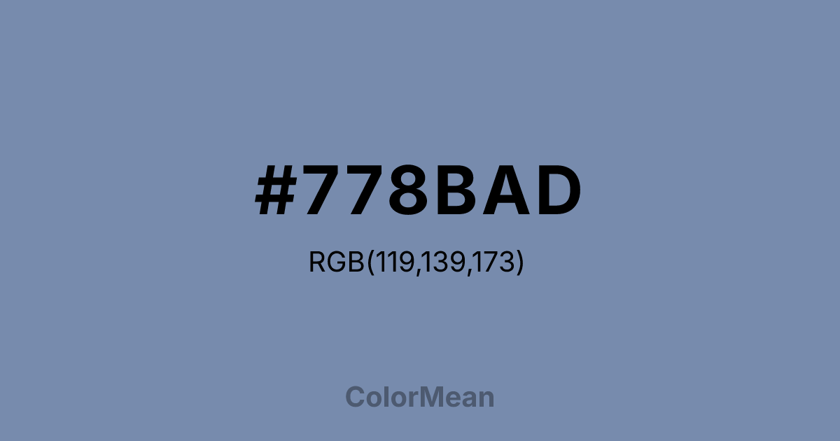
#778BAD RGB value is (119, 139, 173). The hex color red value is 119, green is 139, and blue is 173. Its HSL format shows a hue of 218°, saturation of 25 percent, and lightness of 57 percent. The CMYK process values are 31 percent, 20 percent, 0 percent, 32 percent.
#778BAD Color Meaning
Color #778BAD conveys serene focus, intellectual calm, and soft stability. #778BAD grayish-blue color #778BAD evokes cloudy skies, evening light, and gentle calm. Psychologically, #778BAD promotes concentration, emotional equilibrium, and reflective thinking, fostering measured decision-making. Culturally, color #778BAD is used in professional design, corporate branding, and contemporary interiors, symbolizing reliability, subtle sophistication, and quiet authority. Spiritually, #778BAD channels clarity, introspection, and calm awareness, supporting peaceful thought and mindful engagement. Its subdued blue-gray hue balances tranquility with intellectual focus.
Color Conversion
Convert #778BAD across different color models and formats. These conversions help designers work seamlessly between digital and print media, ensuring this color maintains its intended appearance across RGB screens, CMYK printers, and HSL color manipulations.
RGB Values & CMYK Values
RGB Values
CMYK Values
Color Variations
#778BAD harmonies come to life through carefully balanced shades, tints, and tones, giving this color depth and flexibility across light and dark variations. Shades add richness, tints bring an airy softness, and tones soften intensity, making it easy to pair in clean, modern palettes.
Color Harmonies
#778BAD harmonies create beautiful relationships with other colors based on their position on the color wheel. Each harmony type offers unique design possibilities, enabling cohesive and visually appealing color schemes.
Analogous
Colors adjacent on the color wheel (30° apart)
Complementary
Colors opposite on the color wheel (180° apart)
Split Complementary
Three colors using one base hue and the two hues beside its opposite
Triadic
Three colors evenly spaced (120° apart)
Tetradic
Four colors forming a rectangle on the wheel
Square
Four colors evenly spaced (90° apart)
Double Split
Four colors formed from two base hues and the colors next to their opposites
Monochromatic
Variations of a single hue
Contrast Checker
(WCAG 2.1) Test #778BAD for accessibility compliance against white and black backgrounds. Proper contrast ensures this color remains readable and usable for all audiences, meeting WCAG 2.1 standards for both normal and large text applications.
Sample Text
This is how your text will look with these colors.
Large Text (18pt+)
Normal Text
UI Components
Color Blindness Simulator
See how #778BAD appears to people with different types of color vision deficiencies. These simulations help create more inclusive designs that consider how this color is perceived across various visual abilities.
Normal Vision
protanopia
Note: These simulations are approximations. Actual color vision deficiency varies by individual.
CSS Examples
Background Color
Text Color
Sample Text
Border Color
Box Shadow
Text Shadow
Sample Text
Gradient
#778BAD Color FAQs
Frequently asked questions about #778BAD color meaning, symbolism, and applications. Click on any question to expand detailed answers.

