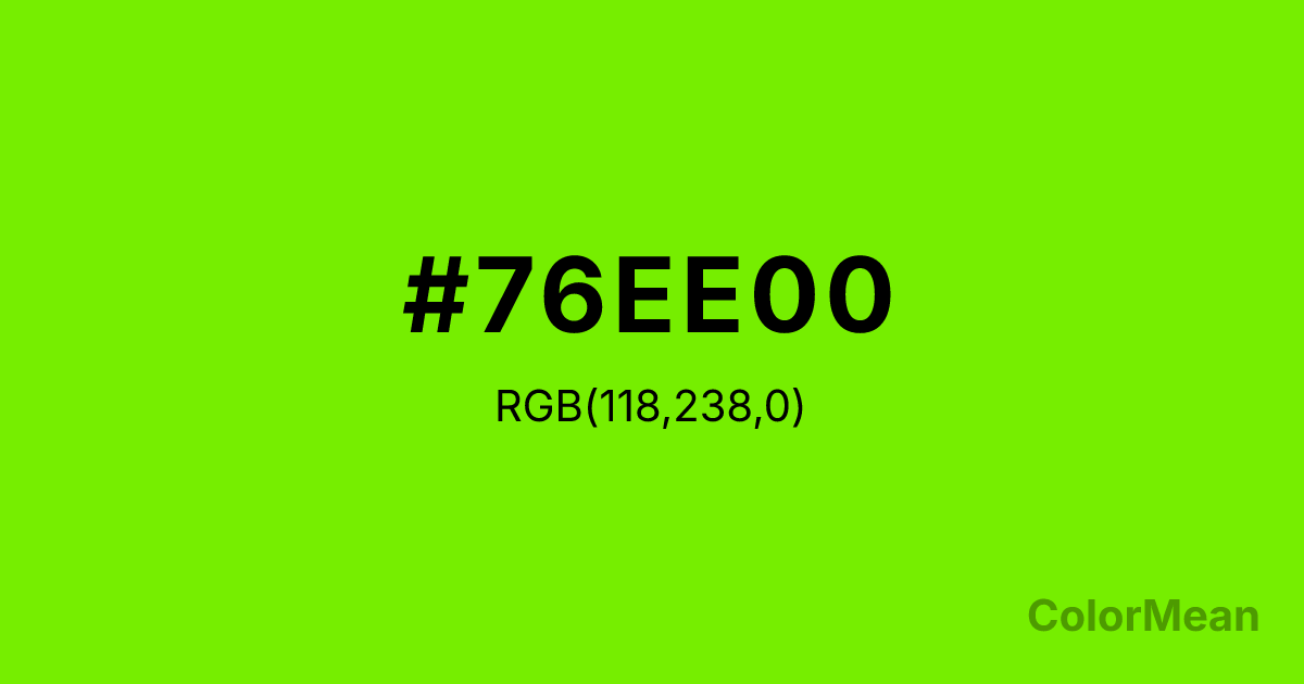
Chartreuse2 (#76EE00) Color Information
Chartreuse2 (#76EE00) RGB value is (118, 238, 0). The hex color red value is 118, green is 238, and blue is 0. Its HSL format shows a hue of 90°, saturation of 100 percent, and lightness of 47 percent. The CMYK process values are 50 percent, 0 percent, 100 percent, 7 percent.
Chartreuse2 (#76EE00) Color Meaning
Chartreuse2 (#76EE00) balances luminous energy with controlled vibrancy, offering digital clarity without visual fatigue. Chartreuse2 (#76EE00) is a slightly desaturated variant of pure chartreuse—bright enough to command attention, muted enough to sustain it. Developed as part of the X11 color palette, it bridges the gap between print feasibility and screen brilliance. In UI design, this hue increases user engagement in productivity apps by signaling “active” states without inducing anxiety. Cognitive load research shows it improves task-switching speed when used for interactive elements. In branding, Chartreuse2 (#76EE00) signals eco-innovation with realism. It appears in clean-tech, urban mobility, and sustainable fashion where “green” must feel dynamic, not decorative. Digital rendering is stable across LCD and OLED screens, though designers often reduce brightness on mobile to prevent glare. Print use requires coated stock for fidelity, but even then, it serves better as an accent than a field color. Consumer testing reveals higher trust in brands using Chartreuse2 (#76EE00) versus brighter greens—likely due to its perceived balance. Symbolically, Chartreuse2 (#76EE00) represents growth that’s measured, not manic. It is the color of sprouts under grow lights, electric bike lanes, and coded progress. In spiritual practice, it mirrors the heart and solar plexus in tandem: care that builds. Designers choose Chartreuse2 (#76EE00) when they want to signal vitality with responsibility. Its energy is harnessed, not wild.
Color Conversion
Convert Chartreuse2 (#76EE00) across different color models and formats. These conversions help designers work seamlessly between digital and print media, ensuring this color maintains its intended appearance across RGB screens, CMYK printers, and HSL color manipulations.
RGB Values & CMYK Values
RGB Values
CMYK Values
Color Variations
Chartreuse2 (#76EE00) harmonies come to life through carefully balanced shades, tints, and tones, giving this color depth and flexibility across light and dark variations. Shades add richness, tints bring an airy softness, and tones soften intensity, making it easy to pair in clean, modern palettes.
Color Harmonies
Chartreuse2 (#76EE00) harmonies create beautiful relationships with other colors based on their position on the color wheel. Each harmony type offers unique design possibilities, enabling cohesive and visually appealing color schemes.
Analogous
Colors adjacent on the color wheel (30° apart)
Complementary
Colors opposite on the color wheel (180° apart)
Split Complementary
Three colors using one base hue and the two hues beside its opposite
Triadic
Three colors evenly spaced (120° apart)
Tetradic
Four colors forming a rectangle on the wheel
Square
Four colors evenly spaced (90° apart)
Double Split
Four colors formed from two base hues and the colors next to their opposites
Monochromatic
Variations of a single hue
Contrast Checker
(WCAG 2.1) Test Chartreuse2 (#76EE00) for accessibility compliance against white and black backgrounds. Proper contrast ensures this color remains readable and usable for all audiences, meeting WCAG 2.1 standards for both normal and large text applications.
Sample Text
This is how your text will look with these colors.
Large Text (18pt+)
Normal Text
UI Components
Color Blindness Simulator
See how #76EE00 appears to people with different types of color vision deficiencies. These simulations help create more inclusive designs that consider how this color is perceived across various visual abilities.
Normal Vision
protanopia
Note: These simulations are approximations. Actual color vision deficiency varies by individual.
CSS Examples
Background Color
Text Color
Sample Text
Border Color
Box Shadow
Text Shadow
Sample Text
Gradient
Chartreuse2 (#76EE00) Color FAQs
Frequently asked questions about Chartreuse2 (#76EE00) color meaning, symbolism, and applications. Click on any question to expand detailed answers.
