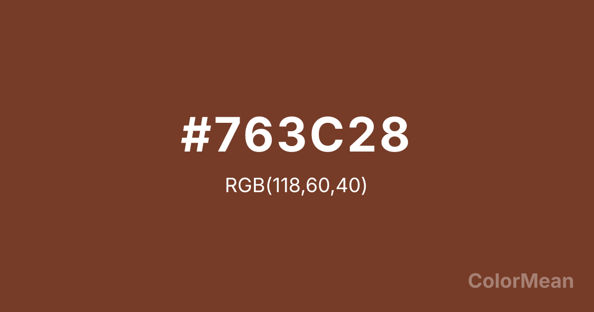
Pearl Copper (#763C28) Color Information
Pearl Copper (#763C28) RGB value is (118, 60, 40). The hex color red value is 118, green is 60, and blue is 40. Its HSL format shows a hue of 15°, saturation of 49 percent, and lightness of 31 percent. The CMYK process values are 0 percent, 49 percent, 66 percent, 54 percent.
Pearl Copper (#763C28) Color Meaning
Pearl Copper (#763C28) embodies earthy richness, aged warmth, and historical substance. This deep, reddish-brown mimics oxidized copper, evoking archaeological artifacts, vintage cookware, and autumn forests. Psychologically, Pearl Copper (#763C28) is grounding and enriching, promoting feelings of durability, heritage, and organic resilience. It stimulates a connection to craftsmanship and natural processes, offering a sense of warmth that is earned and enduring rather than bright and immediate. This color feels both protective and storied. Culturally, Pearl Copper (#763C28) is linked to traditional metalsmithing, rustic decor, and historical reenactment, symbolizing handmade quality, functional beauty, and a direct link to the past. Symbolically, it represents the alchemy of time and element, value formed through use and exposure, and warmth that emanates from within a solid material. Pearl Copper (#763C28) acts as a visual anchor, connecting contemporary design to a sense of timeless, tangible authenticity.
Color Conversion
Convert Pearl Copper (#763C28) across different color models and formats. These conversions help designers work seamlessly between digital and print media, ensuring this color maintains its intended appearance across RGB screens, CMYK printers, and HSL color manipulations.
RGB Values & CMYK Values
RGB Values
CMYK Values
Color Variations
Pearl Copper (#763C28) harmonies come to life through carefully balanced shades, tints, and tones, giving this color depth and flexibility across light and dark variations. Shades add richness, tints bring an airy softness, and tones soften intensity, making it easy to pair in clean, modern palettes.
Color Harmonies
Pearl Copper (#763C28) harmonies create beautiful relationships with other colors based on their position on the color wheel. Each harmony type offers unique design possibilities, enabling cohesive and visually appealing color schemes.
Analogous
Colors adjacent on the color wheel (30° apart)
Complementary
Colors opposite on the color wheel (180° apart)
Split Complementary
Three colors using one base hue and the two hues beside its opposite
Triadic
Three colors evenly spaced (120° apart)
Tetradic
Four colors forming a rectangle on the wheel
Square
Four colors evenly spaced (90° apart)
Double Split
Four colors formed from two base hues and the colors next to their opposites
Monochromatic
Variations of a single hue
Contrast Checker
(WCAG 2.1) Test Pearl Copper (#763C28) for accessibility compliance against white and black backgrounds. Proper contrast ensures this color remains readable and usable for all audiences, meeting WCAG 2.1 standards for both normal and large text applications.
Sample Text
This is how your text will look with these colors.
Large Text (18pt+)
Normal Text
UI Components
Color Blindness Simulator
See how #763C28 appears to people with different types of color vision deficiencies. These simulations help create more inclusive designs that consider how this color is perceived across various visual abilities.
Normal Vision
protanopia
Note: These simulations are approximations. Actual color vision deficiency varies by individual.
CSS Examples
Background Color
Text Color
Sample Text
Border Color
Box Shadow
Text Shadow
Sample Text
Gradient
Pearl Copper (#763C28) Color FAQs
Frequently asked questions about Pearl Copper (#763C28) color meaning, symbolism, and applications. Click on any question to expand detailed answers.

