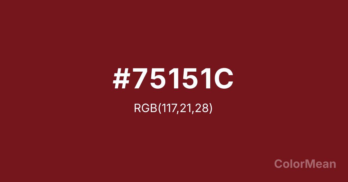
#75151C Color Information
#75151C RGB value is (117, 21, 28). The hex color red value is 117, green is 21, and blue is 28. Its HSL format shows a hue of 356°, saturation of 70 percent, and lightness of 27 percent. The CMYK process values are 0 percent, 82 percent, 76 percent, 54 percent.
#75151C Color Meaning
Color #75151C conveys a dark, somber fusion of passion and gravity, suggesting blood dried to a blackish crimson or wine left to age into profundity. #75151C very dark, brownish red sits on the threshold where red becomes burgundy, evoking aged leather, volcanic rock, and the quiet aftermath of intense emotion. Psychologically, color #75151C is weighty, introspective, and resonant, promoting feelings of deep, settled passion, mature grief, or solemn commitment. #75151C offers the warmth of red grounded by the solemnity of purple and brown. #75151C color is a vow made in shadow. Symbolically, color #75151C represents the roots of desire, love that has known darkness, and power that is ancient, quiet, and formidable. #75151C is the color of a king’s private chamber or the earth that has absorbed centuries of struggle. Culturally, #75151C appears in contexts of heritage, luxury, and somber drama, conveying a sense of rich history, enduring strength, and complex, sometimes tragic, beauty. #75151C is the color of a story that is old, deep, and far from simple.
Color Conversion
Convert #75151C across different color models and formats. These conversions help designers work seamlessly between digital and print media, ensuring this color maintains its intended appearance across RGB screens, CMYK printers, and HSL color manipulations.
RGB Values & CMYK Values
RGB Values
CMYK Values
Color Variations
#75151C harmonies come to life through carefully balanced shades, tints, and tones, giving this color depth and flexibility across light and dark variations. Shades add richness, tints bring an airy softness, and tones soften intensity, making it easy to pair in clean, modern palettes.
Color Harmonies
#75151C harmonies create beautiful relationships with other colors based on their position on the color wheel. Each harmony type offers unique design possibilities, enabling cohesive and visually appealing color schemes.
Analogous
Colors adjacent on the color wheel (30° apart)
Complementary
Colors opposite on the color wheel (180° apart)
Split Complementary
Three colors using one base hue and the two hues beside its opposite
Triadic
Three colors evenly spaced (120° apart)
Tetradic
Four colors forming a rectangle on the wheel
Square
Four colors evenly spaced (90° apart)
Double Split
Four colors formed from two base hues and the colors next to their opposites
Monochromatic
Variations of a single hue
Contrast Checker
(WCAG 2.1) Test #75151C for accessibility compliance against white and black backgrounds. Proper contrast ensures this color remains readable and usable for all audiences, meeting WCAG 2.1 standards for both normal and large text applications.
Sample Text
This is how your text will look with these colors.
Large Text (18pt+)
Normal Text
UI Components
Color Blindness Simulator
See how #75151C appears to people with different types of color vision deficiencies. These simulations help create more inclusive designs that consider how this color is perceived across various visual abilities.
Normal Vision
protanopia
Note: These simulations are approximations. Actual color vision deficiency varies by individual.
CSS Examples
Background Color
Text Color
Sample Text
Border Color
Box Shadow
Text Shadow
Sample Text
Gradient
#75151C Color FAQs
Frequently asked questions about #75151C color meaning, symbolism, and applications. Click on any question to expand detailed answers.
