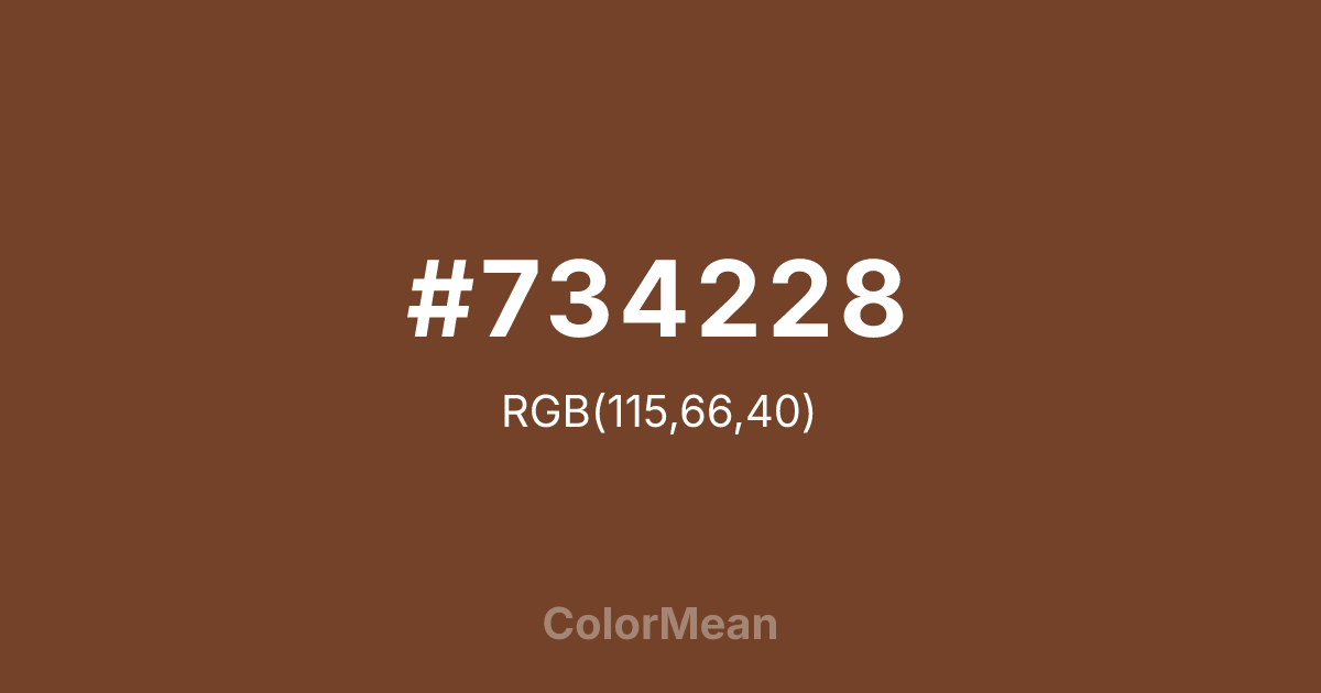
#734228 Color Information
#734228 RGB value is (115, 66, 40). The hex color red value is 115, green is 66, and blue is 40. Its HSL format shows a hue of 21°, saturation of 48 percent, and lightness of 30 percent. The CMYK process values are 0 percent, 43 percent, 65 percent, 55 percent.
#734228 Color Meaning
Color #734228 conveys earthen authenticity, tactile warmth, and unrefined grounding. Color #734228 is a deep, reddish brown that mirrors sun-baked adobe, hand-formed pottery, and raw soil—dense, warm, and slightly granular. Unlike chocolate or coffee browns, #734228 carries the mineral grit of the earth itself. In biophilic design, #734228 hue reduces stress by evoking direct contact with natural materials, especially in interiors using plaster, terracotta, or unglazed ceramics. Psychological studies link such warm, low-chroma earth tones to increased feelings of safety and belonging in communal spaces. Functionally, color #734228 serves as a grounding anchor in artisanal and heritage branding. #734228 pairs powerfully with cream, olive, and sky blue, creating palettes that feel rooted yet breathable. Digital use is strong in dark-mode interfaces and editorial layouts, where #734228 provides excellent contrast against off-whites without the harshness of black. Print reproduction is superb on uncoated and textured stocks, enhancing its tactile credibility. Consumer research shows products framed in color #734228 are perceived as more handcrafted and locally sourced than those in cooler browns. Symbolically, color #734228 represents creation that begins with the ground. #734228 is the color of hands shaping vessels, walls rising from dust, and traditions formed by place. In spiritual practice, #734228 aligns with the root chakra’s foundational mode: stability through connection to land. Designers choose color #734228 when they want to signal authenticity without artifice. Its warmth is honest—not polished, but present.
Color Conversion
Convert #734228 across different color models and formats. These conversions help designers work seamlessly between digital and print media, ensuring this color maintains its intended appearance across RGB screens, CMYK printers, and HSL color manipulations.
RGB Values & CMYK Values
RGB Values
CMYK Values
Color Variations
#734228 harmonies come to life through carefully balanced shades, tints, and tones, giving this color depth and flexibility across light and dark variations. Shades add richness, tints bring an airy softness, and tones soften intensity, making it easy to pair in clean, modern palettes.
Color Harmonies
#734228 harmonies create beautiful relationships with other colors based on their position on the color wheel. Each harmony type offers unique design possibilities, enabling cohesive and visually appealing color schemes.
Analogous
Colors adjacent on the color wheel (30° apart)
Complementary
Colors opposite on the color wheel (180° apart)
Split Complementary
Three colors using one base hue and the two hues beside its opposite
Triadic
Three colors evenly spaced (120° apart)
Tetradic
Four colors forming a rectangle on the wheel
Square
Four colors evenly spaced (90° apart)
Double Split
Four colors formed from two base hues and the colors next to their opposites
Monochromatic
Variations of a single hue
Contrast Checker
(WCAG 2.1) Test #734228 for accessibility compliance against white and black backgrounds. Proper contrast ensures this color remains readable and usable for all audiences, meeting WCAG 2.1 standards for both normal and large text applications.
Sample Text
This is how your text will look with these colors.
Large Text (18pt+)
Normal Text
UI Components
Color Blindness Simulator
See how #734228 appears to people with different types of color vision deficiencies. These simulations help create more inclusive designs that consider how this color is perceived across various visual abilities.
Normal Vision
protanopia
Note: These simulations are approximations. Actual color vision deficiency varies by individual.
CSS Examples
Background Color
Text Color
Sample Text
Border Color
Box Shadow
Text Shadow
Sample Text
Gradient
#734228 Color FAQs
Frequently asked questions about #734228 color meaning, symbolism, and applications. Click on any question to expand detailed answers.
