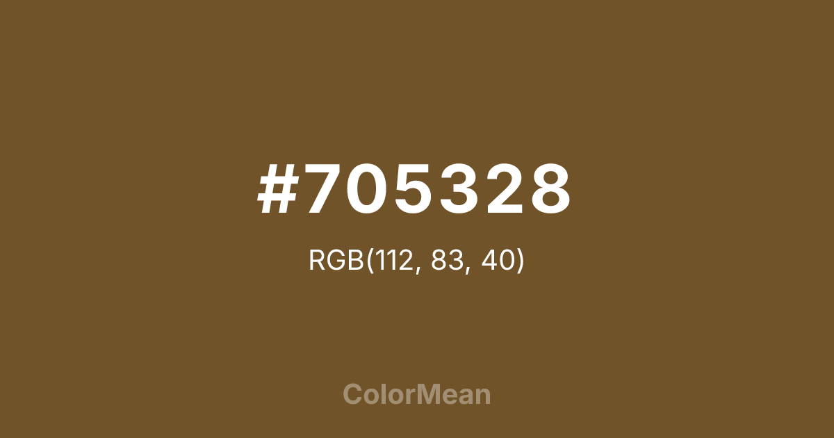
#705328 Color Information
#705328 RGB value is (112, 83, 40). The hex color red value is 112, green is 83, and blue is 40. Its HSL format shows a hue of 36°, saturation of 47 percent, and lightness of 30 percent. The CMYK process values are 0 percent, 26 percent, 64 percent, 56 percent.
#705328 Color Meaning
Color #705328 merges forest shadow with desert earth. #705328 deep, muted brown-green evokes leather straps, sun-baked trails, and weathered field gear—suggesting durability through exposure, not polish. Color #705328 avoids the sterility of gray and the sweetness of tan, landing in a zone of seasoned utility. Designers use color #705328 in outdoor apparel, heritage tooling, and minimalist interiors where authenticity matters more than brightness. Neuroaesthetic studies show that low-chroma warm neutrals like color #705328 reduce cognitive load in complex environments, allowing texture and form to take precedence. Culturally, #705328 references expedition history, artisan workshops, and regenerative land practices. Paired with bone white or rust, color #705328 creates palettes that feel excavated, not designed—rooted in use, not trend.
Color Conversion
Convert #705328 across different color models and formats. These conversions help designers work seamlessly between digital and print media, ensuring this color maintains its intended appearance across RGB screens, CMYK printers, and HSL color manipulations.
RGB Values & CMYK Values
RGB Values
CMYK Values
Color Variations
#705328 harmonies come to life through carefully balanced shades, tints, and tones, giving this color depth and flexibility across light and dark variations. Shades add richness, tints bring an airy softness, and tones soften intensity, making it easy to pair in clean, modern palettes.
Color Harmonies
#705328 harmonies create beautiful relationships with other colors based on their position on the color wheel. Each harmony type offers unique design possibilities, enabling cohesive and visually appealing color schemes.
Analogous
Colors adjacent on the color wheel (30° apart)
Complementary
Colors opposite on the color wheel (180° apart)
Split Complementary
Three colors using one base hue and the two hues beside its opposite
Triadic
Three colors evenly spaced (120° apart)
Tetradic
Four colors forming a rectangle on the wheel
Square
Four colors evenly spaced (90° apart)
Double Split
Four colors formed from two base hues and the colors next to their opposites
Monochromatic
Variations of a single hue
Contrast Checker
(WCAG 2.1) Test #705328 for accessibility compliance against white and black backgrounds. Proper contrast ensures this color remains readable and usable for all audiences, meeting WCAG 2.1 standards for both normal and large text applications.
Sample Text
This is how your text will look with these colors.
Large Text (18pt+)
Normal Text
UI Components
Color Blindness Simulator
See how #705328 appears to people with different types of color vision deficiencies. These simulations help create more inclusive designs that consider how this color is perceived across various visual abilities.
Normal Vision
protanopia
Note: These simulations are approximations. Actual color vision deficiency varies by individual.
CSS Examples
Background Color
Text Color
Sample Text
Border Color
Box Shadow
Text Shadow
Sample Text
Gradient
#705328 Color FAQs
Frequently asked questions about #705328 color meaning, symbolism, and applications. Click on any question to expand detailed answers.

