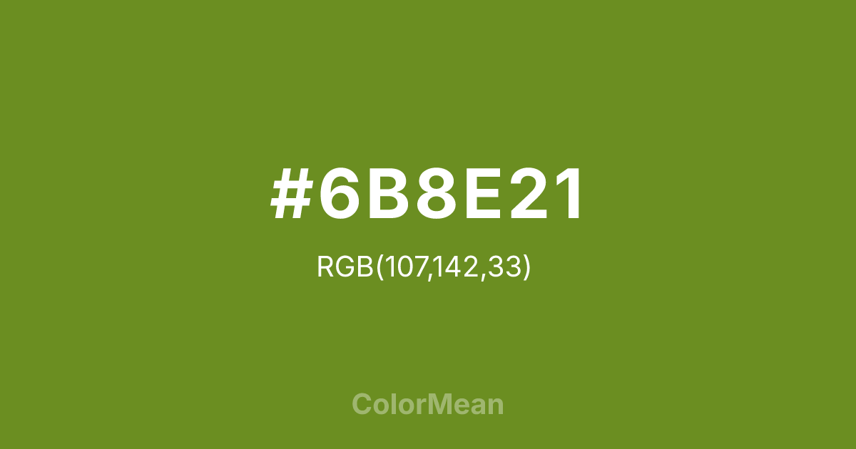
#6B8E21 Color Information
#6B8E21 RGB value is (107, 142, 33). The hex color red value is 107, green is 142, and blue is 33. Its HSL format shows a hue of 79°, saturation of 62 percent, and lightness of 34 percent. The CMYK process values are 25 percent, 0 percent, 77 percent, 44 percent.
#6B8E21 Color Meaning
Color #6B8E21 stands as the archetype of functional green. Nearly identical to Olive Drab (#6B8E21)—a naming variant rooted in military standardization—color #6B8E21 carries decades of association with readiness, concealment, and field-tested resilience. Color #6B8E21 is not decorative; #6B8E21 is operational. #6B8E21 specific hue was engineered for visual disruption in temperate forests, and that legacy informs its modern use in outdoor gear, survival tech, and utilitarian fashion. Color #6B8E21 provides moderate contrast against earth and foliage while avoiding the psychological sharpness of brighter greens. Color #6B8E21 calms through utility, not aesthetics. Today, brands repurpose color #6B8E21 to signal eco-pragmatism—rejecting “greenwashing” in favor of proven durability. When paired with canvas beige or matte black, color #6B8E21 creates a visual language of preparedness without paranoia. Color #6B8E21 doesn’t promise safety; #6B8E21 assumes responsibility for #6B8E21.
Color Conversion
Convert #6B8E21 across different color models and formats. These conversions help designers work seamlessly between digital and print media, ensuring this color maintains its intended appearance across RGB screens, CMYK printers, and HSL color manipulations.
RGB Values & CMYK Values
RGB Values
CMYK Values
Color Variations
#6B8E21 harmonies come to life through carefully balanced shades, tints, and tones, giving this color depth and flexibility across light and dark variations. Shades add richness, tints bring an airy softness, and tones soften intensity, making it easy to pair in clean, modern palettes.
Color Harmonies
#6B8E21 harmonies create beautiful relationships with other colors based on their position on the color wheel. Each harmony type offers unique design possibilities, enabling cohesive and visually appealing color schemes.
Analogous
Colors adjacent on the color wheel (30° apart)
Complementary
Colors opposite on the color wheel (180° apart)
Split Complementary
Three colors using one base hue and the two hues beside its opposite
Triadic
Three colors evenly spaced (120° apart)
Tetradic
Four colors forming a rectangle on the wheel
Square
Four colors evenly spaced (90° apart)
Double Split
Four colors formed from two base hues and the colors next to their opposites
Monochromatic
Variations of a single hue
Contrast Checker
(WCAG 2.1) Test #6B8E21 for accessibility compliance against white and black backgrounds. Proper contrast ensures this color remains readable and usable for all audiences, meeting WCAG 2.1 standards for both normal and large text applications.
Sample Text
This is how your text will look with these colors.
Large Text (18pt+)
Normal Text
UI Components
Color Blindness Simulator
See how #6B8E21 appears to people with different types of color vision deficiencies. These simulations help create more inclusive designs that consider how this color is perceived across various visual abilities.
Normal Vision
protanopia
Note: These simulations are approximations. Actual color vision deficiency varies by individual.
CSS Examples
Background Color
Text Color
Sample Text
Border Color
Box Shadow
Text Shadow
Sample Text
Gradient
#6B8E21 Color FAQs
Frequently asked questions about #6B8E21 color meaning, symbolism, and applications. Click on any question to expand detailed answers.

