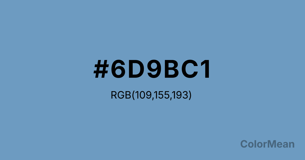
#6D9BC1 Color Information
#6D9BC1 RGB value is (109, 155, 193). The hex color red value is 109, green is 155, and blue is 193. Its HSL format shows a hue of 207°, saturation of 40 percent, and lightness of 59 percent. The CMYK process values are 44 percent, 20 percent, 0 percent, 24 percent.
#6D9BC1 Color Meaning
Color #6D9BC1 suggests softened intellect, accessible calm, and atmospheric neutrality. Color #6D9BC1 is a desaturated blue with grey and subtle lavender undertones—evoking morning mist over calm water or frosted glass in institutional architecture. Unlike vibrant ceruleans, #6D9BC1 avoids dominance, favoring instead a tone of gentle clarity. In workplace psychology, such muted blues reduce perceived cognitive load in collaborative environments, making them ideal for shared digital workspaces and hybrid learning platforms. Color #6D9BC1 doesn’t command attention—#6D9BC1 invites focus. Functionally, color #6D9BC1 excels as a background or secondary hue in user interfaces where neutrality must still feel human. #6D9BC1 pairs effortlessly with warm greys, soft whites, and muted greens, creating palettes that feel modern without sterility. Digital accessibility tests confirm #6D9BC1 meets AA contrast standards when used with deep charcoal or navy text. Print reproduction is consistent across uncoated stocks, enhancing its use in editorial and educational publishing. Consumer studies show higher comfort ratings for dashboards using color #6D9BC1 versus pure greys. Symbolically, color #6D9BC1 represents thought that breathes. #6D9BC1 is not the blue of rigid logic but of flexible understanding. In spiritual contexts, #6D9BC1 mirrors the throat chakra’s receptive mode: listening as a form of clarity. Designers choose color #6D9BC1 when they want to signal openness without fragility. Its strength lies in its softness—a color that holds space for others to think.
Color Conversion
Convert #6D9BC1 across different color models and formats. These conversions help designers work seamlessly between digital and print media, ensuring this color maintains its intended appearance across RGB screens, CMYK printers, and HSL color manipulations.
RGB Values & CMYK Values
RGB Values
CMYK Values
Color Variations
#6D9BC1 harmonies come to life through carefully balanced shades, tints, and tones, giving this color depth and flexibility across light and dark variations. Shades add richness, tints bring an airy softness, and tones soften intensity, making it easy to pair in clean, modern palettes.
Color Harmonies
#6D9BC1 harmonies create beautiful relationships with other colors based on their position on the color wheel. Each harmony type offers unique design possibilities, enabling cohesive and visually appealing color schemes.
Analogous
Colors adjacent on the color wheel (30° apart)
Complementary
Colors opposite on the color wheel (180° apart)
Split Complementary
Three colors using one base hue and the two hues beside its opposite
Triadic
Three colors evenly spaced (120° apart)
Tetradic
Four colors forming a rectangle on the wheel
Square
Four colors evenly spaced (90° apart)
Double Split
Four colors formed from two base hues and the colors next to their opposites
Monochromatic
Variations of a single hue
Contrast Checker
(WCAG 2.1) Test #6D9BC1 for accessibility compliance against white and black backgrounds. Proper contrast ensures this color remains readable and usable for all audiences, meeting WCAG 2.1 standards for both normal and large text applications.
Sample Text
This is how your text will look with these colors.
Large Text (18pt+)
Normal Text
UI Components
Color Blindness Simulator
See how #6D9BC1 appears to people with different types of color vision deficiencies. These simulations help create more inclusive designs that consider how this color is perceived across various visual abilities.
Normal Vision
protanopia
Note: These simulations are approximations. Actual color vision deficiency varies by individual.
CSS Examples
Background Color
Text Color
Sample Text
Border Color
Box Shadow
Text Shadow
Sample Text
Gradient
#6D9BC1 Color FAQs
Frequently asked questions about #6D9BC1 color meaning, symbolism, and applications. Click on any question to expand detailed answers.
