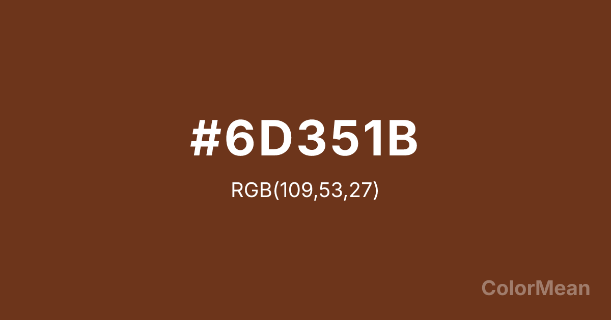
#6D351B Color Information
#6D351B RGB value is (109, 53, 27). The hex color red value is 109, green is 53, and blue is 27. Its HSL format shows a hue of 19°, saturation of 60 percent, and lightness of 27 percent. The CMYK process values are 0 percent, 51 percent, 75 percent, 57 percent.
#6D351B Color Meaning
Color #6D351B embodies autumnal depth, quiet intensity, and earth-rooted warmth. #6D351B rich reddish-brown draws from fallen leaves and polished walnut, suggesting maturity without decay. Psychologically, color #6D351B creates a sense of shelter—#6D351B feels protective, intimate, and inherently stable. Designers use #6D351B in heritage publishing, luxury leather goods, and academic branding where knowledge is conveyed through texture, not just text. Historically tied to natural dyes and forest pigments, #6D351B avoids synthetic vibrancy in favor of organic resonance. Spiritually, #6D351B represents transformation that honors the past—change that composts rather than discards. Use color #6D351B when your message must feel lived in, not launched, and your audience values legacy over novelty.
Color Conversion
Convert #6D351B across different color models and formats. These conversions help designers work seamlessly between digital and print media, ensuring this color maintains its intended appearance across RGB screens, CMYK printers, and HSL color manipulations.
RGB Values & CMYK Values
RGB Values
CMYK Values
Color Variations
#6D351B harmonies come to life through carefully balanced shades, tints, and tones, giving this color depth and flexibility across light and dark variations. Shades add richness, tints bring an airy softness, and tones soften intensity, making it easy to pair in clean, modern palettes.
Color Harmonies
#6D351B harmonies create beautiful relationships with other colors based on their position on the color wheel. Each harmony type offers unique design possibilities, enabling cohesive and visually appealing color schemes.
Analogous
Colors adjacent on the color wheel (30° apart)
Complementary
Colors opposite on the color wheel (180° apart)
Split Complementary
Three colors using one base hue and the two hues beside its opposite
Triadic
Three colors evenly spaced (120° apart)
Tetradic
Four colors forming a rectangle on the wheel
Square
Four colors evenly spaced (90° apart)
Double Split
Four colors formed from two base hues and the colors next to their opposites
Monochromatic
Variations of a single hue
Contrast Checker
(WCAG 2.1) Test #6D351B for accessibility compliance against white and black backgrounds. Proper contrast ensures this color remains readable and usable for all audiences, meeting WCAG 2.1 standards for both normal and large text applications.
Sample Text
This is how your text will look with these colors.
Large Text (18pt+)
Normal Text
UI Components
Color Blindness Simulator
See how #6D351B appears to people with different types of color vision deficiencies. These simulations help create more inclusive designs that consider how this color is perceived across various visual abilities.
Normal Vision
protanopia
Note: These simulations are approximations. Actual color vision deficiency varies by individual.
CSS Examples
Background Color
Text Color
Sample Text
Border Color
Box Shadow
Text Shadow
Sample Text
Gradient
#6D351B Color FAQs
Frequently asked questions about #6D351B color meaning, symbolism, and applications. Click on any question to expand detailed answers.
