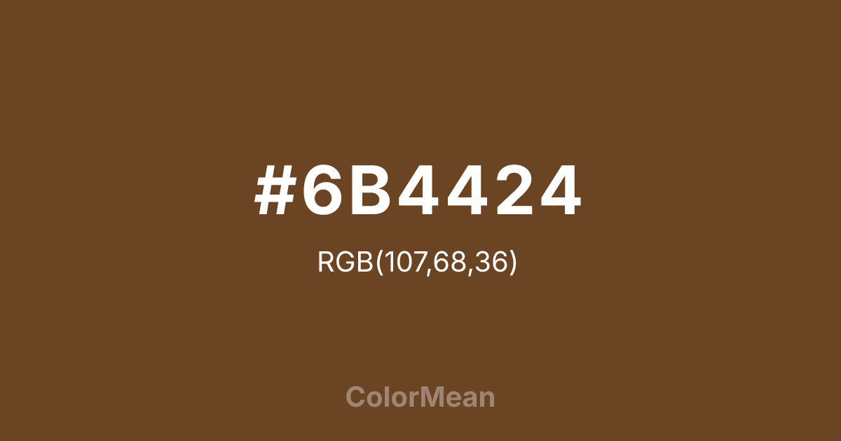
#6B4424 Color Information
#6B4424 RGB value is (107, 68, 36). The hex color red value is 107, green is 68, and blue is 36. Its HSL format shows a hue of 27°, saturation of 50 percent, and lightness of 28 percent. The CMYK process values are 0 percent, 36 percent, 66 percent, 58 percent.
#6B4424 Color Meaning
Color #6B4424 embodies meditative austerity, tea-stained silence, and disciplined simplicity. Named after Japanese brown tea (#6B4424), #6B4424 warm, near-black brown (RGB 107, 68, 35) mirrors matcha froth, roasted barley, and unglazed pottery. Color #6B4424 rejects ornament—its value lies in texture, not vibrancy. Designers use #6B4424 in wabi-sabi interiors, minimalist typography, and ceramic branding to evoke quiet reverence. Psychologically, color #6B4424 lowers visual stimulation, supporting mindfulness and deliberate action. Unlike stark black, #6B4424 absorbs light with warmth, reducing eye strain in print and screen media. Culturally, #6B4424 ties to Zen tea ceremonies, where every shade reflects intentionality—no color is accidental. Symbolically, color #6B4424 represents humility as strength. #6B4424’s the color of hands that work slowly, tools that age gracefully, and moments observed without commentary. In branding, #6B4424 signals heritage through restraint—not legacy through loudness.
Color Conversion
Convert #6B4424 across different color models and formats. These conversions help designers work seamlessly between digital and print media, ensuring this color maintains its intended appearance across RGB screens, CMYK printers, and HSL color manipulations.
RGB Values & CMYK Values
RGB Values
CMYK Values
Color Variations
#6B4424 harmonies come to life through carefully balanced shades, tints, and tones, giving this color depth and flexibility across light and dark variations. Shades add richness, tints bring an airy softness, and tones soften intensity, making it easy to pair in clean, modern palettes.
Color Harmonies
#6B4424 harmonies create beautiful relationships with other colors based on their position on the color wheel. Each harmony type offers unique design possibilities, enabling cohesive and visually appealing color schemes.
Analogous
Colors adjacent on the color wheel (30° apart)
Complementary
Colors opposite on the color wheel (180° apart)
Split Complementary
Three colors using one base hue and the two hues beside its opposite
Triadic
Three colors evenly spaced (120° apart)
Tetradic
Four colors forming a rectangle on the wheel
Square
Four colors evenly spaced (90° apart)
Double Split
Four colors formed from two base hues and the colors next to their opposites
Monochromatic
Variations of a single hue
Contrast Checker
(WCAG 2.1) Test #6B4424 for accessibility compliance against white and black backgrounds. Proper contrast ensures this color remains readable and usable for all audiences, meeting WCAG 2.1 standards for both normal and large text applications.
Sample Text
This is how your text will look with these colors.
Large Text (18pt+)
Normal Text
UI Components
Color Blindness Simulator
See how #6B4424 appears to people with different types of color vision deficiencies. These simulations help create more inclusive designs that consider how this color is perceived across various visual abilities.
Normal Vision
protanopia
Note: These simulations are approximations. Actual color vision deficiency varies by individual.
CSS Examples
Background Color
Text Color
Sample Text
Border Color
Box Shadow
Text Shadow
Sample Text
Gradient
#6B4424 Color FAQs
Frequently asked questions about #6B4424 color meaning, symbolism, and applications. Click on any question to expand detailed answers.

