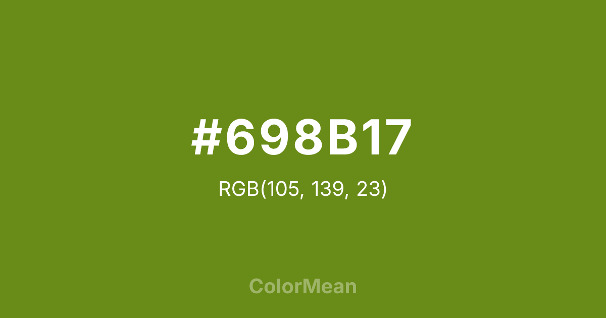
#698B17 Color Information
#698B17 RGB value is (105, 139, 23). The hex color red value is 105, green is 139, and blue is 23. Its HSL format shows a hue of 78°, saturation of 72 percent, and lightness of 32 percent. The CMYK process values are 24 percent, 0 percent, 83 percent, 45 percent.
#698B17 Color Meaning
Color #698B17 returns to the roots of camouflage. Darker and more saturated than standard Olive Drab (#6B8E23), color #698B17 carries a stronger yellow undertone that enhances contrast in shadowed environments. Color #698B17 was designed for precision in low-light field conditions—where visibility must balance concealment. Modern applications leverage color #698B17 in drone interfaces, night-mode dashboards, and expedition gear where clarity under stress is critical. Color #698B17 reduces eye adaptation time between dark and lit zones better than blues or reds. Color #698B17 is functional color as survival tool. Culturally, #698B17 bridges Cold War-era tech and modern stealth aesthetics. In branding, color #698B17 signals serious preparedness—appealing to professionals who operate beyond daylight. Paired with titanium gray or burnt sienna, color #698B17 creates palettes that feel engineered, not curated.
Color Conversion
Convert #698B17 across different color models and formats. These conversions help designers work seamlessly between digital and print media, ensuring this color maintains its intended appearance across RGB screens, CMYK printers, and HSL color manipulations.
RGB Values & CMYK Values
RGB Values
CMYK Values
Color Variations
#698B17 harmonies come to life through carefully balanced shades, tints, and tones, giving this color depth and flexibility across light and dark variations. Shades add richness, tints bring an airy softness, and tones soften intensity, making it easy to pair in clean, modern palettes.
Color Harmonies
#698B17 harmonies create beautiful relationships with other colors based on their position on the color wheel. Each harmony type offers unique design possibilities, enabling cohesive and visually appealing color schemes.
Analogous
Colors adjacent on the color wheel (30° apart)
Complementary
Colors opposite on the color wheel (180° apart)
Split Complementary
Three colors using one base hue and the two hues beside its opposite
Triadic
Three colors evenly spaced (120° apart)
Tetradic
Four colors forming a rectangle on the wheel
Square
Four colors evenly spaced (90° apart)
Double Split
Four colors formed from two base hues and the colors next to their opposites
Monochromatic
Variations of a single hue
Contrast Checker
(WCAG 2.1) Test #698B17 for accessibility compliance against white and black backgrounds. Proper contrast ensures this color remains readable and usable for all audiences, meeting WCAG 2.1 standards for both normal and large text applications.
Sample Text
This is how your text will look with these colors.
Large Text (18pt+)
Normal Text
UI Components
Color Blindness Simulator
See how #698B17 appears to people with different types of color vision deficiencies. These simulations help create more inclusive designs that consider how this color is perceived across various visual abilities.
Normal Vision
protanopia
Note: These simulations are approximations. Actual color vision deficiency varies by individual.
CSS Examples
Background Color
Text Color
Sample Text
Border Color
Box Shadow
Text Shadow
Sample Text
Gradient
#698B17 Color FAQs
Frequently asked questions about #698B17 color meaning, symbolism, and applications. Click on any question to expand detailed answers.

