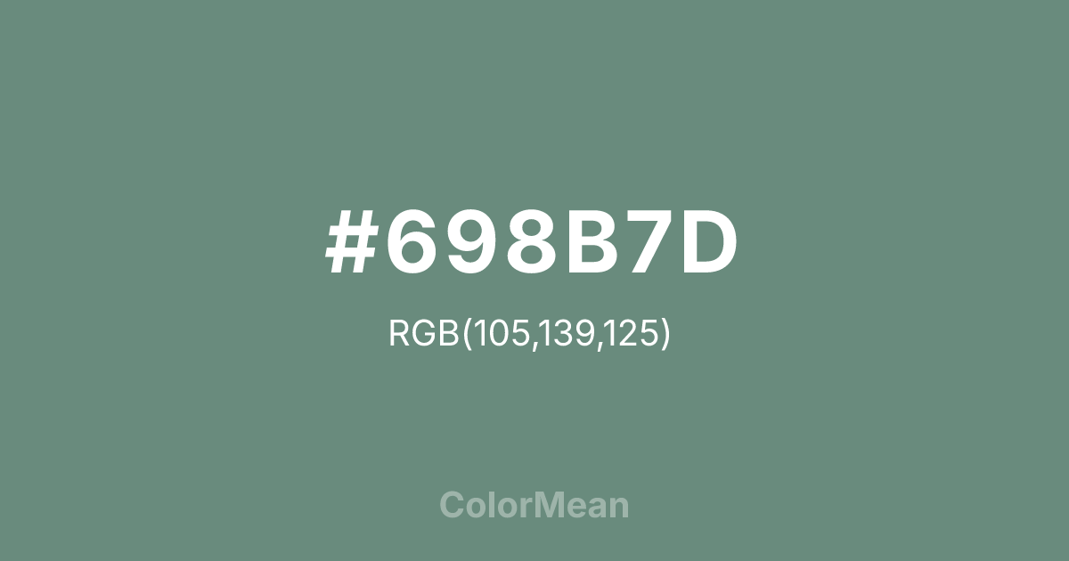
#698B7D Color Information
#698B7D RGB value is (105, 139, 125). The hex color red value is 105, green is 139, and blue is 125. Its HSL format shows a hue of 155°, saturation of 14 percent, and lightness of 48 percent. The CMYK process values are 24 percent, 0 percent, 10 percent, 45 percent.
#698B7D Color Meaning
Color #698B7D signifies calm, stability, and understated sophistication. #698B7D muted gray-green shade evokes subtlety, composure, and mental clarity. Psychologically, color #698B7D encourages focus, emotional balance, and thoughtful reflection, supporting serene and structured spaces. Culturally, color #698B7D is associated with restraint, practicality, and equilibrium in Western traditions, while Eastern symbolism links #698B7D to healing, meditation, and grounded energy. Fengshui considers #698B7D stabilizing, ideal for balancing rooms, reducing stress, and fostering mental clarity. Spiritually, #698B7D resonates with the heart chakra, promoting compassion, reflection, and inner balance. In design and arts, color #698B7D works as a versatile background or accent. Its muted tone pairs well with creams, soft blues, and earthy neutrals, appearing in contemporary interiors, graphic design, and natural-themed artworks.
Color Conversion
Convert #698B7D across different color models and formats. These conversions help designers work seamlessly between digital and print media, ensuring this color maintains its intended appearance across RGB screens, CMYK printers, and HSL color manipulations.
RGB Values & CMYK Values
RGB Values
CMYK Values
Color Variations
#698B7D harmonies come to life through carefully balanced shades, tints, and tones, giving this color depth and flexibility across light and dark variations. Shades add richness, tints bring an airy softness, and tones soften intensity, making it easy to pair in clean, modern palettes.
Color Harmonies
#698B7D harmonies create beautiful relationships with other colors based on their position on the color wheel. Each harmony type offers unique design possibilities, enabling cohesive and visually appealing color schemes.
Analogous
Colors adjacent on the color wheel (30° apart)
Complementary
Colors opposite on the color wheel (180° apart)
Split Complementary
Three colors using one base hue and the two hues beside its opposite
Triadic
Three colors evenly spaced (120° apart)
Tetradic
Four colors forming a rectangle on the wheel
Square
Four colors evenly spaced (90° apart)
Double Split
Four colors formed from two base hues and the colors next to their opposites
Monochromatic
Variations of a single hue
Contrast Checker
(WCAG 2.1) Test #698B7D for accessibility compliance against white and black backgrounds. Proper contrast ensures this color remains readable and usable for all audiences, meeting WCAG 2.1 standards for both normal and large text applications.
Sample Text
This is how your text will look with these colors.
Large Text (18pt+)
Normal Text
UI Components
Color Blindness Simulator
See how #698B7D appears to people with different types of color vision deficiencies. These simulations help create more inclusive designs that consider how this color is perceived across various visual abilities.
Normal Vision
protanopia
Note: These simulations are approximations. Actual color vision deficiency varies by individual.
CSS Examples
Background Color
Text Color
Sample Text
Border Color
Box Shadow
Text Shadow
Sample Text
Gradient
#698B7D Color FAQs
Frequently asked questions about #698B7D color meaning, symbolism, and applications. Click on any question to expand detailed answers.

