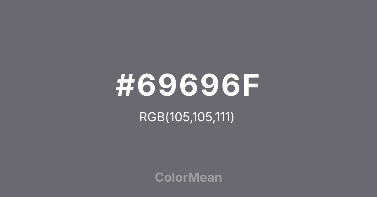
#69696F Color Information
#69696F RGB value is (105, 105, 111). The hex color red value is 105, green is 105, and blue is 111. Its HSL format shows a hue of 240°, saturation of 3 percent, and lightness of 42 percent. The CMYK process values are 5 percent, 5 percent, 0 percent, 56 percent.
#69696F Color Meaning
Color #69696F signifies sophisticated dusk, muted complexity, and urban shadow. #69696F dark, desaturated purple-grey evokes twilight, wet pavement, and crushed berries, suggesting a moody, introspective, and modern elegance. Psychologically, color #69696F is cool, contemplative, and slightly mysterious, encouraging nuanced thought and emotional depth. #69696F adds a layer of sophisticated shadow to a palette, conveying intelligence, reserved creativity, and a taste for the unconventional. #69696F color feels both modern and timelessly somber. Symbolically, color #69696F represents the richness found in darkness, complexity over simplicity, and beauty that is not immediately sweet. #69696F is the color of a thoughtful evening, intellectual nightlife, or a stormy sky. Culturally, #69696F appears in avant-garde fashion, moody interior design, and branding for arts or technology that values depth and subtlety. Color #69696F provides a refined, dark neutral that carries more emotional and chromatic resonance than flat black or grey.
Color Conversion
Convert #69696F across different color models and formats. These conversions help designers work seamlessly between digital and print media, ensuring this color maintains its intended appearance across RGB screens, CMYK printers, and HSL color manipulations.
RGB Values & CMYK Values
RGB Values
CMYK Values
Color Variations
#69696F harmonies come to life through carefully balanced shades, tints, and tones, giving this color depth and flexibility across light and dark variations. Shades add richness, tints bring an airy softness, and tones soften intensity, making it easy to pair in clean, modern palettes.
Color Harmonies
#69696F harmonies create beautiful relationships with other colors based on their position on the color wheel. Each harmony type offers unique design possibilities, enabling cohesive and visually appealing color schemes.
Analogous
Colors adjacent on the color wheel (30° apart)
Complementary
Colors opposite on the color wheel (180° apart)
Split Complementary
Three colors using one base hue and the two hues beside its opposite
Triadic
Three colors evenly spaced (120° apart)
Tetradic
Four colors forming a rectangle on the wheel
Square
Four colors evenly spaced (90° apart)
Double Split
Four colors formed from two base hues and the colors next to their opposites
Monochromatic
Variations of a single hue
Contrast Checker
(WCAG 2.1) Test #69696F for accessibility compliance against white and black backgrounds. Proper contrast ensures this color remains readable and usable for all audiences, meeting WCAG 2.1 standards for both normal and large text applications.
Sample Text
This is how your text will look with these colors.
Large Text (18pt+)
Normal Text
UI Components
Color Blindness Simulator
See how #69696F appears to people with different types of color vision deficiencies. These simulations help create more inclusive designs that consider how this color is perceived across various visual abilities.
Normal Vision
protanopia
Note: These simulations are approximations. Actual color vision deficiency varies by individual.
CSS Examples
Background Color
Text Color
Sample Text
Border Color
Box Shadow
Text Shadow
Sample Text
Gradient
#69696F Color FAQs
Frequently asked questions about #69696F color meaning, symbolism, and applications. Click on any question to expand detailed answers.
