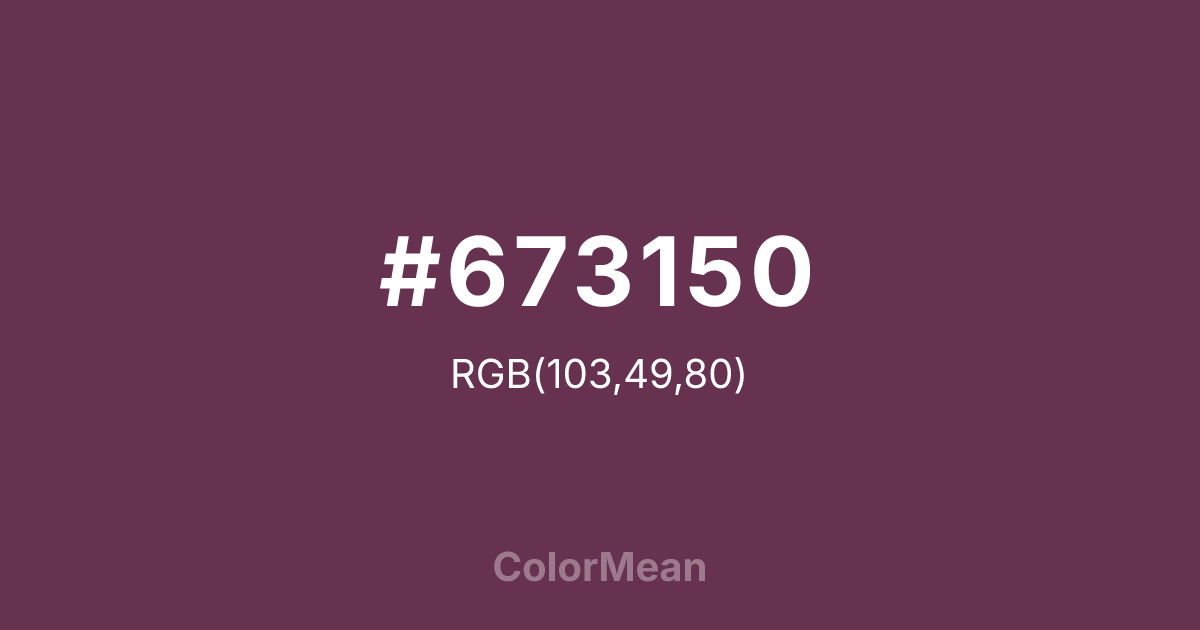
#673150 Color Information
#673150 RGB value is (103, 49, 80). The hex color red value is 103, green is 49, and blue is 80. Its HSL format shows a hue of 326°, saturation of 36 percent, and lightness of 30 percent. The CMYK process values are 0 percent, 52 percent, 22 percent, 60 percent.
#673150 Color Meaning
Color #673150 conveys depth, restraint, and refined warmth. #673150 muted purple leans toward earth and shadow, which creates a sense of maturity rather than spectacle. As a result, color #673150 often feels composed and intentional, favoring thoughtful presence over quick emotion. From a mental perspective, color #673150 supports introspection and emotional regulation. #673150 softens intense feelings while still allowing personal expression. Designers often rely on #673150 color when they want seriousness without coldness, since color #673150 balances comfort with dignity. In symbolic and cultural contexts, color #673150 connects to heritage, ritual desserts, and ceremonial richness. #673150 reflects respect for tradition and patience earned through time. On a spiritual level, color #673150 represents inner wisdom, emotional boundaries, and the quiet confidence that comes from self awareness.
Color Conversion
Convert #673150 across different color models and formats. These conversions help designers work seamlessly between digital and print media, ensuring this color maintains its intended appearance across RGB screens, CMYK printers, and HSL color manipulations.
RGB Values & CMYK Values
RGB Values
CMYK Values
Color Variations
#673150 harmonies come to life through carefully balanced shades, tints, and tones, giving this color depth and flexibility across light and dark variations. Shades add richness, tints bring an airy softness, and tones soften intensity, making it easy to pair in clean, modern palettes.
Color Harmonies
#673150 harmonies create beautiful relationships with other colors based on their position on the color wheel. Each harmony type offers unique design possibilities, enabling cohesive and visually appealing color schemes.
Analogous
Colors adjacent on the color wheel (30° apart)
Complementary
Colors opposite on the color wheel (180° apart)
Split Complementary
Three colors using one base hue and the two hues beside its opposite
Triadic
Three colors evenly spaced (120° apart)
Tetradic
Four colors forming a rectangle on the wheel
Square
Four colors evenly spaced (90° apart)
Double Split
Four colors formed from two base hues and the colors next to their opposites
Monochromatic
Variations of a single hue
Contrast Checker
(WCAG 2.1) Test #673150 for accessibility compliance against white and black backgrounds. Proper contrast ensures this color remains readable and usable for all audiences, meeting WCAG 2.1 standards for both normal and large text applications.
Sample Text
This is how your text will look with these colors.
Large Text (18pt+)
Normal Text
UI Components
Color Blindness Simulator
See how #673150 appears to people with different types of color vision deficiencies. These simulations help create more inclusive designs that consider how this color is perceived across various visual abilities.
Normal Vision
protanopia
Note: These simulations are approximations. Actual color vision deficiency varies by individual.
CSS Examples
Background Color
Text Color
Sample Text
Border Color
Box Shadow
Text Shadow
Sample Text
Gradient
#673150 Color FAQs
Frequently asked questions about #673150 color meaning, symbolism, and applications. Click on any question to expand detailed answers.

