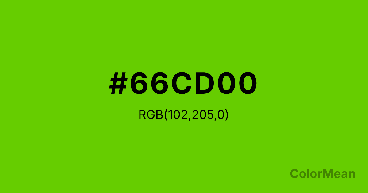
Chartreuse3 (#66CD00) Color Information
Chartreuse3 (#66CD00) RGB value is (102, 205, 0). The hex color red value is 102, green is 205, and blue is 0. Its HSL format shows a hue of 90°, saturation of 100 percent, and lightness of 40 percent. The CMYK process values are 50 percent, 0 percent, 100 percent, 20 percent.
Chartreuse3 (#66CD00) Color Meaning
Chartreuse3 (#66CD00) conveys grounded innovation, botanical urgency, and functional brightness. Chartreuse3 (#66CD00) is a deeper, more olive-leaning green-yellow that retains chartreuse’s energy while adding earthiness. Unlike its electric siblings, it feels plausible—like new wheat or unripe fruit. In agricultural and environmental branding, this hue signals actionable change: not just awareness, but harvest. Psychological studies link such mid-chroma greens to increased perceived credibility in sustainability claims, especially when paired with natural textures. Functionally, Chartreuse3 (#66CD00) performs well across media. It offers strong contrast against deep blues and charcoals, meeting WCAG AA standards for body text in digital formats. Print reproduction is excellent on uncoated stocks, enhancing its artisanal appeal in packaging and editorial design. It’s common in organic food labels, outdoor gear, and educational materials where “fresh” must feel real. Chartreuse3 (#66CD00) doesn’t dazzle—it convinces. Culturally, Chartreuse3 (#66CD00) reflects resilience through cycles—regrowth after fire, crops after drought. It appears in climate resilience campaigns and regenerative agriculture as a symbol of hope with roots. Spiritually, it aligns with the heart chakra’s determined mode: love that plants seeds. Designers use Chartreuse3 (#66CD00) when they want to signal progress that lasts. Its urgency is patient.
Color Conversion
Convert Chartreuse3 (#66CD00) across different color models and formats. These conversions help designers work seamlessly between digital and print media, ensuring this color maintains its intended appearance across RGB screens, CMYK printers, and HSL color manipulations.
RGB Values & CMYK Values
RGB Values
CMYK Values
Color Variations
Chartreuse3 (#66CD00) harmonies come to life through carefully balanced shades, tints, and tones, giving this color depth and flexibility across light and dark variations. Shades add richness, tints bring an airy softness, and tones soften intensity, making it easy to pair in clean, modern palettes.
Color Harmonies
Chartreuse3 (#66CD00) harmonies create beautiful relationships with other colors based on their position on the color wheel. Each harmony type offers unique design possibilities, enabling cohesive and visually appealing color schemes.
Analogous
Colors adjacent on the color wheel (30° apart)
Complementary
Colors opposite on the color wheel (180° apart)
Split Complementary
Three colors using one base hue and the two hues beside its opposite
Triadic
Three colors evenly spaced (120° apart)
Tetradic
Four colors forming a rectangle on the wheel
Square
Four colors evenly spaced (90° apart)
Double Split
Four colors formed from two base hues and the colors next to their opposites
Monochromatic
Variations of a single hue
Contrast Checker
(WCAG 2.1) Test Chartreuse3 (#66CD00) for accessibility compliance against white and black backgrounds. Proper contrast ensures this color remains readable and usable for all audiences, meeting WCAG 2.1 standards for both normal and large text applications.
Sample Text
This is how your text will look with these colors.
Large Text (18pt+)
Normal Text
UI Components
Color Blindness Simulator
See how #66CD00 appears to people with different types of color vision deficiencies. These simulations help create more inclusive designs that consider how this color is perceived across various visual abilities.
Normal Vision
protanopia
Note: These simulations are approximations. Actual color vision deficiency varies by individual.
CSS Examples
Background Color
Text Color
Sample Text
Border Color
Box Shadow
Text Shadow
Sample Text
Gradient
Chartreuse3 (#66CD00) Color FAQs
Frequently asked questions about Chartreuse3 (#66CD00) color meaning, symbolism, and applications. Click on any question to expand detailed answers.
