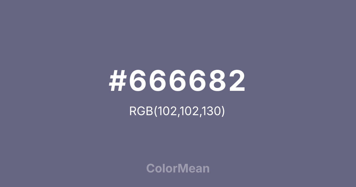
#666682 Color Information
#666682 RGB value is (102, 102, 130). The hex color red value is 102, green is 102, and blue is 130. Its HSL format shows a hue of 240°, saturation of 12 percent, and lightness of 45 percent. The CMYK process values are 22 percent, 22 percent, 0 percent, 49 percent.
#666682 Color Meaning
Color #666682 signifies urban twilight, muted observation, and quiet adaptability. #666682 dusty, greyish-blue is the color of pigeon feathers, dusk city skies, and weathered stone, suggesting a creature that thrives in the interstices of human construction. Psychologically, color #666682 is cool, observant, and subtly melancholic, promoting a sense of adaptive calm, detached watchfulness, and resilient anonymity. #666682 soothes with its muted, non-threatening presence and connection to the everyday urban landscape. #666682 color is a sophisticated, subdued neutral. Culturally, color #666682 references the built environment, industrial aesthetics, and a certain poetic loneliness found in city life. Symbolically, #666682 represents the overlooked beauty of the common, survival through blending in, and peace found in the margins. Color #666682 embodies an aesthetic of urban naturalism, finding a specific, quiet beauty in the colors of infrastructure, wildlife, and the softening effects of time and weather on man-made materials.
Color Conversion
Convert #666682 across different color models and formats. These conversions help designers work seamlessly between digital and print media, ensuring this color maintains its intended appearance across RGB screens, CMYK printers, and HSL color manipulations.
RGB Values & CMYK Values
RGB Values
CMYK Values
Color Variations
#666682 harmonies come to life through carefully balanced shades, tints, and tones, giving this color depth and flexibility across light and dark variations. Shades add richness, tints bring an airy softness, and tones soften intensity, making it easy to pair in clean, modern palettes.
Color Harmonies
#666682 harmonies create beautiful relationships with other colors based on their position on the color wheel. Each harmony type offers unique design possibilities, enabling cohesive and visually appealing color schemes.
Analogous
Colors adjacent on the color wheel (30° apart)
Complementary
Colors opposite on the color wheel (180° apart)
Split Complementary
Three colors using one base hue and the two hues beside its opposite
Triadic
Three colors evenly spaced (120° apart)
Tetradic
Four colors forming a rectangle on the wheel
Square
Four colors evenly spaced (90° apart)
Double Split
Four colors formed from two base hues and the colors next to their opposites
Monochromatic
Variations of a single hue
Contrast Checker
(WCAG 2.1) Test #666682 for accessibility compliance against white and black backgrounds. Proper contrast ensures this color remains readable and usable for all audiences, meeting WCAG 2.1 standards for both normal and large text applications.
Sample Text
This is how your text will look with these colors.
Large Text (18pt+)
Normal Text
UI Components
Color Blindness Simulator
See how #666682 appears to people with different types of color vision deficiencies. These simulations help create more inclusive designs that consider how this color is perceived across various visual abilities.
Normal Vision
protanopia
Note: These simulations are approximations. Actual color vision deficiency varies by individual.
CSS Examples
Background Color
Text Color
Sample Text
Border Color
Box Shadow
Text Shadow
Sample Text
Gradient
#666682 Color FAQs
Frequently asked questions about #666682 color meaning, symbolism, and applications. Click on any question to expand detailed answers.

