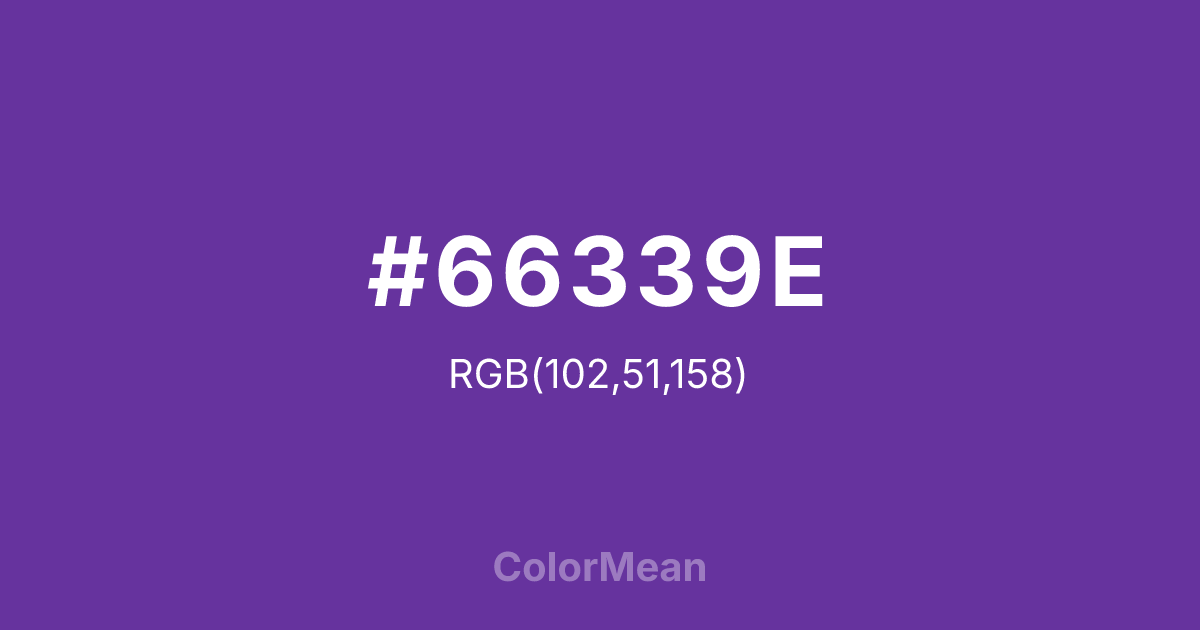
#66339E Color Information
#66339E RGB value is (102, 51, 158). The hex color red value is 102, green is 51, and blue is 158. Its HSL format shows a hue of 269°, saturation of 51 percent, and lightness of 41 percent. The CMYK process values are 35 percent, 68 percent, 0 percent, 38 percent.
#66339E Color Meaning
Color #66339E signifies honor, sacrifice, and noble courage, directly named for the U.S. military decoration. #66339E deep, bluish-purple is solemn and dignified, evoking velvet presentation cases, twilight ceremonies, and profound respect. Psychologically, color #66339E inspires reverence and solemn pride, conveying the gravity of sacrifice, the quiet weight of heroism, and the blending of heart (purple) with duty (structured blue). #66339E is a color that commands a moment of silent reflection. #66339E color is valor made visible in a somber, majestic hue. Culturally, color #66339E is inextricably linked to the medal awarded for being wounded or killed in combat, carrying immense emotional and patriotic weight. Symbolically, #66339E represents the highest cost of service, the physical and spiritual wound that is transformed into a public honor, and the eternal memory of bravery. Its use outside of a military context borrows #66339E profound gravity, aiming to convey deep respect, premium quality, or a tribute to enduring strength in the face of adversity.
Color Conversion
Convert #66339E across different color models and formats. These conversions help designers work seamlessly between digital and print media, ensuring this color maintains its intended appearance across RGB screens, CMYK printers, and HSL color manipulations.
RGB Values & CMYK Values
RGB Values
CMYK Values
Color Variations
#66339E harmonies come to life through carefully balanced shades, tints, and tones, giving this color depth and flexibility across light and dark variations. Shades add richness, tints bring an airy softness, and tones soften intensity, making it easy to pair in clean, modern palettes.
Color Harmonies
#66339E harmonies create beautiful relationships with other colors based on their position on the color wheel. Each harmony type offers unique design possibilities, enabling cohesive and visually appealing color schemes.
Analogous
Colors adjacent on the color wheel (30° apart)
Complementary
Colors opposite on the color wheel (180° apart)
Split Complementary
Three colors using one base hue and the two hues beside its opposite
Triadic
Three colors evenly spaced (120° apart)
Tetradic
Four colors forming a rectangle on the wheel
Square
Four colors evenly spaced (90° apart)
Double Split
Four colors formed from two base hues and the colors next to their opposites
Monochromatic
Variations of a single hue
Contrast Checker
(WCAG 2.1) Test #66339E for accessibility compliance against white and black backgrounds. Proper contrast ensures this color remains readable and usable for all audiences, meeting WCAG 2.1 standards for both normal and large text applications.
Sample Text
This is how your text will look with these colors.
Large Text (18pt+)
Normal Text
UI Components
Color Blindness Simulator
See how #66339E appears to people with different types of color vision deficiencies. These simulations help create more inclusive designs that consider how this color is perceived across various visual abilities.
Normal Vision
protanopia
Note: These simulations are approximations. Actual color vision deficiency varies by individual.
CSS Examples
Background Color
Text Color
Sample Text
Border Color
Box Shadow
Text Shadow
Sample Text
Gradient
#66339E Color FAQs
Frequently asked questions about #66339E color meaning, symbolism, and applications. Click on any question to expand detailed answers.
